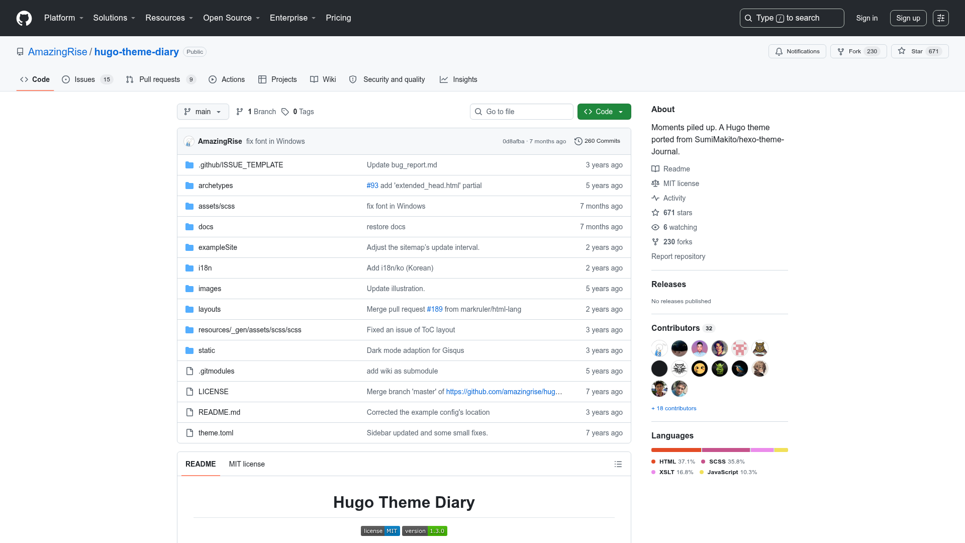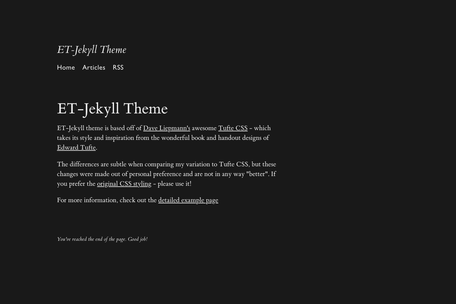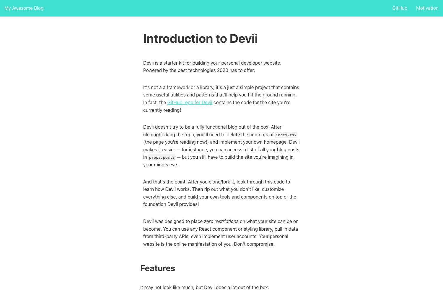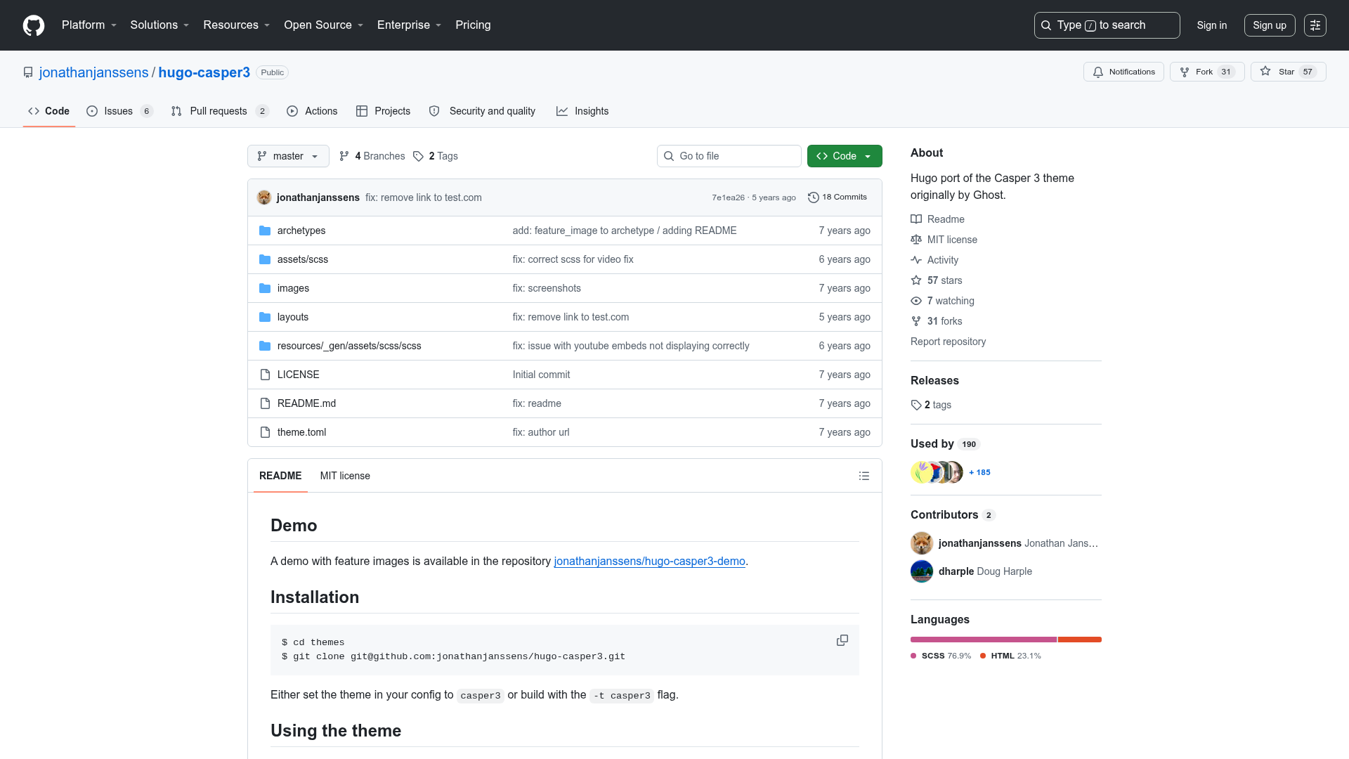

Template details
Mickey
Minimal one-column responsive Jekyll theme for personal blogs, inspired by Hyde and Medium.
About this template
Mickey is a minimal one-column, responsive Jekyll theme for personal blogs, inspired by Hyde, Medium, and Squarespace. It pairs a typography-focused reading experience with Gulp-based build automation and a clean front matter schema for posts.
What is Mickey?
Mickey is a Jekyll theme that turns a standard Jekyll site into a minimalist blog. It takes Markdown posts with front matter (layout, title, date, last_modified_at, excerpt, categories, tags, image, bgContrast) and renders them as a responsive, one-column static site with featured images and custom typography. The theme requires Jekyll 2.x and uses Gulp for compiling Sass, resizing images, and live-reloading via BrowserSync. It is authored by Vincent Chan and released under the MIT license.
Key Features
- One-column responsive layout — A single narrow column keeps reading comfortable on desktop and mobile, in the style of Medium and Hyde.
- Customizable identity — Replace
logo-white.svg,logo-black.svg,logo-text-white.svg, andlogo-text-black.svginassets/images/to rebrand the site without touching layout code. - Typography-driven design — Vertical rhythm and spacing come from
typebase.css, with overrides in_scss/_typography.scssfor fonts and type scale. - Two blockquote styles — Use
class="largeQuote"for a large featured quote, or the normal style with theu--startsWithDoubleQuoteutility class for hanging punctuation. - Image height control — Maintain vertical rhythm by applying classes like
img--14xLeadingto set image height relative to the text leading, as documented in_scss/_images.scss. - Automatic post thumbnails — Gulp resizes any featured images in
assets/images/heroand outputs thumbnails toassets/images/thumbnailsautomatically. - Flexible post front matter — Each post can define its own featured image, top position, background contrast (
bgContrast), and gradient opacity (bgGradientOpacity) for cover treatments.
Who is it for?
- Personal bloggers who want a focused, text-first layout and are comfortable managing a Jekyll site with Git and the command line.
- Jekyll developers who want a customizable starting point with Sass source files (
_scss/), Gulp tasks, and a straightforward_config.yml. - Design-conscious writers who care about typography and vertical rhythm and want predefined blockquote and hanging-punctuation styles.
What can you do with Mickey?
- Publish a personal blog: Write posts with categories and tags, set an excerpt for meta descriptions, and add a feature image with top-position and gradient controls.
- Rebrand the theme quickly: Swap the four SVG logo files to match your own identity without editing layout templates.
- Customize the design system: Edit
_scss/_typography.scssand_scss/_images.scssto adjust fonts, type scale, and image sizing behavior.
How does Mickey work?
Installation follows a typical Jekyll theme workflow: fork the Mickey repo and clone it locally, run npm install to fetch the dependencies in package.json, update _config.yml with your site info, and replace the demo posts and pages. During development, run gulp — it compiles the Jekyll site, compiles Sass into assets/css/main.css, generates post thumbnails, launches BrowserSync, and watches files for changes.
FAQ
Is Mickey free?
Yes, Mickey is open sourced under the MIT license, so you can use, modify, and redistribute it freely as long as you retain the license text. The repository also includes a disclaimer noting it is not affiliated with Disney.
Which Jekyll version do I need?
Mickey requires Jekyll 2.x. If you are on an older version, the README recommends running gem update jekyll or gem install jekyll before using the theme.
How do I change the logo?
Place your own SVG files in assets/images/ and overwrite logo-white.svg, logo-black.svg, logo-text-white.svg, and logo-text-black.svg. The theme picks them up automatically.
How are post thumbnails generated?
Gulp's image resize package processes featured images placed in assets/images/hero and creates resized versions in assets/images/thumbnails as part of the gulp command.