Nuxt Toaster is a Nuxt.js module for displaying toast notifications; it injects a $nt instance into the app and can render any Vue component, render function, string, or number as toast content.
What is Nuxt Toaster?
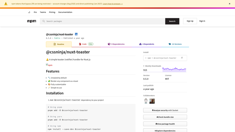
Nuxt Toaster is an unstyled, TypeScript-based toast notification module built for Nuxt.js. It takes a string or a Vue component as input, renders it inside a configurable container div, and outputs a dismissible toast with role="alert" and keyboard focus support. Published as @cssninja/nuxt-toaster on npm, it is designed to be installed as a dev dependency and registered in the modules array of nuxt.config.js. The module automatically creates a $nt instance on useNuxtApp() that you can call from any component, page, or plugin.
Key Features
- Unstyled by default — ships with no CSS, so you are free to apply your own styles or integrate a utility framework like Tailwind CSS.
- Any component as content —
$nt.show()accepts a Vue render function, string, or number; for instance$nt.show(() => h(MyComponent))renders that component as the toast. - Full configuration via show options — each toast can set
duration(default 5000 ms),pauseOnHover(default true),dismissible(default true),maxToasts,transition, and athemewithcontainerId,containerClassandwrapperClass. - Per-container context — each
theme.containerIdmaintains its own toast stack, somaxToastscounts only the toasts in that container. - App config defaults — set default options for all
$nt.show()calls inapp.config.tsunder thetoasterkey to avoid repetition. - Custom plugin support — disable the default plugin with
installPlugin: falseand create your ownninjaToasterinstance usingcreateNinjaToaster(), then provide your own methods likeinfoorerror. - State and progress composables — custom toast components can use
useNinjaToasterState()(exposes hover/active state, timer, duration, click, close) anduseNinjaToasterProgress()(exposes percent, endAt, closeIn) to build interactive toasts. - Programmatic close — close all toasts with
closeAll(), or close toasts in a specific container viaclose(containerId)orclose(theme).
Who is it for?
Nuxt Toaster is for Nuxt.js developers who need a lightweight, unstyled toast system that they can fully control. It is particularly useful for teams building custom design systems or using utility-first CSS frameworks like Tailwind.
- Nuxt.js developers — want to add notifications without pulling in a heavy UI library; they can render their own Vue components as toasts.
- Design-system teams — build a consistent toast component with custom theme classes and use
useNinjaToasterStateanduseNinjaToasterProgressto implement timers, hover-pause, and progress bars. - Developers using Tailwind CSS — the unstyled output and theme class arrays let them apply Tailwind utilities directly to the container and wrapper, as shown in the custom plugin example.
What can you do with Nuxt Toaster?
- Display simple messages — call
$nt.show('Hello world')to show a plain string toast that auto-dismisses after the default 5 seconds. - Render rich custom components — pass a render function such as
() => h(MyToast, { title, type, message })to display interactive or branded notifications. - Create preset toast methods — wrap
nt.show()in your own plugin to exposeinfo()anderror()methods that each use a different component and styling, as demonstrated with the MyToast component. - Manage multi-container layouts — use different
containerIdvalues to position toasts in separate corners of the screen, each with its ownmaxToastslimit.
How does Nuxt Toaster work?
After you install and register the module, it automatically creates a $nt instance available on useNuxtApp(). Calling $nt.show() mounts the toast in a container div that the module creates in the DOM, and returns a promise that resolves with the element and a close function when the toast is mounted. The default plugin injects $nt; if you disable it, you build your own instance with createNinjaToaster() and provide it via a custom Nuxt plugin.
FAQ
Is Nuxt Toaster free?
Yes, Nuxt Toaster is distributed as a public npm package, which you can install with a package manager and use in as many projects as you like.
How do I change the default toast position?
Nuxt Toaster does not hard-code a position; you control positioning through CSS. In the minimal theme example, the #nt-container uses flexbox with flex-direction: column-reverse to push toasts to the bottom, and align-items to align left, center, or right. You can also pass custom classes via theme.containerClass.
Can I use Nuxt Toaster with Tailwind CSS?
Yes, because Nuxt Toaster is unstyled, you can pass Tailwind utility classes through containerClass and wrapperClass in the theme option. The documentation shows a custom plugin that applies classes like bg-indigo-600, rounded p-4, and text-rose-500 to a custom toast component.