Portfolio Responsive Complete is a personal portfolio website template built with HTML, CSS, and JavaScript by Bedimcode, designed to display an individual's work and skills in a responsive, mobile-first layout.
What is Portfolio Responsive Complete?
Portfolio Responsive Complete is a publicly available web template that provides a complete personal portfolio site as static HTML, CSS, and JavaScript files. It takes the user's content — such as name, projects, and skills — and delivers a multi-section website that adapts to any screen size. The template is developed by Bedimcode, a YouTube channel known for web design tutorials, and is hosted on GitHub where it has received 1,425 stars. No build tools or back-end services are required to run it; you simply open the files in a browser or upload them to any static host.
Key Features
- Mobile-first methodology — The CSS is written for mobile screens first, then enhanced for desktop, following modern responsive design practice.
- Smooth scrolling — Navigation links scroll the page to sections smoothly instead of jumping, improving the browsing feel.
- Scroll animations — Elements fade or slide into view as the user scrolls, creating a dynamic presentation without JavaScript libraries.
- Cross-device compatible — The layout works across phones, tablets, and desktops, with a user interface that stays consistent and clean.
- Plain HTML, CSS, and JavaScript — The template uses only standard web technologies, making it easy to read, modify, and integrate into any static site.
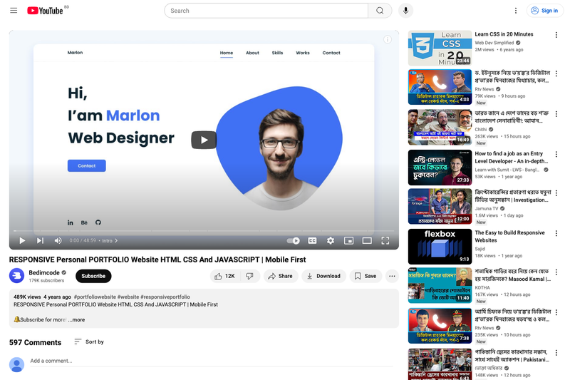
- Video tutorial included — A YouTube tutorial from Bedimcode demonstrates how to edit and launch the portfolio, useful for beginners.
Who is it for?
- Web developers — who want to quickly create a professional-looking personal portfolio without designing from scratch; they can replace the sample content with their own projects and resume.
- UX/UI designers — who need a reliable, responsive layout to showcase design work and case studies to potential clients.
- Students and career changers — who can use the template as a learning resource to see how mobile-first responsive design and JavaScript animations are implemented, or deploy it directly for job applications.
What can you do with it?
- Freelancers: build a personal website that presents their services, past projects, and contact links in a mobile-friendly format.
- Junior developers: put their portfolio online quickly to share with recruiters, demonstrating proficiency in fundamental front-end technologies.
- Designers: customize the color scheme, fonts, and images to match their personal brand, then host it on GitHub Pages or any static web server.