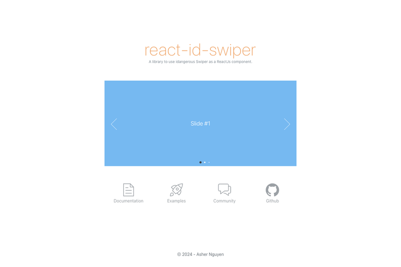
react-id-swiper is a MIT-licensed React component library by Asher Nguyen that wraps the Swiper touch slider (idangerous Swiper) so developers can build mobile-ready carousels using React props and JSX instead of Swiper's imperative API.
What is react-id-swiper?
react-id-swiper is a React wrapper around Swiper, the free modern mobile touch slider with hardware-accelerated transitions. It takes slide children (each wrapped in an HTML element) plus Swiper parameters as React props, and outputs a swipeable slider with pagination, navigation, and scrollbar support. Version 4.0.0 requires React and ReactDOM 16.8.0 or higher (for Hooks) and Swiper 5.0.0 or higher. The library is maintained by Asher Nguyen on GitHub, has 1482 stars, and is distributed as the npm package react-id-swiper.
Key Features
- Swiper params as props — pass any original Swiper API parameter (pagination, navigation, spaceBetween, and more) directly through React props; no imperative setup required.
- Custom build support — the ReactIdSwiperCustom export accepts a Swiper class and a modules array, so only the Swiper modules you need are bundled, reducing bundle size.
- External swiper control — attach a ref to the component and call methods like slideNext() and slidePrev() on ref.current.swiper from buttons or event handlers outside the slider.
- Render props for controls — renderPrevButton, renderNextButton, renderScrollbar, renderPagination, and renderParallax let you supply custom JSX for each Swiper control instead of using the default DOM.
- Configurable class names — containerClass (default swiper-container), wrapperClass (default swiper-wrapper), and slideClass (default swiper-slide) allow restyling without fighting Swiper's defaults.
- Dynamic update options — shouldSwiperUpdate and rebuildOnUpdate props control whether the slider updates or fully rebuilds when the component re-renders.
- Extended props — ContainerEl and WrapperEl set the element type for the container and wrapper; activeSlideKey sets the initial slide index; noSwiping disables swiping conditionally.
- Styling from the Swiper package — import swiper css, scss, or less directly, or load swiper.css from a CDN; the library works with Gatsby static sites.
Who is it for?
- React developers building carousels, image sliders, or content galleries who want Swiper's touch behavior without writing imperative Swiper initialization code.
- Bundle-size-conscious teams that need a carousel with only specific modules (for example, Navigation and Pagination) and use the custom build entry point to shrink their JavaScript payload.
- Gatsby site owners who want a touch slider that works with the Gatsby build pipeline, as the docs explicitly note Swiper works well with Gatsby.
- Mobile web app developers targeting iOS, modern Android, Windows Phone 8, and modern desktop browsers who need hardware-accelerated touch transitions.
What can you do with react-id-swiper?
- E-commerce product galleries: assemble a swipeable image carousel with clickable pagination bullets, prev/next buttons, and 30px spacing between slides using the params object shown in the docs.
- Testimonial and banner sliders: render any number of slide children in a loop with Swiper params, and customize the navigation arrows via renderPrevButton and renderNextButton.
- Programmatic slide control: wire external prev/next buttons to the swiper instance through a React ref, calling slideNext() and slidePrev() without touching the swiper internals.
- Customized visual components: replace stock Swiper DOM with your own buttons or scrollbars by matching the el class names (for example, .swiper-button-prev) in both params and render props.
How does react-id-swiper work?
Install the package alongside Swiper, import the Swiper component and the Swiper stylesheet, then pass slides as children and a params object of Swiper options. For custom builds, import ReactIdSwiperCustom instead and provide the Swiper class and a modules array, plus a Babel loader config for Webpack that excludes node_modules except swiper and dom7. Each slide must be wrapped in an HTML element such as a span or div; plain text children are not valid slides.
Pricing
react-id-swiper is free and open source under the MIT License. No paid tiers or premium features are advertised; the author accepts coffee donations via Buy Me a Coffee.
Alternatives
- Embla Carousel — a lightweight, dependency-free carousel library with React hooks.
- react-slick — a React carousel component built on the Slick slider.
- Swiper's official React components — the underlying Swiper project now ships its own React bindings.
FAQ
Is react-id-swiper free?
Yes. react-id-swiper is released under the MIT License and is free to use in commercial and personal projects. There are no paid tiers, and the source is available on GitHub, where the project has 1482 stars.
What React version does react-id-swiper require?
From version 2.0.0, react-id-swiper requires React and ReactDOM 16.8.0 or higher because it uses Hooks. It also requires Swiper 5.0.0 or later as a dependency from version 2.4.0 onward.
How do I use a custom Swiper build?
Install react-id-swiper and swiper, then import ReactIdSwiperCustom from react-id-swiper/lib/ReactIdSwiper.custom. Pass the Swiper class and a modules array (for example, Navigation and Pagination) as props. If you use Webpack and Babel, you must adjust the Babel loader to exclude node_modules except swiper and dom7.
Why are my slides not rendering?
Each slide must be wrapped by an HTML element. The docs show that bare text like "Slide content" directly inside the Swiper component fails, while wrapping it in a span or div works.
Can I control the swiper from outside the component?
Yes. Attach a ref to the Swiper component and access ref.current.swiper to call methods such as slideNext() and slidePrev(). The docs include an example with a useRef hook and external buttons.