Responsive Framework is an open-source Flutter package from Codelessly that automatically adapts mobile, tablet, and desktop user interfaces to different screen sizes using breakpoints, auto-scaling, and a set of responsive widgets.
What is Responsive Framework?
Responsive Framework is a Flutter library (package responsive_framework) that helps developers build apps for mobile, desktop, and web without recreating layouts for each screen size. It takes a Flutter widget tree and wraps it with ResponsiveBreakpoints.builder, and it produces UI that resizes or scales based on defined breakpoints. The package is maintained by Codelessly, a Flutter app UI and website builder, and is licensed under BSD Zero-Clause.
What makes Responsive Framework stand out?
- Breakpoint system — Define custom breakpoints with names, e.g., MOBILE (0–450), TABLET (451–800), DESKTOP (801–1920), and '4K' (1921+), and use conditionals like
largerThan,smallerThan,equals, andbetween. - AutoScale — Automatically scales a layout proportionally so it preserves the exact design when moving from phone to tablet to desktop; can be enabled per breakpoint with
ResponsiveBreakpoint.autoScale. - ResponsiveValue — Provides different values based on the current breakpoint (from the package's source files).
- ResponsiveVisibility — Shows or hides widgets conditionally based on screen size.
- ResponsiveRowColumn — A row/column that switches orientation at breakpoints.
- ResponsiveGridView — A grid that adapts its number of columns to the screen width.
- ResponsiveScaledBox — Scales a widget proportionally.
- MaxWidthBox — Constrains content to a maximum width for large screens.
Who should use Responsive Framework?
- Flutter app developers — Build one codebase that renders appropriately on phones, tablets, and desktops without writing separate layouts.
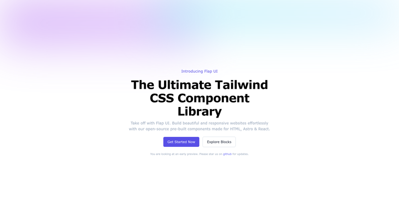
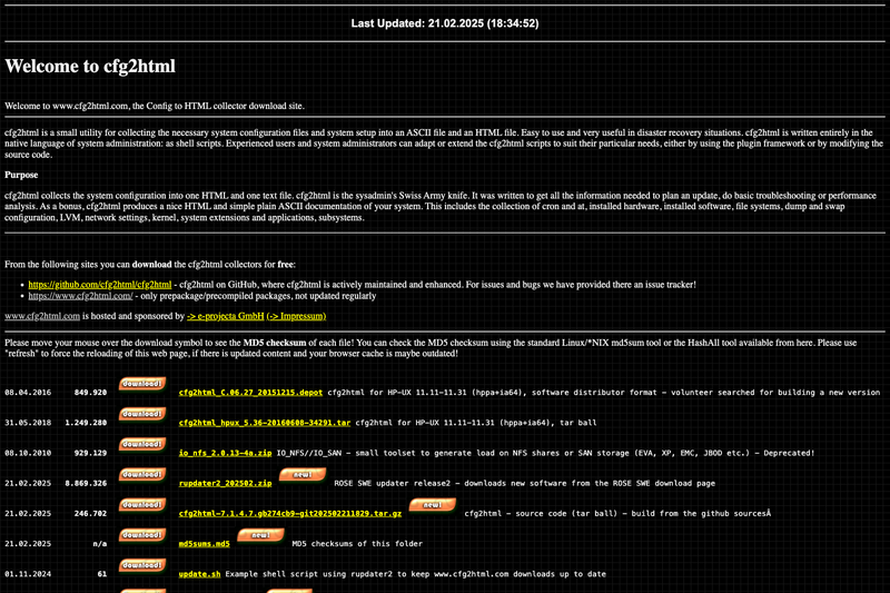
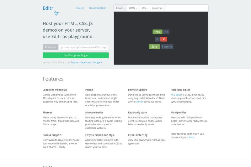
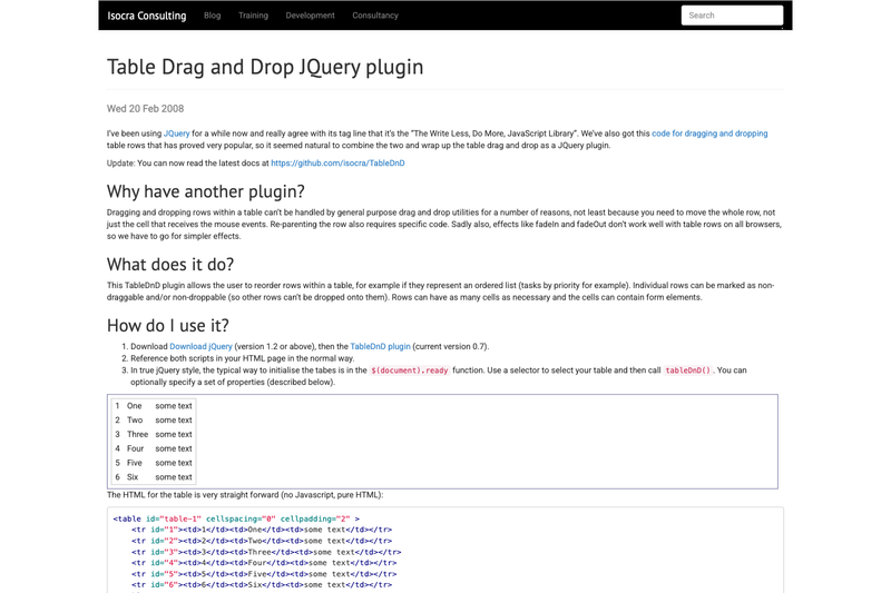
- Web developers recreating sites in Flutter — The package powers demo sites that recreate flutter.dev and pub.dev in Flutter, showing how to implement responsive web pages.
- Teams wanting consistent design across devices — Use auto-scaling so a design stays pixel-identical when screen dimensions change.
What can you do with Responsive Framework?
- Mobile-first apps: Define a MOBILE breakpoint and use
ResponsiveBreakpoints.of(context).isMobileto render compact UI. - Tablet layouts: Create a TABLET breakpoint that triggers auto-scaling to avoid tiny text.
- Desktop/web apps: Use custom breakpoints like 'EXPAND_SIDE_PANEL' to switch navigation rails to full width once enough space is available.
- Recreate existing websites: The included demos show the flutter.dev and pub.dev sites rebuilt in Flutter as responsive web applications.
How does Responsive Framework work?
Add responsive_framework to pubspec.yaml, then wrap your app's builder with ResponsiveBreakpoints.builder, pass an array of Breakpoint objects with start/end widths and names, and access the current state via ResponsiveBreakpoints.of(context). The package respects Flutter's default resizing and only scales when you enable autoScale at a breakpoint.
Pros and cons
- Pro: No need to rewrite layouts for each screen size; auto-scaling preserves design fidelity.
- Pro: Fully customizable breakpoint labels and mixed resize/scale behavior.
- Con: The legacy
ResponsiveWrapperAPI was deprecated and removed in v1.0.0, with a migration guide provided, so older code requires updates. - Con: Documentation is incomplete — the project wiki does not exist yet and the maintainers are seeking contributors.
Pricing
Responsive Framework is free and open-source, released under the BSD Zero-Clause license. It is also distributed as "emailware," meaning developers are invited (not required) to subscribe to Codelessly updates.
FAQ
Is Responsive Framework free?
Yes, Responsive Framework is open-source under BSD Zero-Clause, so you can use, copy, modify, and distribute it freely. It is also considered emailware: it asks you to subscribe to Codelessly updates, but this is optional.
How do I get started with Responsive Framework?
Add responsive_framework: ^latest_version to your pubspec.yaml, then wrap your MaterialApp or CupertinoApp builder with ResponsiveBreakpoints.builder. Define breakpoints and labels for MOBILE, TABLET, DESKTOP, and more using the Breakpoint class.
Does Responsive Framework work on web?
Yes, it supports mobile, tablet, desktop, and website layouts. The demo projects include a minimal website, a recreation of flutter.dev, and a recreation of pub.dev, all built in Flutter with responsive web support.
What is AutoScale?
AutoScale is a feature that proportionally shrinks and expands the layout to preserve the exact look of your UI as the screen size changes. It is off by default, and you enable it per breakpoint by setting autoScale: true in a ResponsiveBreakpoint.
What's the difference between ResponsiveWrapper and ResponsiveBreakpoints?
ResponsiveWrapper was the legacy API used in versions at or below v0.2.0. In v1.0.0, it was replaced by ResponsiveBreakpoints.builder and widgets like ResponsiveValue and ResponsiveVisibility. A migration guide is available in the repository.