Newsletter
Join the Community
Subscribe to our newsletter for the latest news and updates

Responsive Portfolio Website Using HTML CSS JS
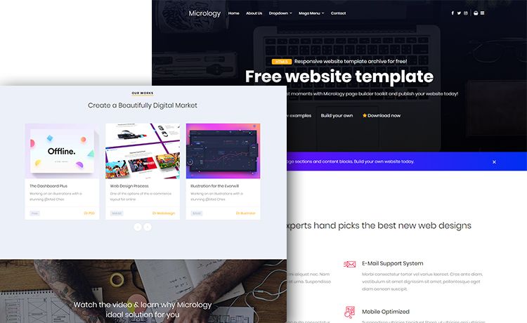
Free one-page responsive portfolio HTML template with off-canvas navigation, mega menu, Instagram feed, and Bootstrap 4.
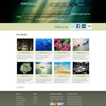
Free HTML/CSS portfolio template with main page and sub page for 4-column thumbnail showcase and work details.
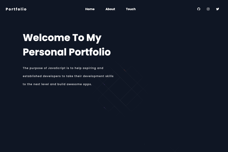
A responsive portfolio starter built with Next.js, Framer Motion, and create-next-app for fast personal-site launches.
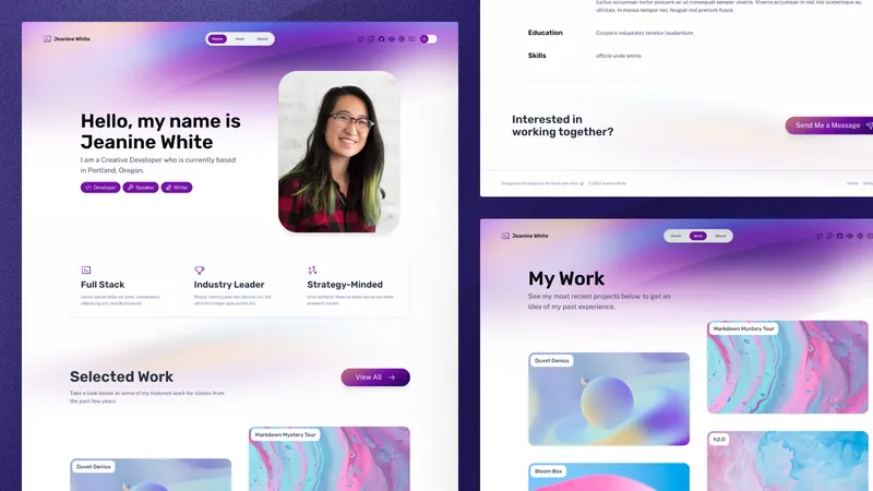
Share your hard work with this portfolio starter from the Astro team.
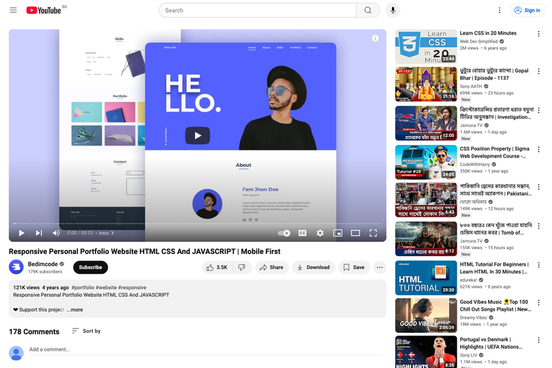
Responsive Personal Portfolio Website is a ready-to-use HTML, CSS, and JavaScript template from Bedimcode that builds a personal portfolio site with mobile-first responsive design, scroll animations, and smooth scrolling.
This is a single-page portfolio website template built entirely with vanilla HTML, CSS, and JavaScript, published on GitHub by the Bedimcode YouTube channel. It takes your personal information, projects, and contact details and outputs a fully styled, responsive portfolio page that works across mobile, tablet, and desktop viewports. The template pairs with a YouTube tutorial that walks through each development step, making it both a launchable site and a learning resource.
The template uses plain HTML for structure, CSS for styling and responsiveness, and JavaScript for scroll animations and smooth scrolling. No frameworks or build tools are required, so it can be opened directly in a browser or hosted on any static file server.
Yes, the source code is publicly available in the GitHub repository linked from the Bedimcode YouTube channel. You can download it, modify it, and use it for your own portfolio without paying any fee.
Edit the HTML file to replace the placeholder name, bio, project links, and contact details with your own information. Adjust colors, fonts, and spacing in the CSS file. To change scroll animations, modify the JavaScript file where the animation triggers are defined.
Yes, it is developed with a mobile-first methodology, meaning the layout is designed for small screens first and then enhanced for larger screens. It is compatible with all mobile devices and scales gracefully to tablets and desktops.