Newsletter
Join the Community
Subscribe to our newsletter for the latest news and updates

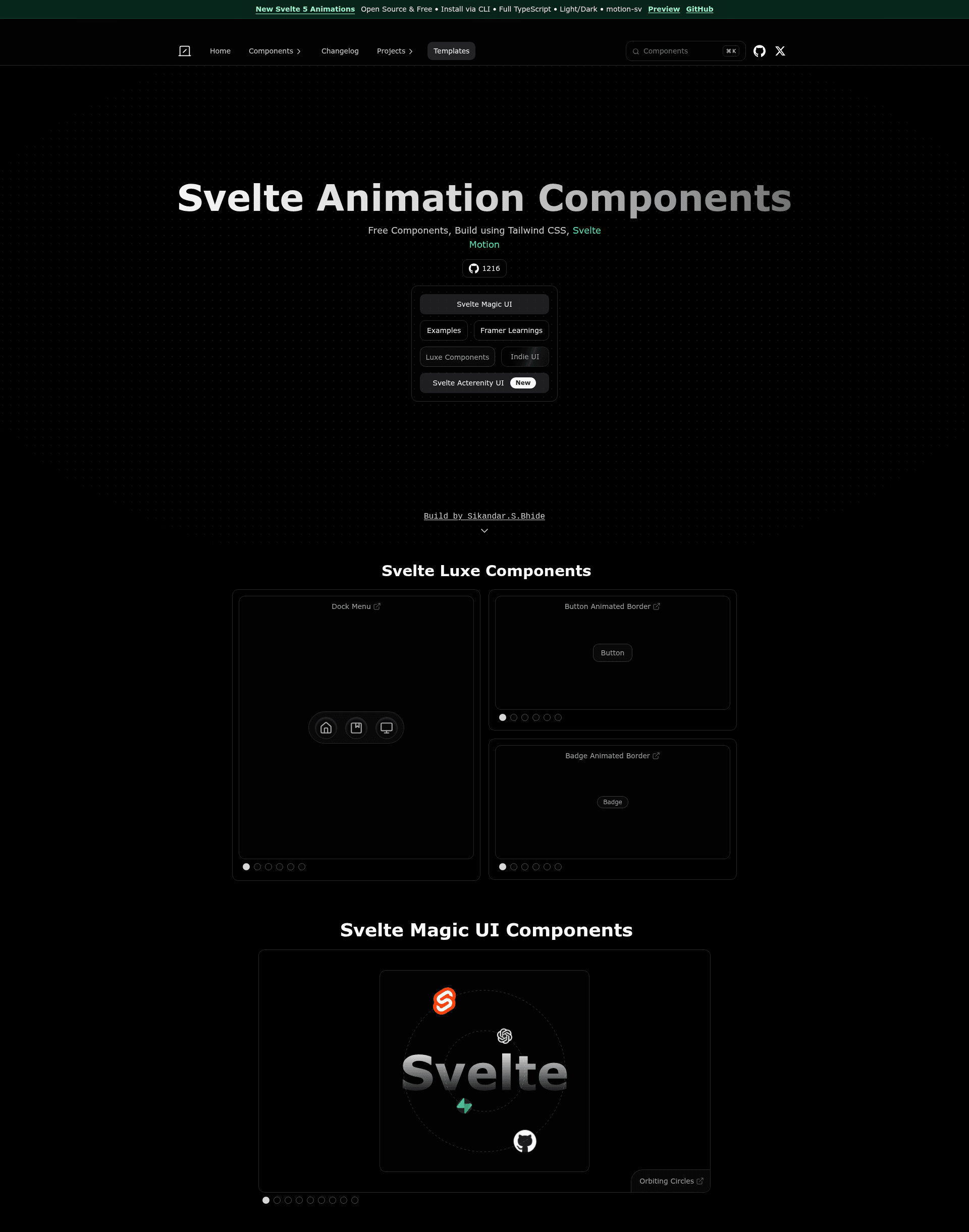
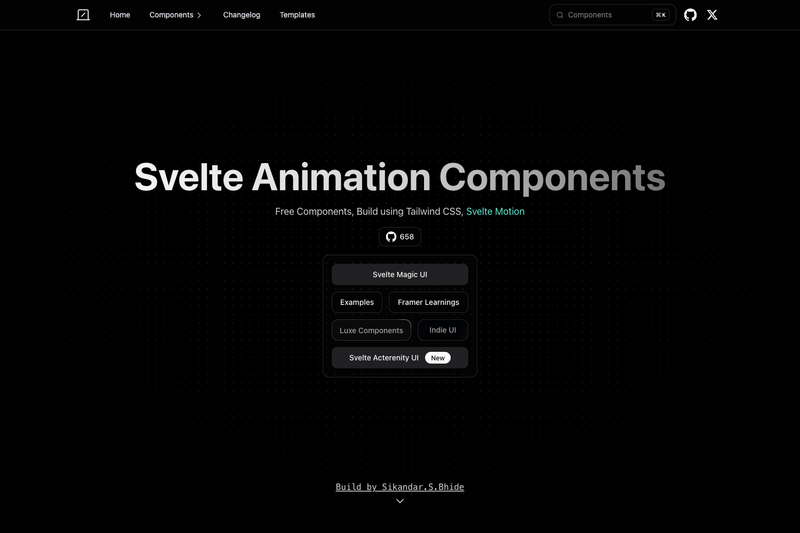
Reusable Svelte animation components and templates built with Tailwind CSS and Svelte Motion, including Magic UI and Aceternity UI ports.
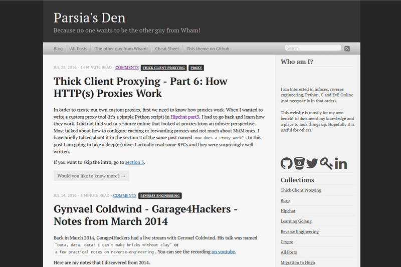
A Hugo theme that ports the classic Octopress blog design with customizable sidebar, shortcodes, and configurable features.
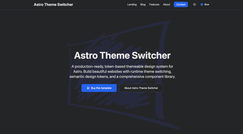
An open-source, token-based themeable design system for Astro with runtime theme switching, semantic design tokens, and a component library.
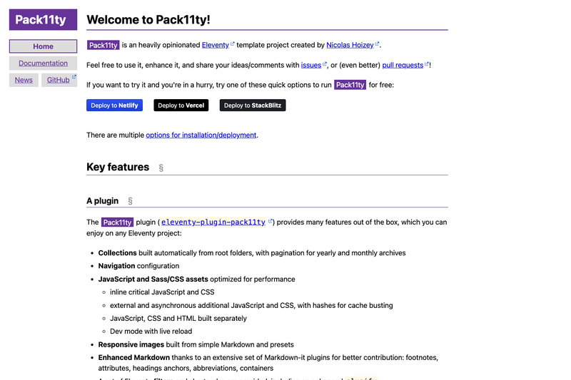
Command to create a new Eleventy site with the Pack11ty starter

A Hugo template for architecture websites, built on Hugolify with Bootstrap and Netlify deployment.
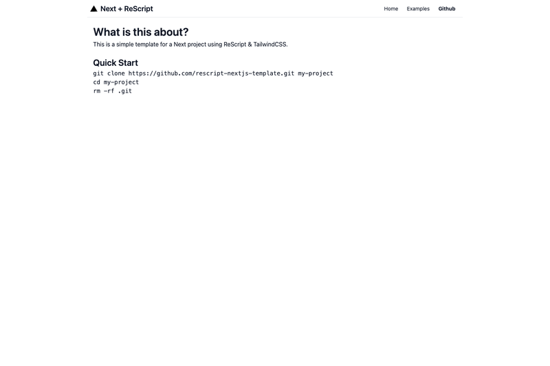
Opinionated boilerplate for NextJS, Tailwind, and ReScript with preconfigured bindings and Fast Refresh support.
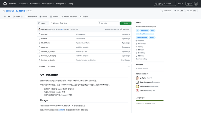
A Chinese-friendly LaTeX CV/resume template based on ModernCV, compiled with XeLaTeX.
Svelte Animation Components is a free, open-source collection of Svelte animation components and starter templates built with Tailwind CSS and Svelte Motion, offering drop-in UI effects inspired by Magic UI, Aceternity UI, and Luxe UI.
Svelte Animation Components is a repository and demo site by Sikandar Bhide (Twitter @Sikandar_Bhide) that packages reusable Svelte animation components and learning examples. It takes Svelte components and outputs animated UI elements such as buttons, text effects, and shaders that developers can copy or install directly. The project runs on Svelte, with a new Svelte 5 version hosted at sv-animations.vercel.app, and is styled with Tailwind CSS, using Svelte Motion and the motion-sv library for animations.
Browse the live demo at animation-svelte.vercel.app, pick a component, and either copy the code or install it through the shadcn-svelte CLI on the new Svelte 5 site. The documentation at sv-animations.vercel.app provides usage details for each component.
The component libraries and open-source templates are free to use, and the repository has 1,216 GitHub stars. A premium Startup Template is sold separately with a 30% discount; the price amount is not listed on the page.
The open-source components and templates are free to use, and the project has 1,216 GitHub stars. A separate premium startup template is paid, with a 30% discount code available.
The new version at sv-animations.vercel.app adds CLI installation via shadcn-svelte, full TypeScript support, light/dark mode, and components like Dither Shader, Pixel Image, and Text Animate, built on the motion-sv library.
The components are ports or adaptations of Magic UI, Aceternity UI, Luxe UI, Indie UI, and Hover.dev, with credit listed on the page.
Yes, the new Svelte 5 version includes full TypeScript support for all components.