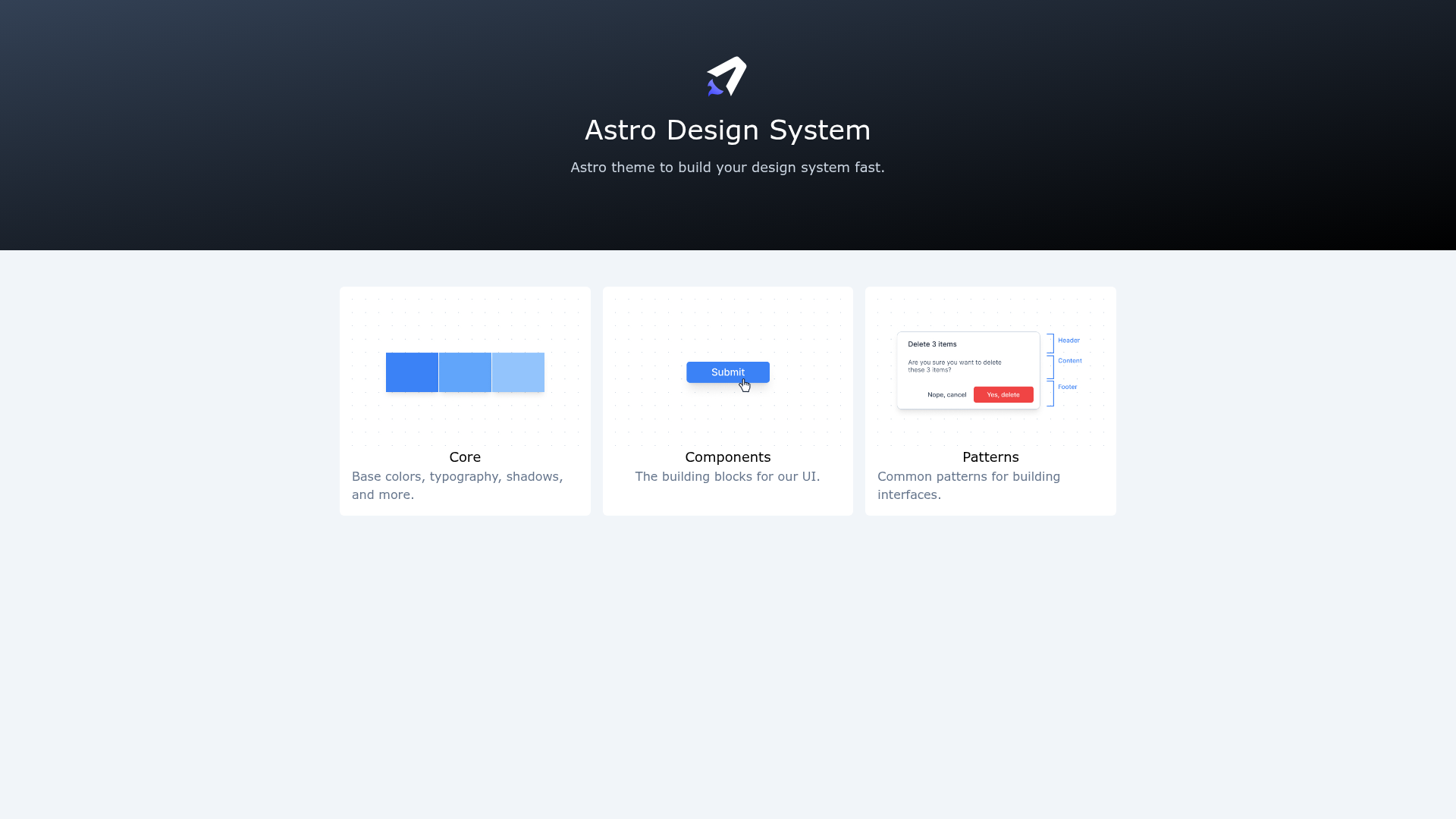
Astro Design System Theme is an open-source Astro starter template built for documenting design systems, styleguides, and component libraries in markdown. You can import your own component library—from React, Vue, or Svelte—and document every design decision and component directly inside markdown files.
What is Astro Design System Theme?
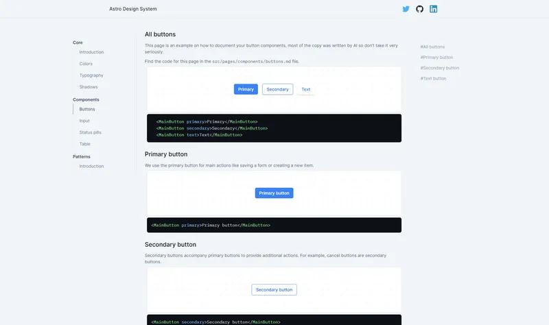
Astro Design System Theme is a documentation theme for design systems built with the Astro static site generator. It takes markdown and .astro files as input and produces a documentation site with a left-side navigation sidebar. The theme is created by @jordienr, has 145 stars on GitHub, and is free for personal and commercial use.
Key Features
- Astro framework — Runs on Astro, the content-focused static site builder, and allows you to import components from React, Vue, or Svelte for live previews inside your docs.
- Markdown-based documentation — Write pages in markdown or
.astrofiles undersrc/pages/[section]/, and they automatically become part of the site. - Navigation config — Configure the left sidebar by editing the
SIDEBARarray insrc/config.ts, with support for section headers and links. - Design configuration — Customize colors, typography, and shadows centrally in
src/config/design.config.ts; page-level styles live insrc/styles/content.scss. - Component preview utility — Wrap any component in the
.component-previewclass to render it centered in a grid, ideal for showcasing component states. - Example component — Includes a
MainButtoncomponent used insrc/pages/en/buttons.mdas a reference for documenting your own components. - Tailwind CSS styling — The included button example uses Tailwind utility classes like
bg-blue-500,px-4, andpy-2, and the preview wrapper uses a grid layout.
Who is it for?
- Design system maintainers — Need a structured place to document design tokens, components, and usage guidelines for their team or organization.
- Front-end developers — Want to import and document their own React, Vue, or Svelte component library without building a docs site from scratch.
- Open-source project owners — Can use this starter to publish living styleguides and component documentation alongside their codebase, complete with customizable navigation and theming.
What can you do with Astro Design System Theme?
- Create new sections — Create folders and add entries to the navigation config to organize docs into Core, Components, or custom sections like
src/pages/components/buttons.md. - Customize the look and feel — Override colors, typography, shadows, and page CSS centrally through
design.config.tsandcontent.scssto match your brand. - Document live components — Import components from any supported framework and display them in markdown pages with the
.component-previewutility for interactive examples.
How does the theme work?
- Create a new page by adding an
.astroor markdown file tosrc/pages/[section]/my-page.md. - Add the page to the
SIDEBARarray insrc/config.tsso it appears in the left navigation. - Import your component library into any page and use the
.component-previewclass to wrap examples for a clean presentation.
You're free to organize pages however you want, and the theme is designed to adapt to your existing component library rather than dictating a structure.