Newsletter
Join the Community
Subscribe to our newsletter for the latest news and updates

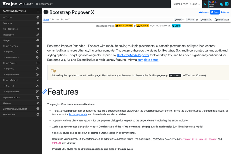
Bootstrap popover extended with modal properties and more.
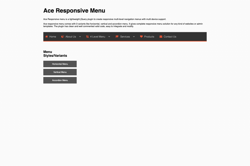
Ace responsive menu is a lightweight jQuery plugin to create responsive multi-level navigation menus with multi device support.
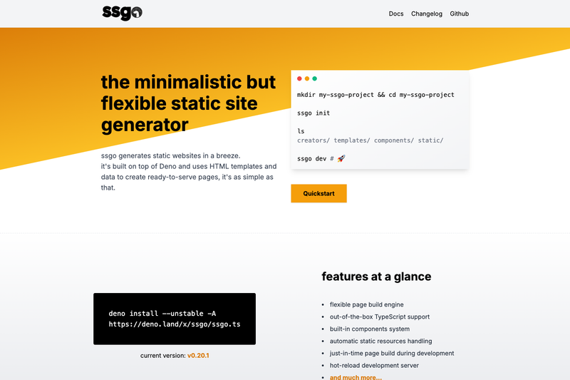
The minimalistic but flexible static site generator for Deno 🦕.
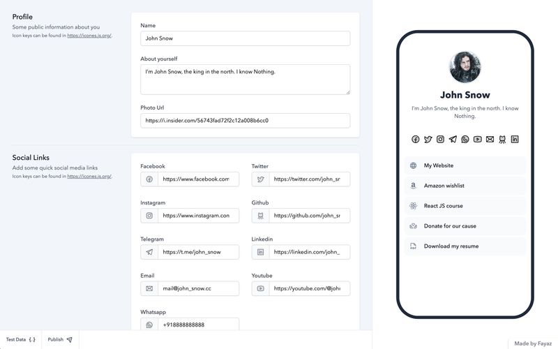
Onelink is an experimental link-in-bio tool built with Nuxt 3 where profile data lives in the URL as a base64 query parameter – no database required.
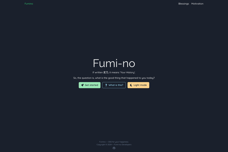
FOSS version of 'Happiness Jar', built with Next.js and Chakra UI. Application is live!
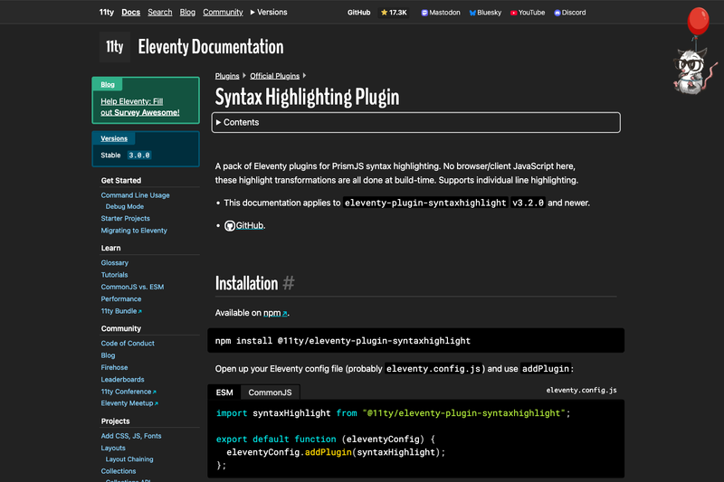
A pack of Eleventy plugins for syntax highlighting in Markdown, Liquid, and Nunjucks templates.
Bootstrap Popover X is a jQuery plugin that turns Bootstrap's popover into a modal-style dialog with header, footer, 19 placement options, and automatic positioning based on screen and scroll. It is developed by Kartik Visweswaran for Krajee and supports Bootstrap 5.x, 4.x, and 3.x.
Bootstrap Popover X is an extended popover component that combines the look of a Bootstrap popover with the behavior of a Bootstrap modal. It accepts either HTML markup with data-toggle="popover-x" attributes or JavaScript initialization through the PopoverButton plugin, and outputs a styled popover window containing a header, a close icon, a body, and an optional footer. Because the plugin extends the Bootstrap modal plugin, all modal methods are available, but the page can still scroll while the popover is open. The plugin is maintained by Kartik Visweswaran as part of the Krajee jQuery plugin suite.
bootstrap.modal.js.right, left, top, bottom, corner placements such as top top-left, and auto variants including auto-top, horizontal, and vertical..popover-header with an optional close icon and a .popover-footer with specially spaced Bootstrap buttons.primary, info, success, danger, and warning.bootstrap-popover-x.min.css and bootstrap-popover-x.min.js must be loaded, with Bootstrap's bundle before the plugin script.Bootstrap developers building admin dashboards or internal tools who need popovers that can hold forms, buttons, or rich content without writing a full modal. Front-end engineers who need precise arrow placement or auto-positioning for responsive layouts can set any of the 19 placement values directly in markup. Plugin authors who embed third-party controls can use the PopoverButton JavaScript API to bind popovers to elements created at runtime.
data-toggle="popover-x" and data-target on any controller element.Load Bootstrap's CSS and JS (any of 5.x, 4.x, or 3.x), jQuery, then the plugin's CSS and JS files. You can then activate a popover either with markup (data-toggle="popover-x" plus data-target on a button) or with JavaScript by calling the popoverButton method on the trigger element and passing the target id as an option. The plugin automatically handles arrow placement, optional footer, and closing behavior.
Bootstrap Popover X supports Bootstrap 5.x, 4.x, and 3.x from release v1.4.8 onward. It requires the Bootstrap modal plugin, so bootstrap.min.js or bootstrap.bundle.min.js must be loaded before bootstrap-popover-x.min.js.
You can install it with Bower using bower install bootstrap-popover-x, with Composer by requiring kartik-v/bootstrap-popover-x in your composer.json, or manually by downloading the source ZIP and extracting the css and js folders.
Add data-toggle="popover-x" and a data-target="#myPopover" attribute to a button or other controller element. You can also set data-placement to control position, and the popover markup must include a .popover element with the matching id.
Yes. Use the PopoverButton plugin and call the popoverButton method on the trigger element with the target and trigger options set. This approach lets you bind popovers at runtime.
Yes, the plugin is released under the BSD-3-Clause license, so it is free to use in personal and commercial projects. The source includes a bundled LICENSE.md with the full license text.