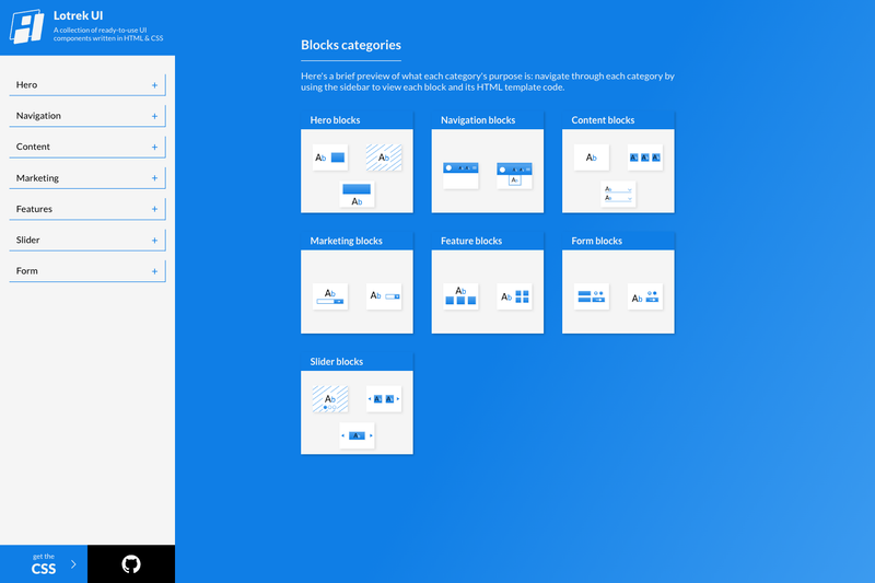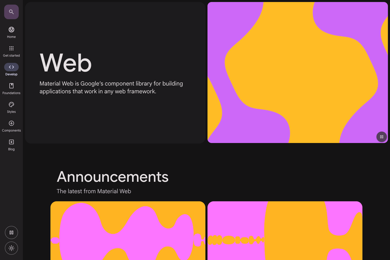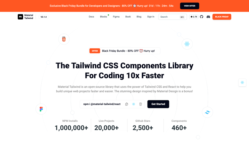
Material Tailwind is an open-source UI component library by Creative Tim that brings Google Material Design styling to Tailwind CSS projects, available as @material-tailwind/react for React and @material-tailwind/html for plain HTML. It provides a set of ready-to-use components that accept Tailwind CSS classes and can be customized through a theme provider.
What is Material Tailwind?
Material Tailwind is a components library that marries Material Design principles with Tailwind CSS utility classes. It ships as two npm packages: @material-tailwind/react (version 2.1.10) and @material-tailwind/html (version 2.2.3), both distributed under the MIT license. The library takes plain Tailwind CSS setups and adds Material-style components like buttons, cards, dialogs, and menus, so developers don't have to hand-build these patterns. It was created by Creative Tim and is documented at material-tailwind.com.
Key Features
- Two distribution formats — React components via @material-tailwind/react for JSX projects and @material-tailwind/html for plain HTML/JavaScript pages, each with its own docs and version.
- Material Design on Tailwind — Components follow Google's Material Design guidelines while remaining stylable with Tailwind utility classes.
- Large component set — The React package lists over 40 components including Accordion, Alert, Avatar, Button, Card, Checkbox, Chip, Dialog, Drawer, Input, Menu, Navbar, Popover, Progress Bar, Select, Slider, Tabs, Timeline, Tooltip, and more; the HTML package covers a subset of around 25 of these.
- ThemeProvider for customization — React apps wrap their root in ThemeProvider from @material-tailwind/react to set default or custom component styles.
- withMT Tailwind configuration — Both packages provide a withMT() function that wraps your Tailwind config to enable Material Tailwind's component styles.
- Published on npm — Installable via
npm i @material-tailwind/reactornpm i @material-tailwind/htmlafter Tailwind CSS is already installed. - Community and contribution channels — The project has a Discord server, contribution guidelines, and a code of conduct, all linked from the GitHub repository.
Who is it for?
- React developers who want pre-built Material Design components without writing them from scratch — they install @material-tailwind/react, wrap their app in ThemeProvider, then import components like Button directly.
- Tailwind CSS users working in plain HTML — they use @material-tailwind/html to drop Material components into static pages or non-React frameworks, after setting up Tailwind and withMT().
- Design system builders — they can use withMT() and ThemeProvider to override component defaults and create a consistent custom theme across projects.
What can you do with Material Tailwind?
- Build admin dashboards fast: combine Card, Table, Sidebar, Progress Bar, and Pagination components to assemble data-heavy interfaces using Tailwind utility classes.
- Prototype UI flows: assemble Dialog, Drawer, Menu, Popover, and Tabs to model interactions before committing to full product code.
- Style marketing pages: use Navbar, Footer, Typography, and Button to compose landing layouts that still share the Material look.
How does Material Tailwind work?
Install the package with npm after Tailwind CSS is configured, wrap your Tailwind config with the withMT() function, then for React wrap your application in ThemeProvider. After those setup steps you can import any component — for example, import { Button } from "@material-tailwind/react" — and render it with usual JSX. The HTML version follows the same withMT() wrapping but has no provider step.
Alternatives
- Material UI (MUI) — a Material Design React component library that ships its own styling engine rather than building on Tailwind CSS.
- Headless UI — which provides unstyled accessible components for Tailwind projects without the Material Design look.
FAQ
Is Material Tailwind free?
It is open source under the MIT license, so both @material-tailwind/react and @material-tailwind/html can be used freely without licensing fees.
Does Material Tailwind require Tailwind CSS?
Yes, both packages work with Tailwind CSS classes and require Tailwind CSS to be installed in the project. The setup includes a withMT() wrapper around your Tailwind configuration.
What is the difference between @material-tailwind/react and @material-tailwind/html?
The React package is for React applications and includes a ThemeProvider for theming; the HTML package is for plain HTML and non-React environments, with a smaller component set. Both are configured using withMT().
How do I get started with Material Tailwind?
Install the appropriate npm package, wrap your Tailwind config with the withMT() function, then for React wrap your app in ThemeProvider. Detailed installation instructions are at material-tailwind.com/docs/react/installation and the HTML equivalent.
What components does Material Tailwind include?
The React package includes over 40 components such as Accordion, Alert, Button, Card, Dialog, Input, Menu, Navbar, Select, Tabs, Tooltip, Typography, Sidebar, and Table. The HTML package covers over 20, including Button, Card, Dialog, Input, Menu, and Tabs.