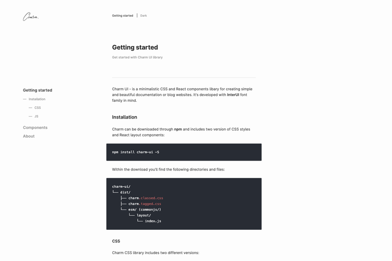
Charm UI Docs is a GitHub-hosted documentation theme for the Charm UI React component library, built with Gatsby and Markdown to generate component documentation sites.
What is Charm UI Docs?
Charm UI Docs is the documentation theme and tooling behind the Charm UI component library. It takes Markdown-based documentation content and renders it as a static React site, with the repository metadata describing it as a documentation theme and documentation tool for component libraries. The site runs on Gatsby, which compiles the Markdown pages into HTML/CSS/JS assets suitable for deployment to GitHub Pages, and it is recommended to pair the theme with the Inter UI font family for best visual results. The project is stored on GitHub and currently has 2 stars.
Key Features
- Gatsby-powered static generation — The docs use Gatsby as the site generator, producing a static site that can be served from any web host.
- Markdown-based content — Documentation pages are authored in Markdown, simplifying writing and versioning of component docs.
- GitHub Pages ready — Repository topics include github-pages, indicating the theme is set up to publish directly to GitHub Pages.
- React component library focus — The docs are purpose-built for documenting React component libraries, and the repository metadata includes both react and ui-library tags.
- Inter UI font pairing — The theme is designed to look best with the Inter UI font family, as stated on the docs homepage.
- Documentation theme and tooling — The repo is tagged as both a documentation-theme and a documentation-tool, covering the presentation layer and the workflow for generating docs.
Who is it for?
- React component library maintainers — Publish API documentation, usage guides, and examples for their components using Markdown and Gatsby.
- Design system teams — Stand up a component documentation site on GitHub Pages where developers can find accepted props and patterns.
- Open-source project authors — Use the theme to create a clean, static docs site for a UI library with minimal infrastructure.
What can you do with Charm UI Docs?
- Document React components: Write Markdown files that describe component props, examples, and usage notes, and have them rendered into a structured docs site.
- Deploy documentation to GitHub Pages: Leverage the GitHub Pages publishing workflow mentioned in the repository topics to host the generated Gatsby site.
- Customize the docs font: Set the theme to use Inter UI as the typography to match the intended design.
Alternatives
- Docusaurus — a React-based documentation site generator with built-in versioning and search.
FAQ
What is Charm UI Docs used for?
Charm UI Docs is a documentation theme and tool for the Charm UI React component library. It turns Markdown-authored content into a static Gatsby site that documents React components, and it is set up so the result can be published to GitHub Pages.
Does Charm UI Docs use Gatsby?
Yes. The source metadata for the project lists Gatsby as the static site generator and Markdown as the content format, so the docs are built by compiling Markdown pages through Gatsby into a static React site.
What font does Charm UI Docs recommend?
The docs homepage states that the theme looks best with the Inter UI font family. Inter UI is a sans-serif typeface designed for user interfaces, and the recommendation means you should include it in your deployment for the intended appearance.
Can Charm UI Docs be hosted on GitHub Pages?
Yes. The repository topics include github-pages, indicating the theme is designed to be published to GitHub Pages. Because Gatsby outputs a static site, the generated files can be served from any static host.
Is Charm UI Docs related to React?
Yes. The repository metadata tags include react and ui-library, and the docs are specifically for Charm UI, a React component library. The documentation theme is built on React via Gatsby.