Newsletter
Join the Community
Subscribe to our newsletter for the latest news and updates

A CSS-based web component library with typography, responsive grid, buttons, and forms.
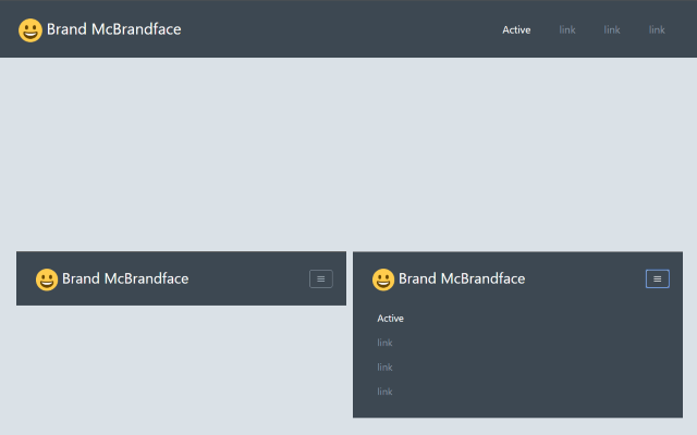
Free and open-source Tailwind CSS starter template with a toggle-button responsive header.
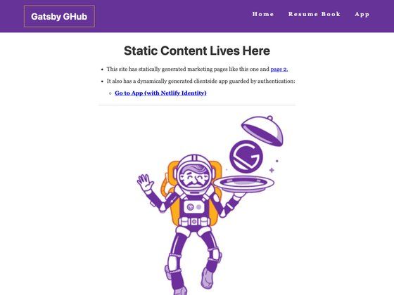
Gatsby starter combining static and dynamic content to generate resumes from GitHub profiles using Netlify Identity and Apollo Client.
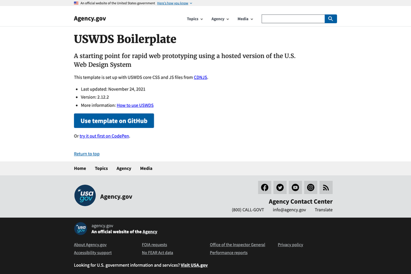
A starting point for rapid web prototyping using a hosted version of the U.S. Web Design System
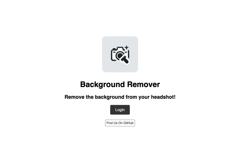
SvelteKit boilerplate using Appwrite and Azure AI to remove image backgrounds, with auth and image history.
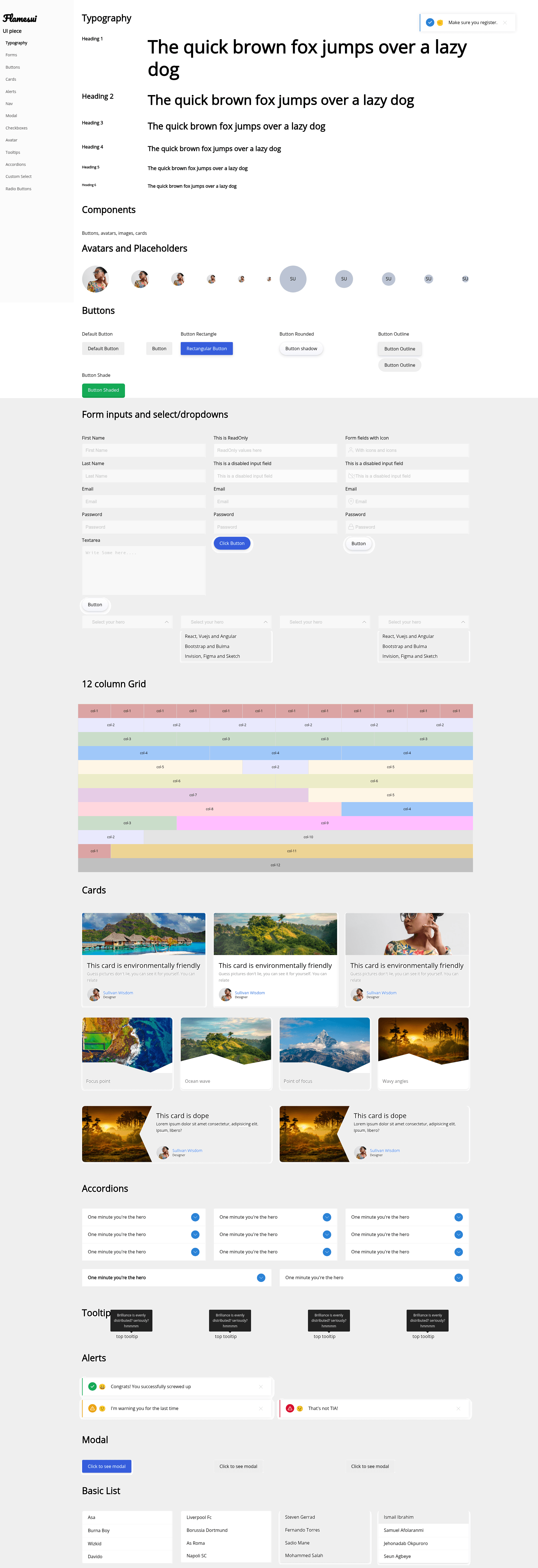
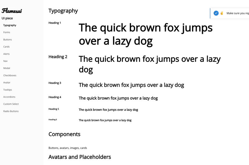
Flamesui is a CSS-based web component library that provides ready-to-copy styles for typography, layout, buttons, and forms, built with Andela in-house projects in mind.
Flamesui, also known as flamescss, is a collection of hand-written CSS classes created by Sullivan Wisdom. It is not a CSS framework but what the project calls a "UI store": you pick the components you need, copy their styles, and leave the rest behind. The library takes plain HTML and applies class names such as .container, .col-6, .button, and .input-field to produce responsive, styled interfaces. It runs entirely on CSS and SCSS with no JavaScript dependency, and it has been designed for the Andela in-house project context.
.col-1 through .col-12 plus .col and .col-auto classes use flexbox, with media query breakpoints at 576, 768, 992, and 1200 pixels..container centers content with a 1140px maximum width on screens at least 1200px wide, while .container-fluid spans the full viewport width..button class with .button-dark, .button-rectangle, and .button-rounded variants for different shapes and colors..input-field, .textarea, .label, .input-control, .form-horizontal, and .form-vertical provide structure for both inline and stacked forms.#3273dc, headings and paragraphs get margin resets, and placeholder colors for inputs and textareas are defined..button-rounded and .form-vertical..container, .columns, .col-4, and .button classes directly in HTML..input-control, .label, and .input-field, then switch between .form-horizontal and .form-vertical layouts.styles.css, edit SCSS variables like $color-black and $mid-black, and tweak component styles until they match your design.You download or copy the flames.css file, link it in the head of your HTML document, and apply the documented class names to your markup. The page explicitly encourages you to rename the file to styles.css and modify or delete components as needed, so there is no enforced workflow or build step.
No. The project describes itself as a "UI store," not a framework. You use its class names like .button and .container, but you are expected to customize and keep only the pieces you need.
No. All the provided components are CSS-only. Forms use standard HTML elements, and there are no JavaScript widgets such as modals or dropdowns in the library.
The grid supports 12 columns via .col-1 through .col-12, plus .col for equal-width columns and .col-auto for auto-sized columns, all built with flexbox.
Yes. The styles are modular, so you can copy only the button styles, form styles, or grid styles into your own stylesheet without including the entire flames.css file.