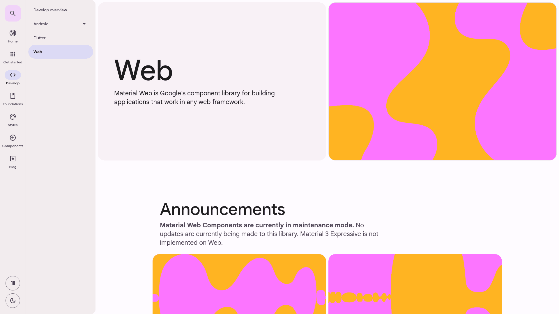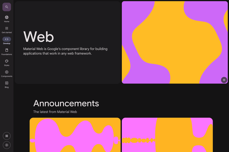
Material Components Web (material-components-web) is an open-source library of modular, customizable Material Design UI components for the web, developed by a core team at Google as the successor to Material Design Lite.
What is Material Components Web?
Material Components Web is a collection of modular UI components—such as filled text fields, floating labels, and line ripples—that implement Google's Material Design guidelines. It takes HTML markup styled with mdc-* classes and JavaScript instantiation calls, and produces interactive, accessible web interfaces. The library runs in any modern browser and is distributed both as a minified CDN bundle on unpkg and as individual NPM packages like @material/textfield and @material/floating-label. It was developed by a core team of engineers and UX designers at Google.
Key Features
- Modular architecture — Each component is published as a separate NPM package (for example,
@material/textfield), so you can import only the pieces your project needs. - Advanced theming — Customize not only color but also typography, shape, and interaction states through Sass variables and mixins, following the Material Design guidelines.
- Framework adaptability — The library is specifically architected to adapt to major web frameworks, with dedicated framework wrappers documented in the repository's
docs/framework-wrappers.md. - CDN quick start — Load the minified CSS and JS from unpkg (
material-components-web.min.cssandmaterial-components-web.min.js) and attach a component with one call:mdc.textField.MDCTextField.attachTo(...). - Sass-based styling — Styles are compiled with Sass using the modern
@usesyntax, e.g.,@include textfield.core-styles;. - Structured release cadence — The project follows semver with a 2-week release schedule, including one major release per month that may contain breaking changes and intermediate patch releases.
Who is it for?
- Web developers who want to implement Material Design consistently without building components from scratch, whether on a static site or a complex JavaScript application.
- Teams using multiple frameworks — Because the core is vanilla JavaScript with Sass, React, Angular, and Vue teams can all adopt the same components, with wrappers easing integration.
- Design system maintainers — The extensive theming customization for color, typography, shape, and states lets teams craft a unified design language across products.
What can you do with Material Components Web?
- Add a Material Design text field to a page — Write the
mdc-text-fieldHTML structure, load the required styles and JS, then callMDCTextField.attachTo()on the element to initialize it. - Customize a theme — Use Sass mixins to adjust color, typography, shape, and states across all components to match your brand's visual language.
- Build hybrid client/server rendering systems — The components are designed to fit into lightweight, idiomatic integration in static, JavaScript-heavy, and hybrid rendering contexts.
How does it work?
The quick start offers two paths. Via CDN, you include the minified stylesheet and script from unpkg and then call mdc.textField.MDCTextField.attachTo() on a .mdc-text-field element. Via NPM, you install @material/textfield, import the required Sass modules (floating-label, line-ripple, textfield) and JavaScript, then instantiate new MDCTextField(...) in a webpack setup.
Pros and cons
- Modular packages keep production bundles lean by importing only needed components.
- Deep theming extends beyond color to typography, shape, and states.
- Framework wrappers ease adoption in React, Angular, and other ecosystems.
- Not actively maintained — the team will not prioritize new features or bug fixes, and automated updates may stop in the future.
- Monthly breaking changes under semver require attentive dependency management.
FAQ
Is Material Components Web still maintained?
The project is no longer actively maintained. While automated updates may still occur, the team will not prioritize new features or bug fixes, and those updates will be turned off in the future.
How do I install Material Components Web?
You can load it via CDN from unpkg using the material-components-web.min.css and material-components-web.min.js files, or install individual NPM packages like @material/textfield and import the Sass and JS modules in your build.
What happened to Angular Material?
Angular Material moved away from this library, a change the Angular team believes allows faster iteration. Their blog post explains the future of Material support in Angular.
Does it support React or Vue?
The core library is framework-agnostic and provides framework wrappers documented in the repository, so React and Vue developers can use it, though the core is vanilla JavaScript with Sass.
How often does it release updates?
It follows a 2-week release schedule with one major release per month that may include breaking changes, plus intermediate patch releases with bug fixes.