Newsletter
Join the Community
Subscribe to our newsletter for the latest news and updates

A custom startup page for your browser.
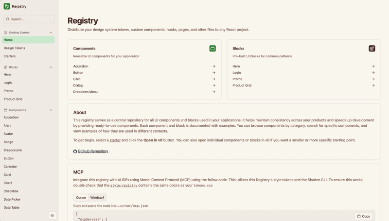
Next.js 16 + Shadcn UI admin dashboard template with multiple dashboards, authentication, theme presets, and a colocated file structure.
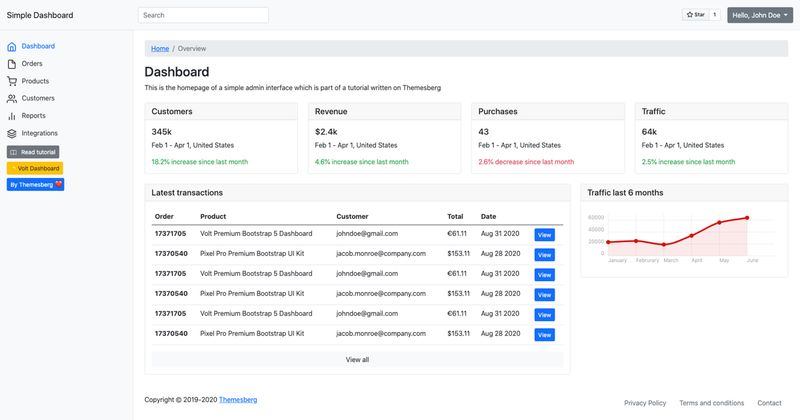
Simple Bootstrap 5 Admin Dashboard Template
SimpleDash is a clean Twitch dashboard that shows your streaming data in a simple UI.
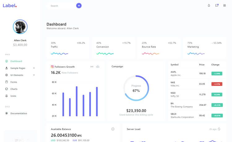
Free responsive Bootstrap 4 admin dashboard template with charts, authentication pages, data tables, and gulp-based workflow.
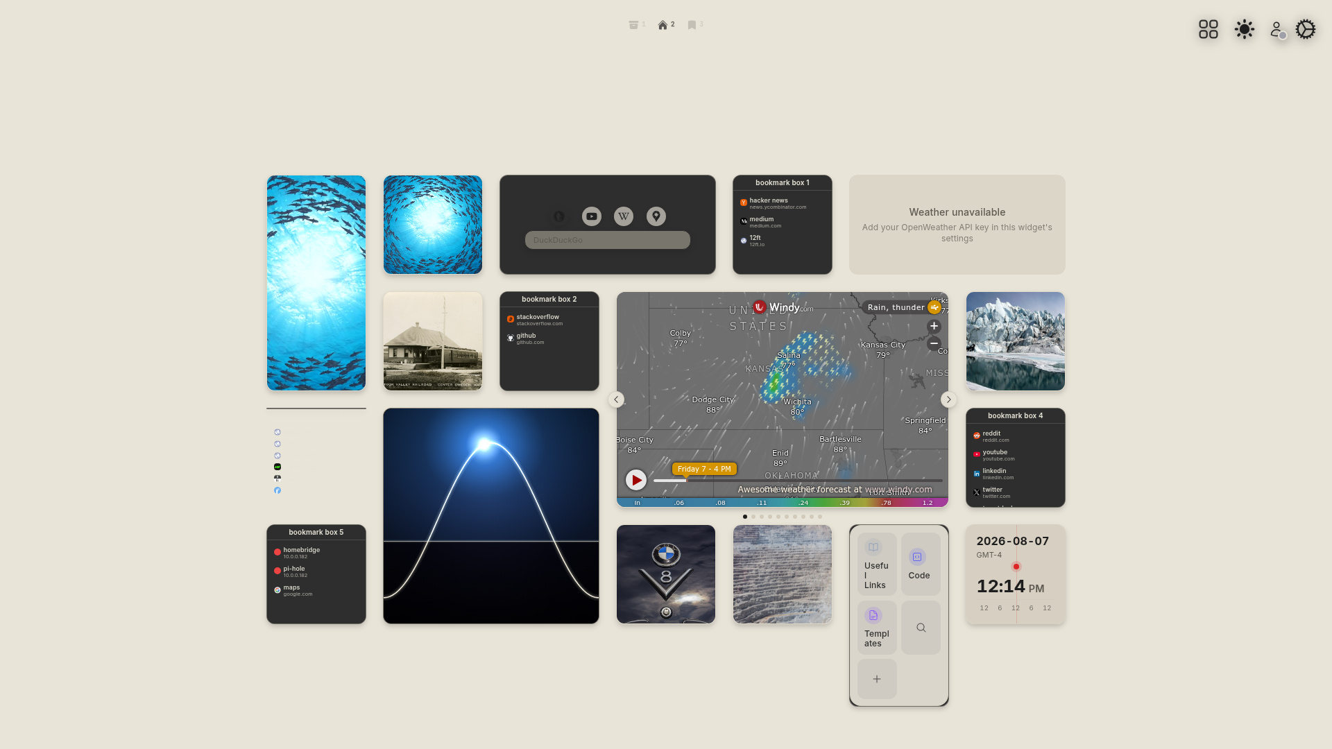
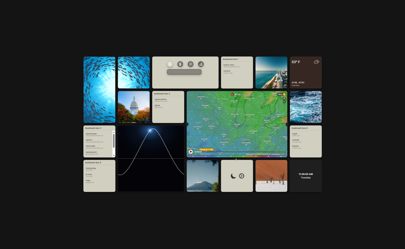
Modular Grid Page is a themeable browser start page built with React and Vite that arranges widgets, bookmarks, weather, and media into a responsive tile grid with an in-app settings panel.
Modular Grid Page is a fast, customizable browser homepage built as a React app. It takes configuration from a built-in settings panel — no config files to edit by hand — and renders a responsive auto-sizing tile grid with tiles for photos, bookmarks, weather, a solar graph, clock, feature panel, decorative video, and search. It runs on Vite as the build tool and can be deployed to GitHub Pages or Vercel. The project is open source on GitHub under the startup-page repository.
make setup, and deploy to GitHub Pages or Vercel.make serve.The template is a React SPA; run make setup to install dependencies and build, then make dev starts the Vite dev server. All configuration is edited through the gear-icon settings panel, which persists changes to IndexedDB and mirrors them in localStorage; settings can also be exported to a timestamped JSON file and re-imported at any time.
Yes, the repository is open source and available on GitHub. The page works without API keys; OpenWeather and Unsplash keys are optional additions for enhanced data.
No. Both the OpenWeather API key and the Unsplash Access Key are optional — the page falls back to Wikimedia photos if no Unsplash key is set.
For GitHub Pages, run pnpm run deploy and update the base field in vite.config.js to match your repository name. For Vercel, pushing a branch creates a Preview deployment and merging to main deploys Production; cloud features activate when environment variables are configured.
React, Vite, Tailwind CSS v4, Radix UI, shadcn-style components, kbar for the command palette, Paper Design Shaders for WebGL filters, and axios for Unsplash API requests.