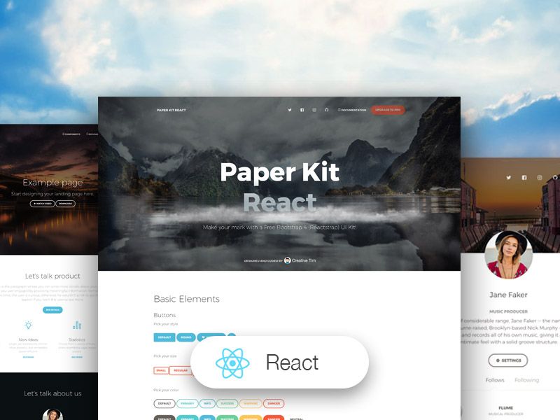
Paper Kit React is a free Bootstrap 4 UI kit built with React, Reactstrap, and React Hooks, created by Creative Tim around a paper-and-pastel design language. It ships with three pre-built pages, a full component gallery, and SCSS variables for recoloring the entire theme.
What is Paper Kit React?
Paper Kit React is a starter UI kit for building responsive web interfaces with React and Bootstrap 4. It takes a standard React project scaffold and adds a complete set of redesigned Bootstrap components — buttons, navbars, carousels, notifications, progress bars, typography, and more — styled with pale colors and drawings that mimic paper. The kit is developed and maintained by Creative Tim, and the current version is 1.3.2. It fully supports React Hooks and uses Reactstrap, the Bootstrap 4 React component library.
Key Features
- React Hooks support — The kit is built on React and Reactstrap, so every component works with function components and hooks out of the box.
- Bootstrap 4 redesign — Most Bootstrap 4 elements are restyled to resemble sheets of paper and pastel colors; untouched elements fall back to Bootstrap defaults.
- Three example pages — Includes a Landing Page, a Register page, and a Profile Page, all fully implemented and responsive.
- Customizable palette — All branding colors live in
src/assets/scss/paper-kit/_variables.scss; change hex values or predefined variables to re-theme the kit. - Responsive components — Every component is responsive across screen sizes with transitions, shadows, and colors that follow the paper aesthetic.
- One-click deployment — A Deploy to Genezio button lets you deploy your own version directly from the GitHub repository.
- Documentation & tutorial — A tutorial page is included in the download archive, and full online documentation is hosted on the demo site.
Who is it for?
- Front-end developers who want a React + Bootstrap 4 foundation with a distinctive visual style instead of the default Bootstrap look.
- Startup and product teams that need a Landing Page, registration flow, and profile screen quickly, without designing from scratch.
- UI/UX designers looking for a pastel, paper-textured component library to prototype user-facing flows in code.
What can you do with it?
- Launch a marketing site: Use the Landing Page example to announce a product with hero sections, navbar, and footer already structured.
- Build an auth flow: The Register page provides a ready-made sign-up layout with form styling and notification components.
- Create a team or personal profile: The Profile Page example shows how to display user information with cards, avatars, and navigation.
- Assemble custom screens: Combine the section components (Buttons, Carousel, JavaScript, Login, etc.) to compose new pages from reusable blocks.
How does it work?
To get started, download the project zip, install Node.js, and run npm install in the folder containing package.json. Then start the development server with npm start. To change the look, edit the color variables in src/assets/scss/paper-kit/_variables.scss before launching.
FAQ
Is Paper Kit React free?
Yes, Paper Kit React is a free download from Creative Tim. It includes the full source code and the three example pages described above.
What tech stack does Paper Kit React use?
It uses React, React Hooks, Bootstrap 4, and Reactstrap. The styling is written in SCSS and compiled with the standard Create React App or similar setup.
What example pages are included?
The kit comes with a Landing Page, a Register page, and a Profile Page. All are reachable from the demo and structured as separate view files inside src/views/examples/.
Can I customize the colors?
Yes. All branding colors are defined in src/assets/scss/paper-kit/_variables.scss as hex values or predefined variables, and changing them re-themes the entire kit.
Which browsers are supported?
Creative Tim officially supports the last two versions of Chrome, Firefox, Edge, Safari, and Opera.