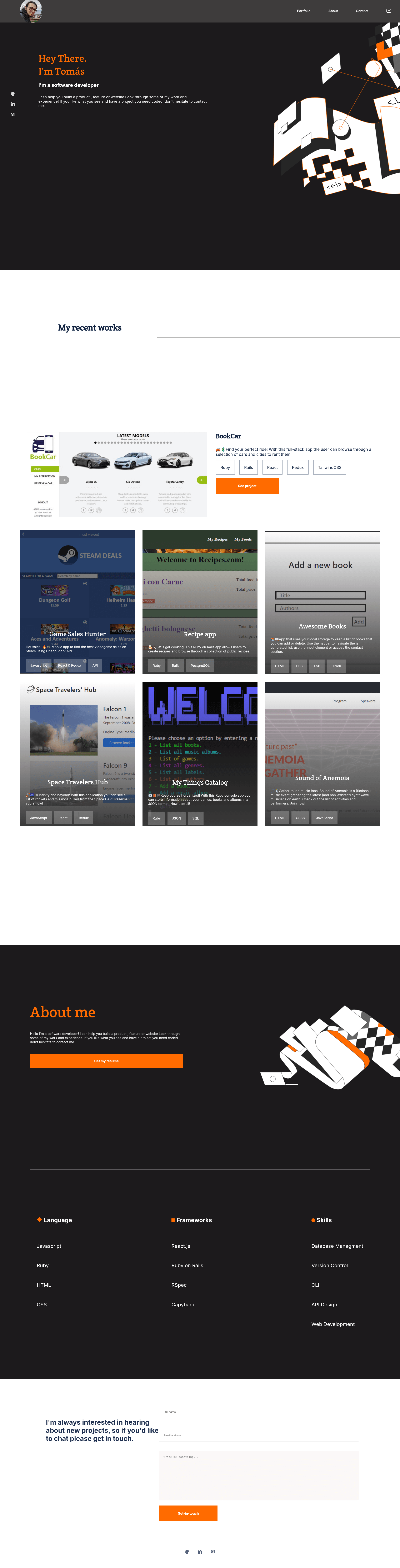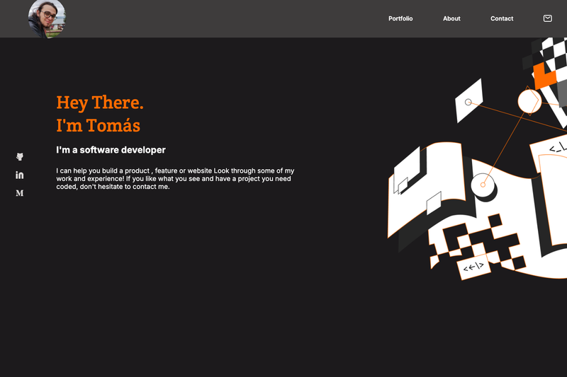
Portfolio: Mobile First is a responsive portfolio website template built with HTML, CSS, and JavaScript that offers two layout modes — mobile-first and desktop (min-width 768px) — and was created by Tomás Esquivel as a Microverse program project.
What is Portfolio: Mobile First?
Portfolio: Mobile First is a mock portfolio webpage that demonstrates a mobile-first responsive design approach. It takes standard portfolio content — an about section, projects, and contact information — and renders it as a single-page site that adapts to screen width. The template runs in any web browser with no build step, uses HTML, CSS, and JavaScript, and relies on flexbox to replicate a fixed design template. The project is authored by Tomás Esquivel and is hosted as a live demo on GitHub Pages.
Key Features
- Two responsive layouts — The template includes a functional mobile layout and a full desktop version that activates at a minimum screen width of 768px, with CSS animations on the desktop view.
- Mobile-first design — The CSS is written with a mobile-first approach, meaning the base styles target small screens and are progressively enhanced for larger viewports.
- Flexbox-based layout — Flexbox is used to align and position sections so the page matches the original portfolio template that was cloned.
- JavaScript functionalities — JavaScript is included in the project (per the repository metadata) to add interactive behavior beyond static HTML and CSS.
- Linter integration — The client-side tech stack includes linters, which help catch coding errors and enforce consistent style during development.
- GitHub Pages ready — The project ships with a live demo at https://tomasesquivelgc.github.io/Portfolio_Mobile_First/, and the README includes clone-and-open instructions, making deployment to GitHub Pages straightforward.
Who should use Portfolio: Mobile First?
- Beginner web developers — Anyone learning responsive design can study how this template implements mobile-first CSS, media queries, and flexbox.
- Microverse students — The template started as a Microverse program assignment, so it aligns with that curriculum's milestones for building a portfolio.
- Job-seeking developers — Developers who need a simple, clean portfolio can clone this repo, replace the example content, and publish it to GitHub Pages in minutes.
- Front-end learners — People who want to see JavaScript added to a static HTML/CSS page can use this project as a reference.
Use cases
- Quick portfolio launch: Clone the repository, edit the HTML and CSS with your own details, and open index.html or deploy to GitHub Pages for a live personal site.
- Responsive design practice: Use the codebase as a working example of how a mobile-first layout transitions to a desktop layout at the 768px breakpoint.
- Portfolio template for assignments: Students can fork this project to meet coursework requirements that ask for a responsive personal portfolio.
How does the template work?
The README gives a straightforward setup: clone the repository to a local folder using git, then open index.html in any web browser — no build tools or server required. The page renders the mobile layout by default, and once the viewport reaches 768px wide, CSS media queries switch to the desktop layout with animations.
Pros and cons
- Pros: Free to use and modify under the MIT license; requires only a web browser to run; includes both mobile and desktop layouts; made with widely known HTML, CSS, and JavaScript.
- Cons: Social media links and an overlay menu for mobile are listed as not-yet-implemented features; the template's content is a mock portfolio, so you must replace the text and images with your own.
Pricing
Portfolio: Mobile First is an open-source project released under the MIT license, meaning it is free to use, modify, and distribute.
FAQ
Is Portfolio: Mobile First free to use?
Yes, the project is open source under an MIT license, so you can freely use, modify, and distribute it, even for commercial purposes, as long as you retain the license notice.
What do I need to run this template?
You only need a web browser. After cloning the repository, open the index.html file directly, and the portfolio will render without any server or build step.
Does it include a desktop version?
Yes, the template includes a desktop version that activates when the screen width reaches 768px or more, and that desktop layout includes animations.
What technologies are used?
The template is built with HTML, CSS, and JavaScript, using flexbox for the layout and linters for code quality. There is no framework or build tool involved.
Where can I see the live demo?
The live demo is hosted on GitHub Pages at https://tomasesquivelgc.github.io/Portfolio_Mobile_First/.