Newsletter
Join the Community
Subscribe to our newsletter for the latest news and updates

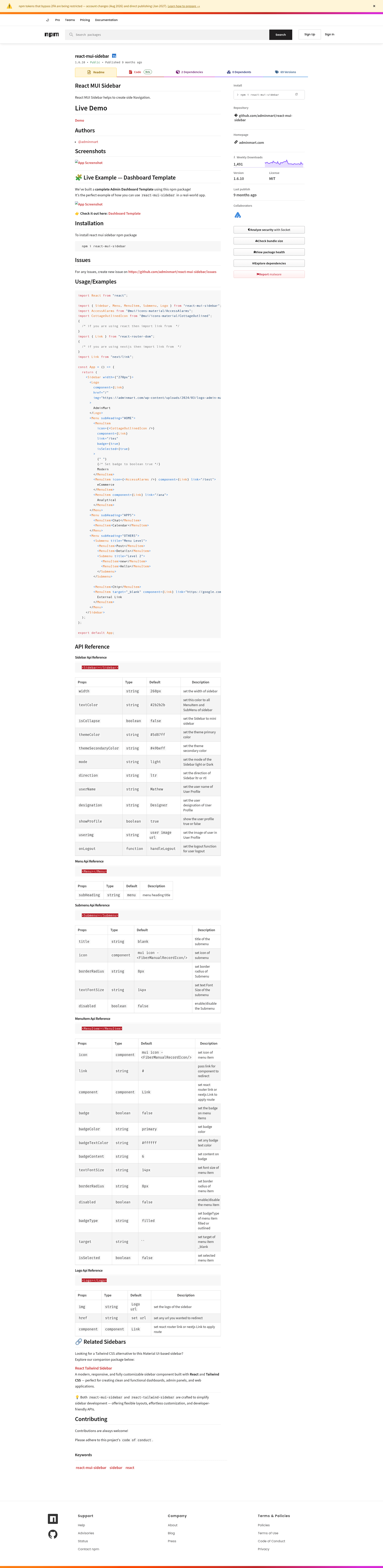
React MUI Sidebar helps to create side Navigation. ( with Typescript )
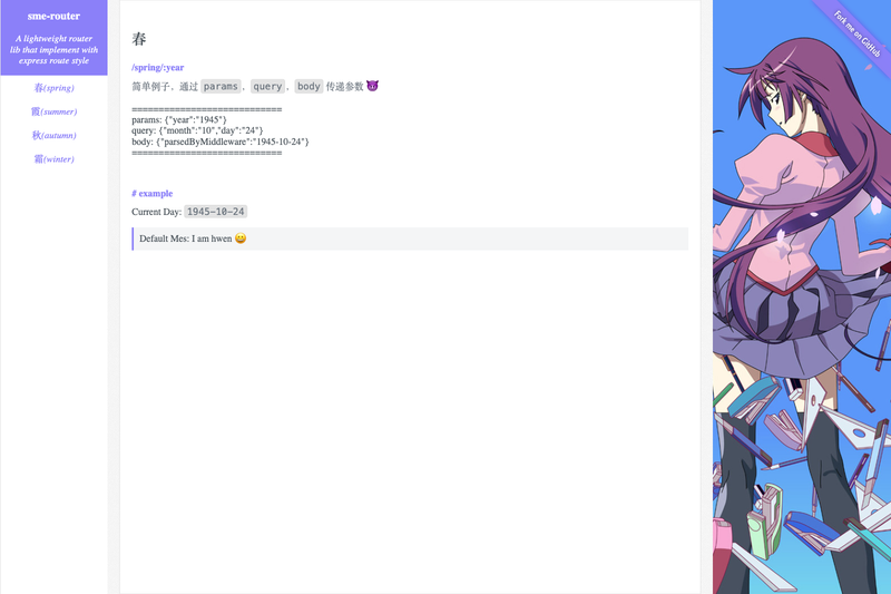
A lightweight client-side router library implementing Express-style route syntax for single-page applications.
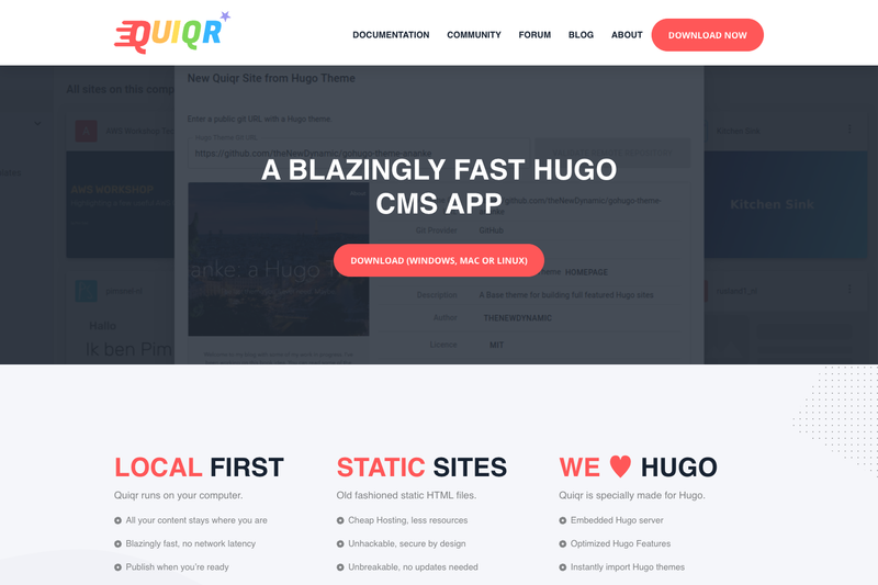
Local-first flat-file CMS and publishing application with built-in Git client for Hugo and other static site generators.
A Hugo shortcode that embeds PDF files in pages using Mozilla's PDF.js library.
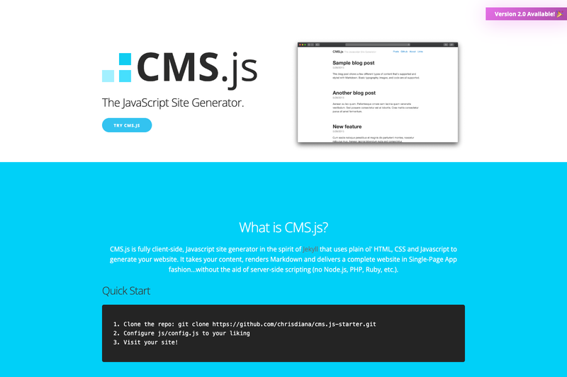
CMS.js is a client-side JavaScript Markdown site generator that builds a complete website in single-page app fashion without server-side scripting.
Build a standard and professional single page resume
react-mui-sidebar is an npm package that provides ready-made Material UI (MUI) sidebar navigation components for React and Next.js projects, created by AdminMart. It exports Sidebar, Menu, Submenu, MenuItem, and Logo components that accept configurable props to control width, colors, direction, user profile, and collapse behavior, making it a drop-in navigation shell for admin dashboards and web applications.
react-mui-sidebar is a React component library that generates the complete markup and styling for a collapsible side navigation panel using Material UI primitives. You supply the menu items, nesting, badges, and a user profile via JSX, and the package renders them according to its built-in themes, with TypeScript definitions included. The package integrates with React Router or Next.js routing by passing a Link component through the component prop. A live demo is hosted at https://react-mui-sidebar.vercel.app, and the source is maintained on GitHub by AdminMart under the adminmart/react-mui-sidebar repository.
isCollapse prop toggles the sidebar into a mini icon-only mode, letting users expand more content area when needed.themeColor and themeSecondaryColor set primary and secondary colors, while mode switches between light and dark themes across the whole sidebar.showProfile, userName, designation, userimg, and onLogout render a user card at the top or bottom of the sidebar with a logout callback.MenuItem supports badge, badgeContent, badgeColor, badgeTextColor, and badgeType to display notification counts or status chips.Submenu components allow multi-level hierarchies; the package's example shows a "Menu Level" submenu with a second-level nested submenu.component accepts any router link, the same code works with React Router's Link or Next.js's Link.direction switches the layout between LTR and RTL, and width accepts any CSS length, defaulting to 260px.React developers building admin dashboards or internal tools who want a pre-styled navigation shell without hand-rolling MUI layout code. Next.js teams using the App Router or Pages Router who need a sidebar that respects Next.js links. MUI users who already have an icon set and want a sidebar whose colors and text sizes are exposed as simple props. Developers maintaining multi-language or RTL websites can use the direction prop to mirror the layout without extra CSS.
Link to the component prop so menu items perform client-side navigation with active states via isSelected.Link for the same components, enabling route transitions and prefetching without changing the sidebar markup.direction="rtl" to flip the sidebar for Arabic, Hebrew, or other right-to-left locales, while keeping ltr as the default.Yes. The component prop is designed to accept a Next.js Link component, so menu items can perform client-side routing inside Next.js pages or the App Router. The package's README demonstrates setting component={Link} with href for both Next.js and React Router.
Run npm i react-mui-sidebar in your project after installing @mui/material and @mui/icons-material dependencies. The package works with a standard React or Next.js setup and includes TypeScript type definitions.
The mode prop accepts "light" or "dark" and applies the selected theme to the sidebar background, text, and interactive elements. You can set it per sidebar and combine it with the themeColor prop for brand-specific palettes.
Yes, each MenuItem accepts a boolean badge prop along with badgeContent, badgeColor, badgeTextColor, and badgeType (filled or outlined). This is handy for unread-count indicators or "new" labels on navigation entries.