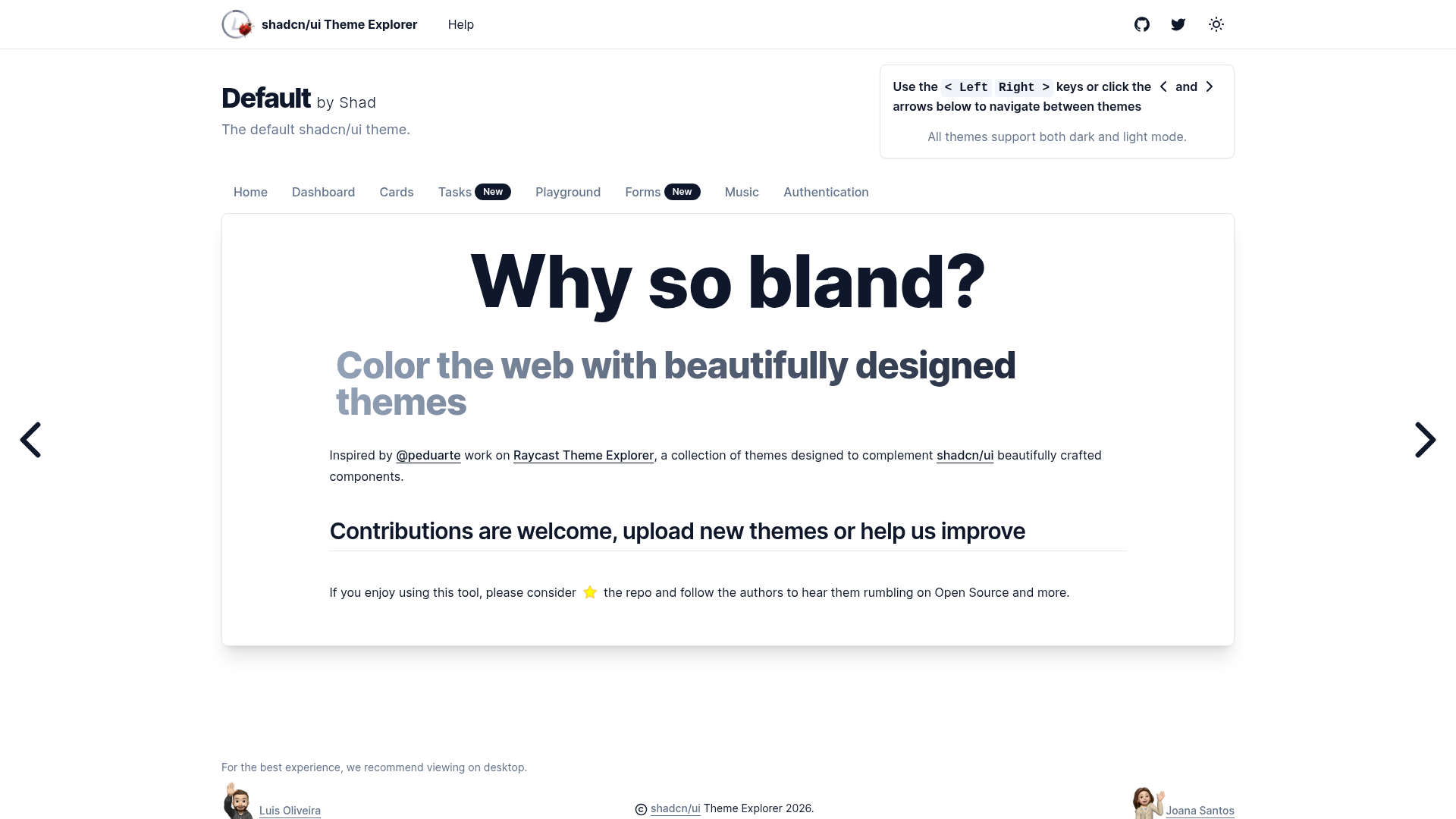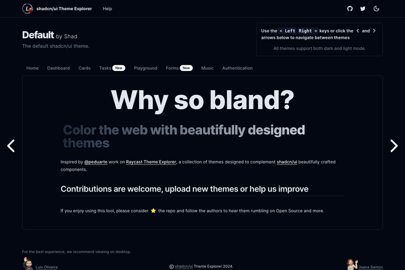
shadcn/ui Theme Explorer is an open-source Next.js 13 web app that collects and displays CSS color themes designed for shadcn/ui, giving developers a single place to find, compare, and contribute light and dark palettes.
What is shadcn/ui Theme Explorer?
shadcn/ui Theme Explorer is an open-source project hosted on GitHub under the account luisFilipePT and released under the MIT License. It is built as a Next.js 13 application and was directly inspired by @peduarte's Raycast Theme Explorer at themes.ray.so. The app's core function is to present a collection of themes that complement shadcn/ui components: each theme is written as CSS custom properties in HSL triplets, covering tokens such as --background, --foreground, --primary, --secondary, --muted, --popover, --border, --input, --card, --accent, --destructive, and --ring, defined once for light mode and once for dark mode.
What makes shadcn/ui Theme Explorer stand out?
- Next.js 13 framework — The project runs on Next.js 13 and is started locally with
npm run dev, following the standard Next.js development workflow. - Light and dark theme pairs — Every theme defines both a
.theme-{name}.lightand a.theme-{name}.darkCSS class, so each palette includes a matching dark mode. - shadcn/ui token format — Themes are expressed as CSS variables using HSL values with the exact token names shown in the repository's theme example (--background, --foreground, --muted, --primary, --destructive, --ring, and more).
- Community contribution workflow — New themes are added by editing themes/index.json, creating a CSS file inside styles/themes, and importing it in global.css; the README explicitly welcomes pull requests.
- Open-source licensing — The entire codebase is released under the MIT License, so anyone can fork, modify, and reuse it.
- Prettier code style — The repository enforces Prettier formatting, and the badge marks pull requests as welcome.
- All-contributors recognition — The project follows the all-contributors specification, crediting every person who contributes code, design, documentation, or maintenance.
Who should use shadcn/ui Theme Explorer?
- shadcn/ui developers — Developers building interfaces with shadcn/ui can find a ready-made palette and copy the CSS variable values into their own theme configuration.
- Theme designers — Designers who want to share their color schemes can follow the documented upload steps to submit new themes to the collection.
- Open-source contributors — Developers looking for a small, welcoming Next.js codebase can contribute themes, code, documentation, or design; the repository states that contributions of any kind are welcome.
What can you do with shadcn/ui Theme Explorer?
- Pick a starting palette: Browse the theme collection to find a light and dark color scheme that fits a new shadcn/ui project.
- Study the token mappings: Inspect how each theme assigns HSL values to shadcn/ui's CSS variable tokens before adopting it.
- Submit your own theme: Add a theme via themes/index.json, a CSS file in styles/themes, and an import statement in global.css, then open a pull request.
- Run the app locally: Download the repository and execute
npm run devfrom the project root to explore themes during development.
How does shadcn/ui Theme Explorer work?
The repository's documented "Upload a theme" workflow describes the process contributors follow. First, add the theme's information to the themes/index.json file. Second, create a CSS file inside the styles/themes folder using the theme name with spaces replaced by hyphens. Third, define the theme using the provided CSS format with both light and dark class variants, then import the new file in the global.css file.
Pricing
shadcn/ui Theme Explorer is free and open source, released under the MIT License. The repository mentions no paid tiers, subscriptions, or hosted plans.
Alternatives
Raycast Theme Explorer (themes.ray.so) by @peduarte is the project that inspired this one; it is a similar gallery-style theme site but focuses on themes for the Raycast launcher rather than shadcn/ui.
FAQ
Is shadcn/ui Theme Explorer free?
Yes. The project is open source and released under the MIT License, so the code can be used, modified, and redistributed freely. No paid tiers or licensing fees are mentioned anywhere in the repository.
What does shadcn/ui Theme Explorer do?
It is a Next.js 13 web app that collects and displays CSS themes designed for shadcn/ui components. Each theme provides HSL-based values for shadcn/ui's design tokens in both light and dark variants, and the site presents the collection in an explorer-style gallery.
How do I contribute a theme?
Add your theme to themes/index.json, create a CSS file in the styles/themes folder named after the theme with spaces replaced by hyphens, write the light and dark CSS variable definitions, and import the file in global.css. Then submit the changes as a pull request.
What framework powers shadcn/ui Theme Explorer?
The app is built with Next.js 13. To run it locally, download the repository and run npm run dev from the project root.