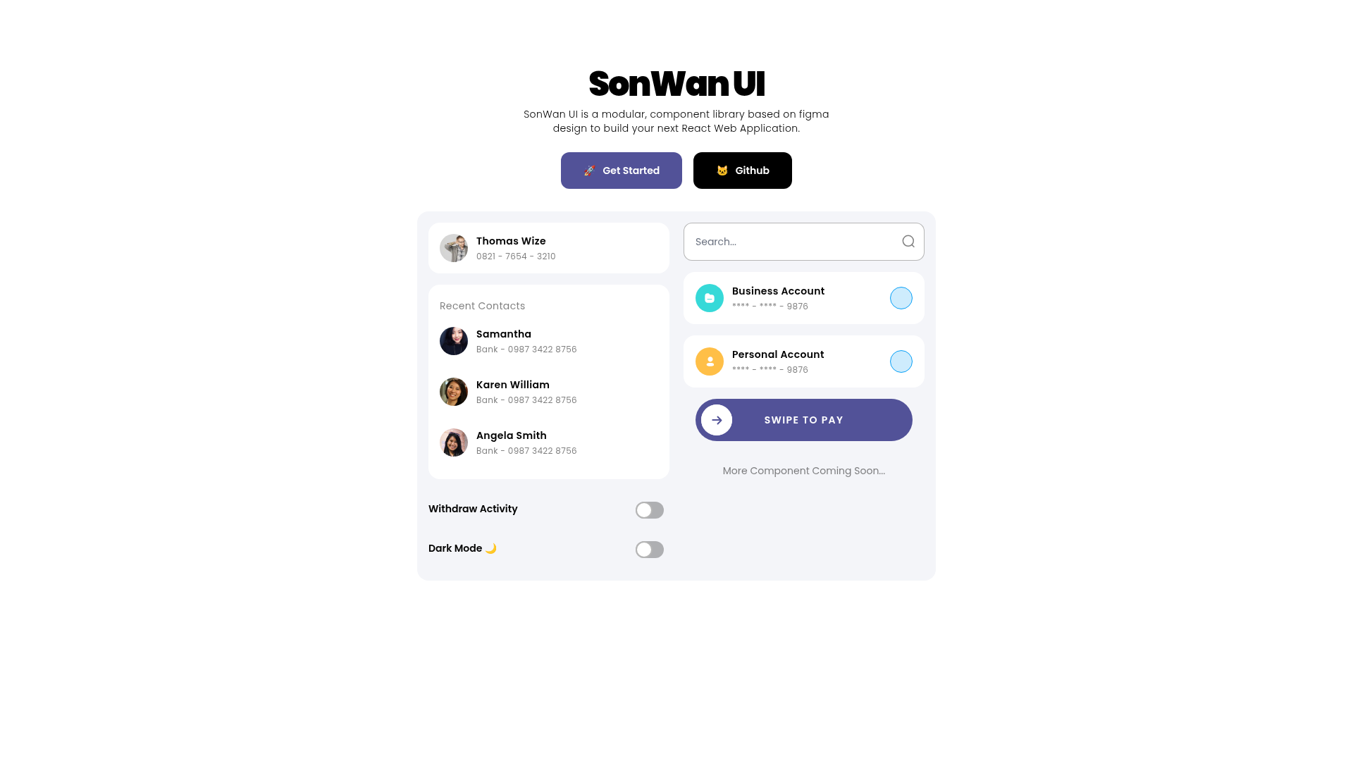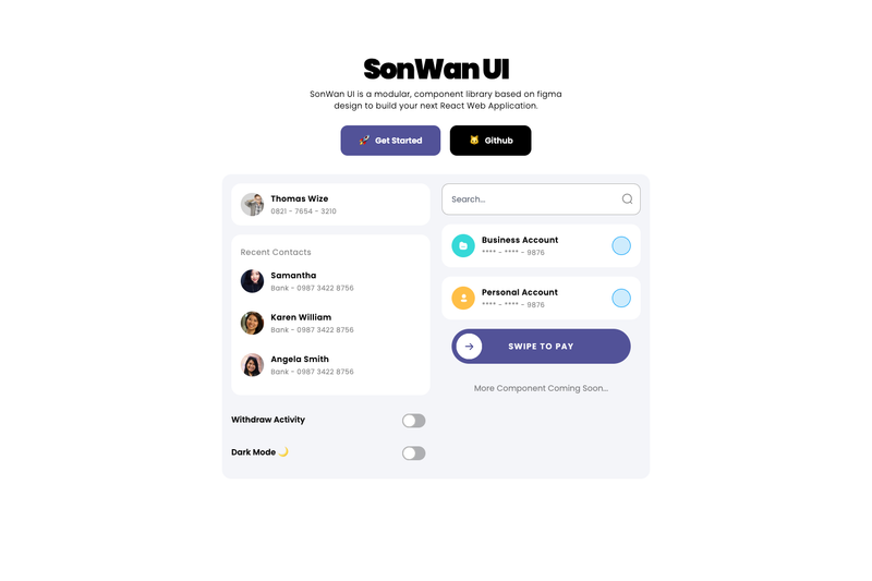
SonWan UI is a modular React UI component library, built on a Figma design system, that provides ready-to-use components for assembling web application interfaces.
What is SonWan UI?
SonWan UI is a React component library distributed via npm as sonwan-ui. It exports a single SonWan object containing components like Input, Switch, Card, CardItem, and ListItem, along with a compiled CSS file at build/style.min.css. The library's repository lists Tailwind CSS and React in its topics, and its description states the components are based on a Figma design. Developers install the package, import the CSS and the SonWan object, and render the components directly in a React app.
Key Features
- Modular component set — Provides Input, Switch, Card, CardItem, and ListItem components that can be imported individually via object destructuring.
- Tailwind-themed styles — The repository's topics list Tailwind CSS and Tailwind, indicating the component styling is built with Tailwind utility classes.
- CSS bundle included — A prebuilt stylesheet is shipped at
build/style.min.css; importing it applies the library's styling to components. - Figma-based design — The library's components are based on a Figma design system, per the official description.
- React and React Native support — The core library targets React web applications, and a separate React Native port is available at github.com/Drzaln/SonWanUI-RN.
- Demo and chat UI — A CodeSandbox demo is provided for testing components, and a full chat UI application built with SonWan UI is live at sonwan-chat.vercel.app with source on GitHub.
Who is it for?
- React web developers — They can use SonWan UI to quickly assemble UI components without writing custom markup and CSS from scratch.
- Developers who want a Figma-matched component library — Teams that design in Figma can use components that mirror the design system, reducing design-to-code friction.
- Builders of chat applications — The included chat UI demo shows how to combine SonWan components to create a functional messenger interface.
What can you do with SonWan UI?
- Assemble forms — Use the Input and Switch components to build form controls and toggle settings.
- Display contact or profile cards — Use Card and CardItem to render a card with a title and subtitle (as shown in the README example with a name and phone number).
- Prototype interfaces quickly — Install the package and import the CSS bundle to get styled components without configuring build tooling.
How does SonWan UI work?
Install the package with npm or yarn, import the compiled stylesheet and the SonWan object, then destructure the components you need and render them inside a React component. The README demonstrates this with a short code snippet that combines an Input and a Card inside a fragment.
Alternatives
- Material UI — A React component library that implements Google's Material Design guidelines.
- Chakra UI — A modular React component library that emphasizes accessibility.
FAQ
How do I install SonWan UI?
Run npm i sonwan-ui or yarn add sonwan-ui inside your React project, then import the stylesheet and the SonWan object in your JavaScript or TypeScript file.
Does SonWan UI support React Native?
Yes, a community port is available at github.com/Drzaln/SonWanUI-RN, though the core package targets React web applications.
What components does SonWan UI provide?
The README explicitly shows Input, Switch, Card, CardItem, and ListItem, which can be destructured from the SonWan import.
How do I use SonWan UI components?
Import the library, then render components like Input and Card with CardItem directly in your render function.
Is there a live demo?
Yes, a CodeSandbox demo is linked in the README, and a full chat UI demo is available at sonwan-chat.vercel.app.