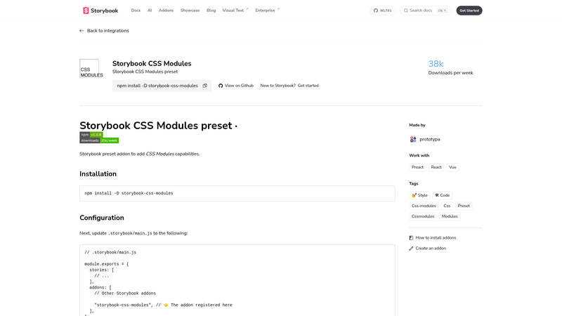
storybook-css-modules is a Storybook preset addon that adds CSS Modules support to Storybook, automatically processing *.modules.css files and exposing their class names as locally scoped JavaScript objects.
What is storybook-css-modules?
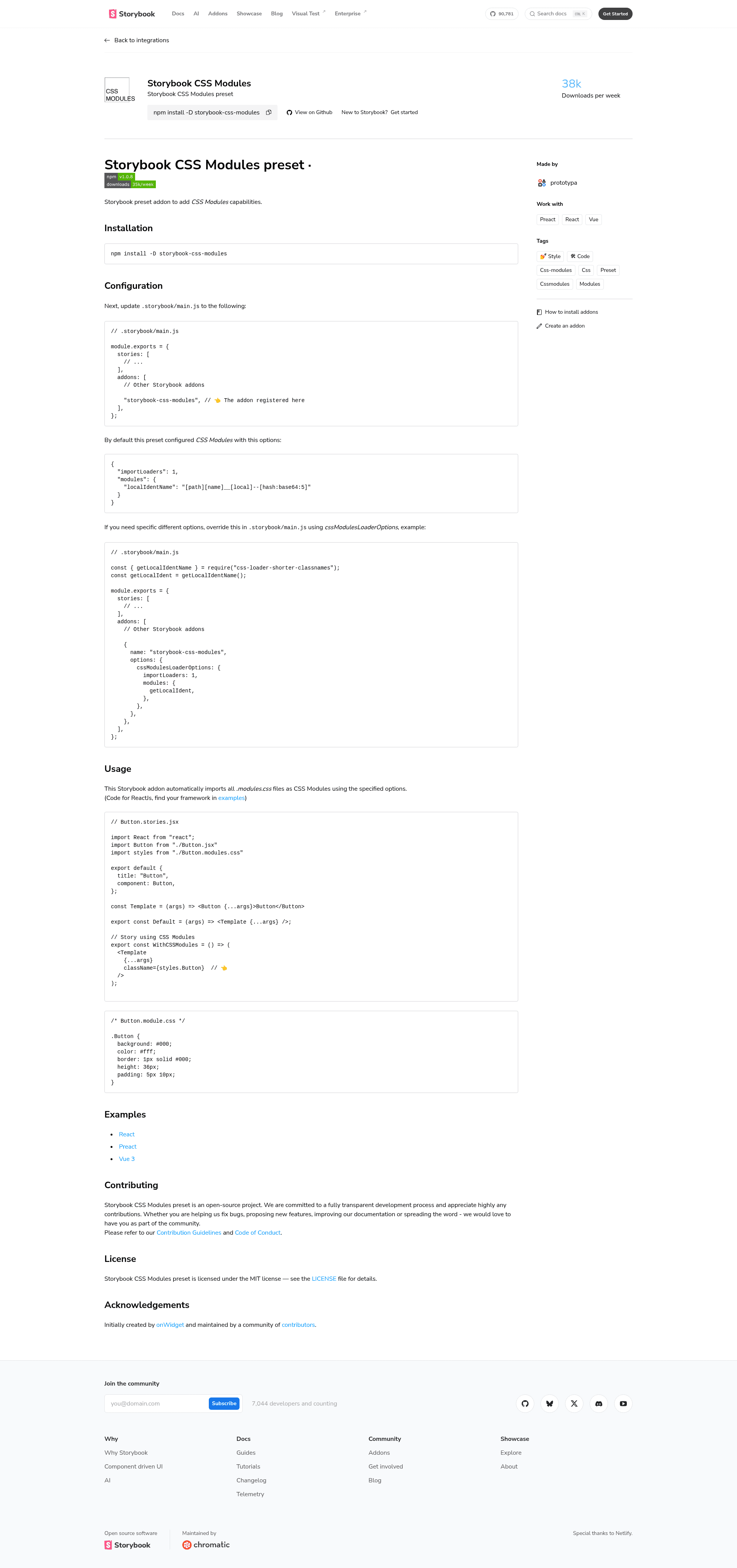
storybook-css-modules is a preset addon for Storybook that enables CSS Modules in component stories. It takes .module.css files as input and compiles them so that class names become hashed, locally scoped identifiers that can be imported as properties of a JavaScript object. The addon runs inside Storybook's webpack build and is distributed on npm, created by onWidget and maintained by a community of contributors.
Key Features
- Preset auto-registration — Add
"storybook-css-modules"to theaddonsarray in.storybook/main.jsand Storybook wires up css-loader without extra webpack configuration. - Sensible default options — Ships with
importLoaders: 1andlocalIdentNameset to[path][name]__[local]--[hash:base64:5], giving readable yet unique class names. - Overridable loader options — You can pass a
cssModulesLoaderOptionsobject to the addon inmain.jsto customize how CSS Modules are processed, for example usingcss-loader-shorter-classnamesfor shorter hashes. - Framework examples — The GitHub repository includes runnable examples for React, Preact, and Vue 3, each showing the same pattern of importing a
*.module.cssfile into a story. - MIT licensed — Free to use and modify under the MIT license, with contribution guidelines and a code of conduct published in the repository.
Who should use storybook-css-modules?
Storybook teams that write styles with CSS Modules and want them to work inside stories without manually tweaking webpack. React, Preact, and Vue 3 developers can copy the example projects as a starting point. Component library maintainers who need consistent class-name generation across multiple projects will benefit from the configurable loader options.
Use cases
- Design system engineers: wire up CSS Modules once in Storybook and every component story automatically receives scoped class names, removing style leakage between stories.
- Component library maintainers: customize
cssModulesLoaderOptionsto keep production class names short or match an existing naming convention, then reuse the same preset across projects. - Multi-framework teams: follow the provided React, Preact, and Vue 3 examples to set up the same CSS Modules workflow in each Storybook instance.
How does storybook-css-modules work?
Install it with npm install -D storybook-css-modules, then register it in .storybook/main.js as a string entry in addons. Finally, import a stylesheet like import styles from './Button.module.css' in any story and use styles.Button as the className prop. The preset configures css-loader for everything ending in .module.css.
Pricing
storybook-css-modules is free, open-source software released under the MIT license.
FAQ
Is storybook-css-modules free?
Yes, the addon is released under the MIT license and can be used in commercial and open-source projects alike.
How do I add CSS Modules to Storybook?
Run npm install -D storybook-css-modules, add "storybook-css-modules" to the addons array in .storybook/main.js, then import .module.css files inside your stories and use the exported class names.
Can I change the generated class name format?
Yes, pass a cssModulesLoaderOptions object when registering the addon. The example in the documentation replaces the default localIdentName with a custom getLocalIdent function from css-loader-shorter-classnames.
Which frameworks are supported?
The repository provides examples for React, Preact, and Vue 3. Because it relies on Storybook's webpack build, the preset works with any Storybook setup that can process css-loader modules.