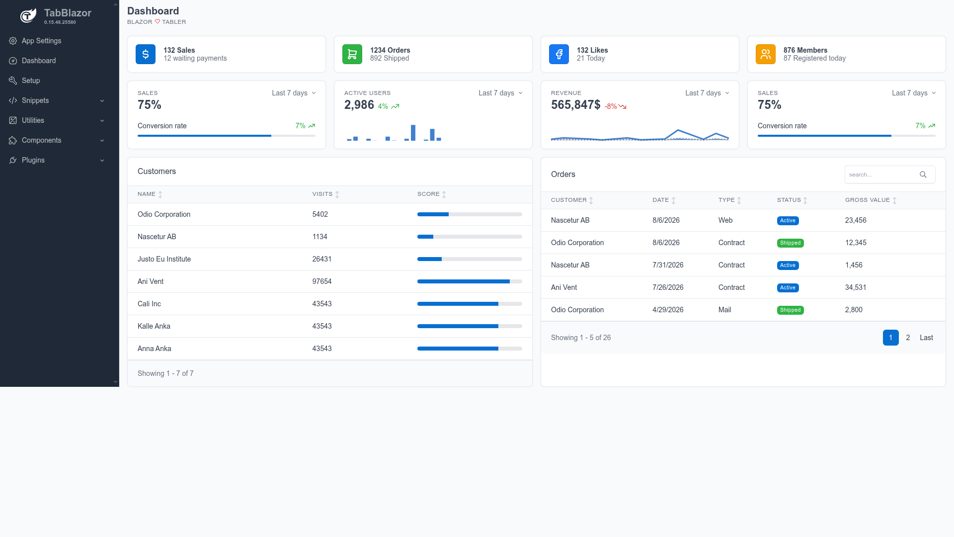
TabBlazor is an open-source Blazor component library and admin template built on the Tabler UI framework, offering 90+ Razor components for building admin dashboards and back-office interfaces.
What is TabBlazor?
TabBlazor is a Blazor component library and admin template that runs on .NET, targeting both Blazor Server and Blazor WebAssembly. It takes the Tabler UI framework (a Bootstrap-based design system) and wraps it into 90+ reusable Razor components, letting developers assemble dashboards, forms, tables, modals, and navigation without writing custom CSS. The package is distributed on NuGet as TabBlazor, with an optional companion package TabBlazor.QuickTable.EntityFramework for EF Core table integration. A live demo at tabblazor.com shows hundreds of working examples with source code.
Key Features
- 90+ Razor components — forms, tables, modals, dashboards, and navigation components ready to drop into any Blazor page.
- QuickTable — a table component with virtual scrolling, sorting, filtering, and grouping, plus optional EF Core integration via the TabBlazor.QuickTable.EntityFramework package.
- Pluggable validation — DataAnnotations validation by default, with a custom IFormValidator interface for alternative rules.
- Modal and offcanvas services — async services that return results to the calling code, useful for confirmations and side panels.
- Theme switching — built-in dark/light theme toggle.
- Minimal JavaScript — almost all components are pure C#/CSS, with opt-in popper.js only for dynamic tooltip and dropdown positioning.
Who is it for?
TabBlazor is aimed at .NET developers who want to build admin panels, dashboards, and internal tools in Blazor without hand-coding UI components. It also suits teams that need a consistent Tabler-based visual style across multiple projects, and developers who want a ready-made starting point via the TabBlazor.Templates project templates.
What can you do with TabBlazor?
- .NET web developers: assemble a complete admin dashboard from ready-made Card, Button, Table, and Modal components in a few lines of Razor markup.
- Blazor teams: use QuickTable to display paginated, sortable, filterable data with virtual scrolling, and plug in EF Core via the optional integration package.
- Prototypers: quickly set up modals and offcanvas side panels using the async services that return results, speeding up confirm/cancel flows.
- UI maintainers: switch between dark and light themes with the built-in toggle, and customize validation by implementing a custom IFormValidator.
How does TabBlazor work?
TabBlazor is installed via dotnet add package TabBlazor, then registered in Program.cs with builder.Services.AddTabBlazor(options => ...). In a Razor app, you reference the Tabler CSS, TabBlazor CSS, and tabblazor.js in App.razor (or index.html for WebAssembly). After that, components can be used directly in Razor markup, e.g. a Card with a Button that has a click handler.
FAQ
Is TabBlazor free?
TabBlazor is open source and available on GitHub with a public repository. It is distributed as free NuGet packages, and you can run the demo locally from the docs/Tabler.Docs.Wasm folder.
Does TabBlazor work with Blazor WebAssembly?
Yes, the live demo at tabblazor.com runs as a WebAssembly app (docs/Tabler.Docs.Wasm), and the package also works with Blazor Server. The setup requires referencing CSS and a small JavaScript file in index.html for WebAssembly or App.razor for Blazor Server.
What is QuickTable?
QuickTable is a built-in table component in TabBlazor that supports virtual scrolling, sorting, filtering, and grouping. An optional NuGet package, TabBlazor.QuickTable.EntityFramework, integrates it directly with EF Core queries.