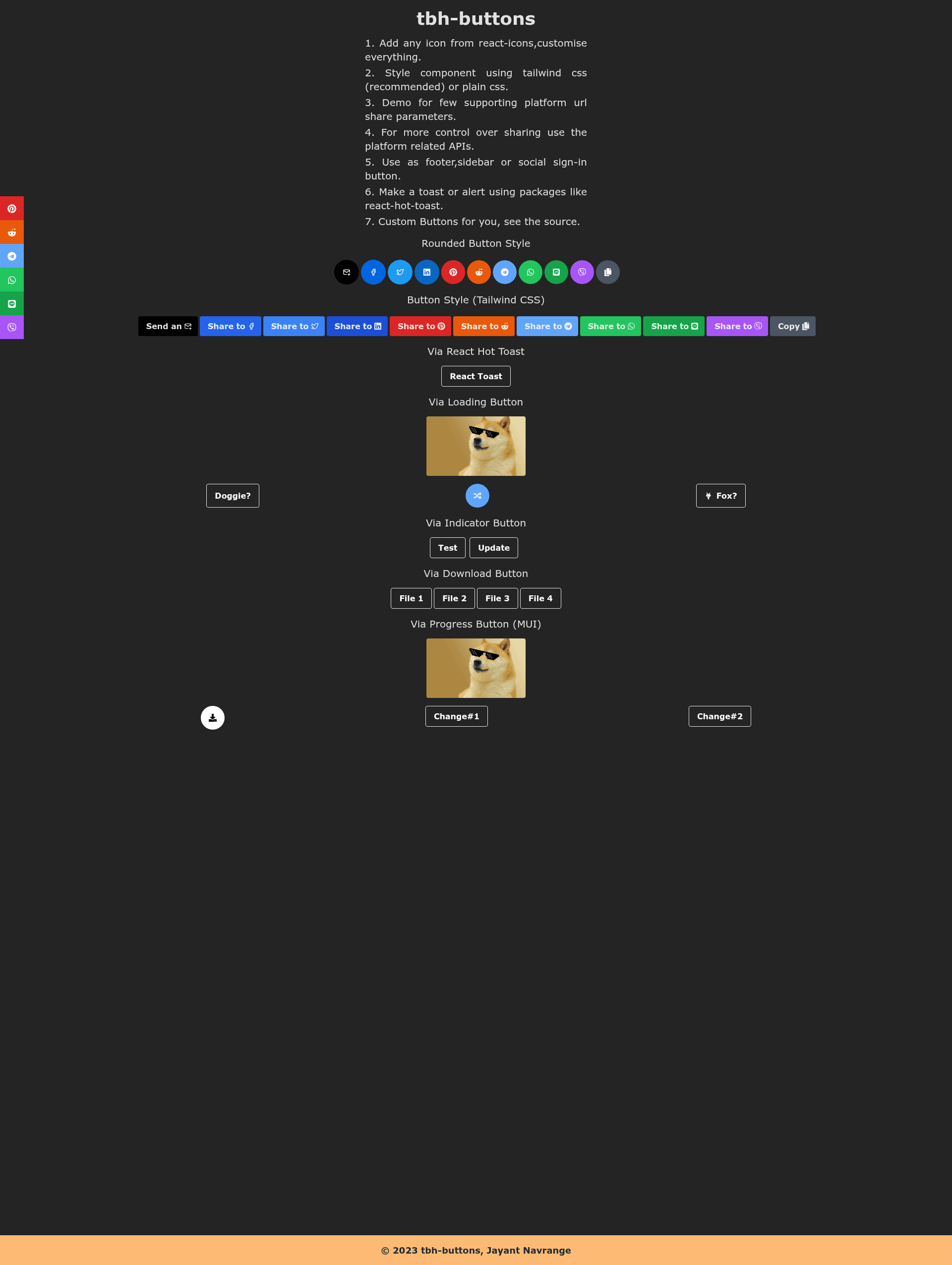
tbh-buttons is an open-source React and TypeScript component library for building button UI with icons, loading states, progress indicators, download behavior, and social share utilities.
What is tbh-buttons?
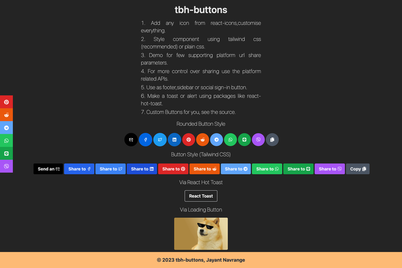
tbh-buttons is a React button component library written in TypeScript that provides a set of button components including icon buttons, loading buttons, progress buttons, and download buttons, along with share utility functions for platforms like Facebook and WhatsApp. It takes React component inputs (such as icon components from react-icons) and returns rendered buttons with customizable styles via the className prop, allowing integration with CSS frameworks like Bootstrap and Tailwind CSS. The library can be installed via npm, yarn, or a direct CDN script from unpkg, and its source and demo are available on GitHub at the tbhweb repository.
Key Features
- Framework-agnostic styling — Buttons accept className and style props, so they work with plain CSS, Bootstrap, Tailwind CSS, or any other styling approach without preset styles.
- React-icons integration — Icon, IconButton, and IconContainer components accept icon components from react-icons, shown in the example with TbBrandFacebook and FaWhatsapp icons.
- Share utility functions — Includes fbShare and sendWAMessage helpers to share URLs to Facebook and send WhatsApp messages; more control is available via platform SDKs if needed.
- Specialized button components — Provides DLButton for download, LoadingButton for loading states, IndicatorButton for indicators, and PBButton for progress bars, each returning standard button elements with specific behavior.
- Multiple installation options — Available through npm, yarn, and a direct CDN link (unpkg) for use in any web project.
- Lightweight and extensible — The package is a WIP but usable, and the source and demo are available on GitHub for extension and contribution.
Who is it for?
- React developers — building web apps who need ready-made button components for icons, loading states, progress, and downloads without writing markup from scratch.
- Developers using CSS frameworks — people using Tailwind CSS, Bootstrap, or plain CSS who want buttons that accept their own classes without preset styles.
- Developers needing social sharing — those who want quick one-liner functions to share content on Facebook or WhatsApp without pulling in a full SDK.
Use cases
- Add icon buttons to any UI — Combine IconButton with a react-icons icon to create a social share button or a toolbar button with a single component.
- Trigger social shares — Call fbShare with a URL to open Facebook's share dialog, or sendWAMessage with a message to open WhatsApp.
- Show loading or progress states — Use LoadingButton and PBButton to indicate async operations or progress within a button.
- Create download buttons — Use DLButton to provide a download attribute on a button element.
FAQ
Is tbh-buttons free?
Yes, tbh-buttons is distributed under the MIT License, so it is free to use, modify, and distribute in both personal and commercial projects.
Does tbh-buttons work with Tailwind CSS or Bootstrap?
Yes. The components have no preset styles and accept className and style props, so you can apply utility classes from Tailwind CSS, Bootstrap, or any other CSS framework directly to the rendered elements.
Is tbh-buttons production-ready?
The package is marked as WIP but usable. The author notes that the demo and source are available on GitHub, and the share utility functions are not guaranteed to work on mobile or tablet devices.