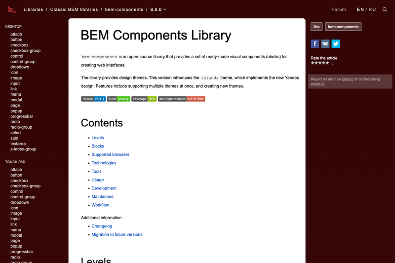
bem-components is an open-source library of ready-made visual components (called blocks) for creating web interfaces, developed by Yandex and released under the Mozilla Public License 2.0.
What is BEM Components Library?
bem-components (styled as bem-components on npm) is a set of reusable UI blocks — attach, button, checkbox, dropdown, icon, input, link, menu, modal, popup, progressbar, radio, select, spin, textarea, and others — that implement the BEM methodology. The library takes BEM-oriented markup and JavaScript and produces compiled CSS and JS via a Vite build, outputting three platform bundles: dist/desktop/, dist/touch-pad/, and dist/touch-phone/. It was created by Yandex and is maintained on GitHub under the bem/bem-components repository.
Key Features
- Multiple design themes — The
islandstheme implements the new Yandex design; the library supports several themes at once and allows creating new themes. - Platform levels — Blocks are split into
common.blocks,desktop.blocks,touch.blocks,touch-phone.blocks,touch-pad.blocks, plus design levels, so the same component adapts to device types. - 22 ready-made blocks — Includes attach, button, checkbox-group, dropdown, icon, image, input, link, menu, modal, popup, progressbar, radio-group, select, spin, textarea, and z-index-group.
- State management via modifiers — Blocks expose states through modifiers and fields; changing a modifier fires an event (for example,
changefor value fields) that you can listen to. - Two focus styles — The
focusedmodifier is applied on mouse click, whilefocused-hardis set for keyboard or JavaScript focus and adds a stronger visual highlight, such as an extra border in theislandstheme. - ES modules and i-bem.js — The library is built on ES modules, i-bem.js, BEMHTML, DEPS, and PostCSS.
- Modern tooling and testing — Uses Vite as the build tool and dev server, Autoprefixer for vendor prefixes, ESLint for JavaScript linting, and Playwright for browser regression tests.
- Supported browsers — Desktop: last two stable versions of Firefox, Chrome, Safari, and Yandex Browser; Touch: Android 5+ and iOS 12+.
Who is it for?
- Frontend developers using BEM — Teams that follow the BEM methodology get a tested set of blocks instead of writing UI components from scratch.
- Developers building Yandex-style interfaces — The
islandstheme provides the Yandex visual language out of the box. - Product teams shipping multi-platform web apps — The platform levels let the same component serve desktop, smartphone, and tablet layouts.
Use cases
- Form-heavy applications: Assemble form controls (input, button, checkbox, radio, select, textarea) with consistent styling and focus handling.
- Web apps needing overlays and menus: Use modal, popup, dropdown, menu, and menu-item for navigation and dialogs.
- Design-system teams: Create a new theme alongside
islandsto rebrand all blocks consistently.
How does it work?
Install with npm install bem-components (requires Node.js >= 20 and peer dependencies bem-core ^5.0.0 and jquery ^4.0.0). Add the library to your project, import the needed blocks, and build with Vite. Blocks change state through modifiers; you listen to modifier-change events instead of creating custom BEM events.
FAQ
Is bem-components free?
Yes. The code is open-source and released under the Mozilla Public License 2.0; documentation is © 2012 YANDEX LLC.
What are the peer dependencies?
bem-components requires bem-core ^5.0.0 and jquery ^4.0.0. You also need Node.js >= 20.
Does it support touch devices?
Yes. It has separate levels for touch, touch-phone, and touch-pad, and the build outputs a dist/touch-phone/ and dist/touch-pad/ bundle. Supported versions: Android 5+ and iOS 12+.
What build tools are included?
The repository uses Vite as the build tool and dev server, PostCSS with Autoprefixer, ESLint for code analysis, and Playwright for browser regression tests.
How do I contribute or report issues?
The source is on GitHub at bem/bem-components. Current tasks are tracked via GitHub Issues, and tests run automatically on GitHub Actions for each pull request.