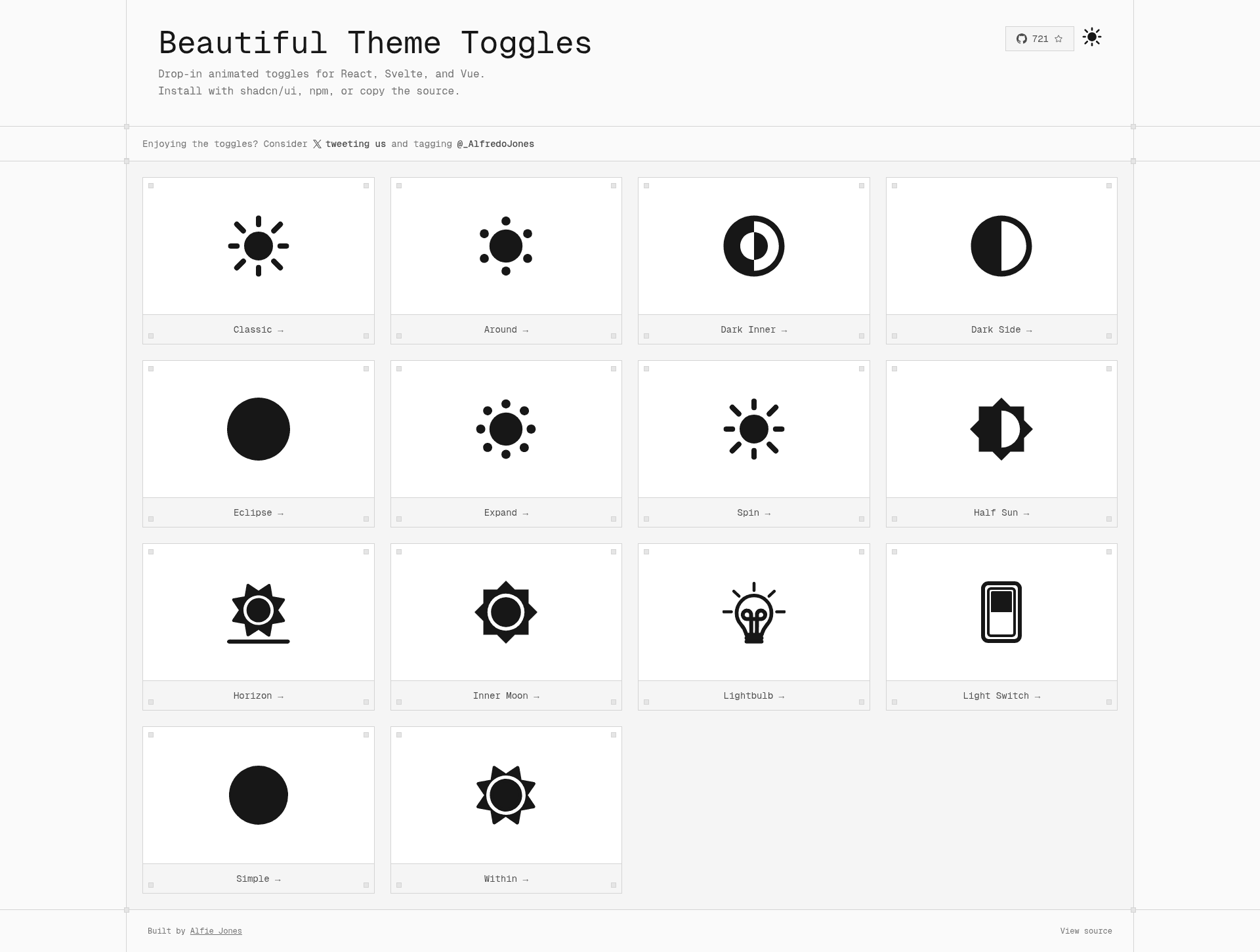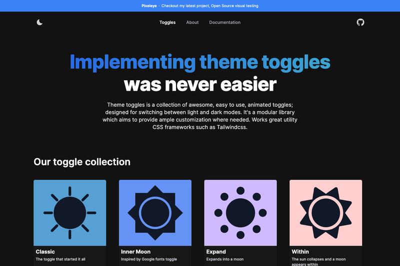
Theme Toggles is an open-source library of animated theme toggles for React, Vue, and Svelte that lets developers drop a lightweight, customizable light/dark mode switch into a web app.
What is Theme Toggles?
Theme Toggles is a collection of animated toggle components designed specifically for switching between light and dark modes in web applications. It ships as three separate npm packages — @theme-toggles/react, @theme-toggles/vue, and @theme-toggles/svelte — so each framework gets a tailored implementation. The library is MIT-licensed and hosted on GitHub, with documentation available at toggles.dev. It takes a boolean on/off state as input and renders an animated toggle button that reflects the current theme; developers wire it to their own theme state management.
Key Features
- Multi-framework support — Provides first-class packages for React, Vue, and Svelte, each installable via a dedicated npm package (@theme-toggles/react, @theme-toggles/vue, @theme-toggles/svelte).
- Animated transitions — Each toggle includes motion effects that visually indicate the switch between light and dark mode, with the goal of making the theme change feel responsive.
- Modular collection — The library is a collection of multiple toggle styles, giving developers a range of visual options to choose from rather than a single locked design.
- Documentation site — A dedicated website at toggles.dev provides usage examples and API references for all three framework packages.
- MIT license — The source code is freely usable in personal and commercial projects without license fees.
- Modern development tooling — The repository uses bun for installation and build scripts (bun install, bun run build, bun test), reflecting a modern JavaScript toolchain.
Who is it for?
- React developers — Add a themed toggle to a React application by installing @theme-toggles/react and importing the component into any component tree.
- Vue developers — Build a light/dark mode switcher in Vue projects using @theme-toggles/vue, with the same component exposed as a Vue component.
- Svelte developers — Integrate an animated theme toggle into Svelte or SvelteKit projects through @theme-toggles/svelte.
- Design-system maintainers — Wrap the toggle in a design system to offer a consistent, reusable theme switch across multiple projects.
What can you do with Theme Toggles?
- React developers: Install @theme-toggles/react and immediately render an animated toggle that can be bound to a theme state value (e.g., a boolean or a theme object) to trigger light/dark mode changes.
- Vue developers: Use @theme-toggles/vue in a Vue 3 single-file component to switch classes or data attributes that drive theme styling.
- Svelte developers: Add @theme-toggles/svelte to a Svelte component, leveraging Svelte's reactivity to respond to the toggle's checked state.
- UI/UX designers: Experiment with different toggle animations from the collection to find an interaction that fits the app's visual style.
How does Theme Toggles work?
After installing the package for your framework with the npm command listed in the README, you import the toggle component into your application and connect its state to your theme logic. The project's documentation at toggles.dev provides the API details for props and events for each of the React, Vue, and Svelte packages.
FAQ
Is Theme Toggles free?
Yes, Theme Toggles is open source and released under the MIT license, so it can be used freely in personal and commercial projects without licensing fees.
Which frameworks are supported?
Theme Toggles ships three separate npm packages: @theme-toggles/react for React, @theme-toggles/vue for Vue, and @theme-toggles/svelte for Svelte. There is no single package containing all three.
How do I install Theme Toggles?
Run the corresponding npm install command: npm install @theme-toggles/react, npm install @theme-toggles/vue, or npm install @theme-toggles/svelte, depending on your framework.
Where is the documentation?
Documentation is hosted at toggles.dev, which covers usage examples and API details for all supported frameworks.