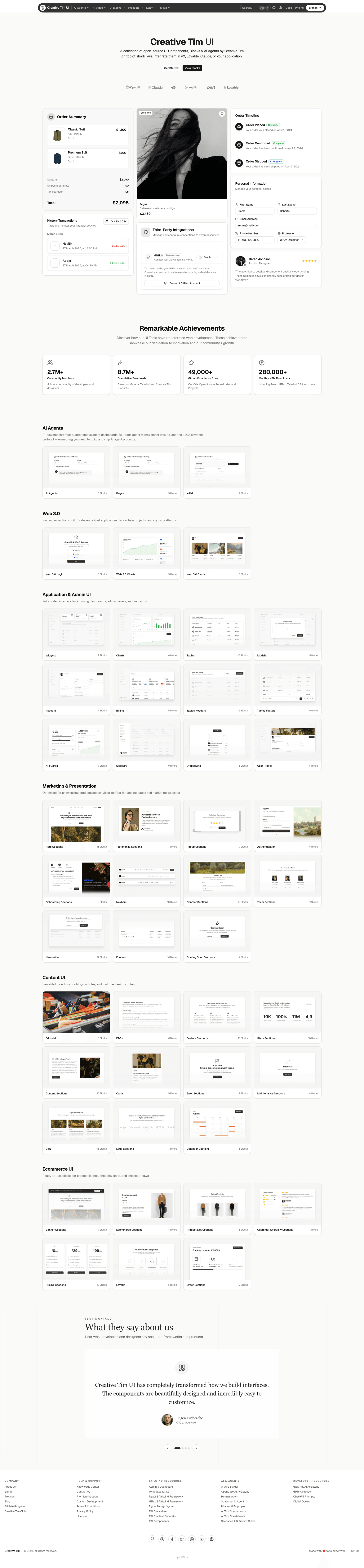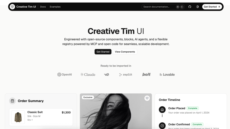
Creative Tim UI is an open-source React component library built on shadcn/ui that delivers pre-built, customizable components and section-level blocks to Next.js projects through a registry and CLI.
What is Creative Tim UI?
Creative Tim UI is a component library created by Creative Tim that packages shadcn/ui-compatible React components and larger section blocks into an installable registry. It takes a Next.js project that already has shadcn/ui and Tailwind CSS configured, and outputs copied, customizable component source files plus any required dependencies into the project's components directory. The library is MIT-licensed and is hosted at creative-tim.com/ui, with all source code available on GitHub.
Key Features
- Registry and CLI installation — Add individual components with the command
npx @creative-tim/ui@latest add card, install everything at once withnpx @creative-tim/ui@latest add all, or use the standard shadcn CLI with the registry URLhttps://creative-tim.com/ui/r/all.json. - Built on shadcn/ui — The atomic components, registry structure, and documentation patterns come directly from the open-source shadcn/ui project, which is MIT licensed.
- Application UI blocks — 17 blocks across Modals (5 blocks), Account (7), and Billing (5) for dashboard and admin interfaces.
- Marketing blocks — 69 blocks spanning Testimonials (17), Contact sections (15), Footers (16), FAQs (6), and Blog (15).
- Ecommerce blocks — 14 ready-to-use sections covering product listings, shopping carts, and checkout flows.
- Web 3.0 blocks — 5 cards designed for decentralized applications, blockchain projects, and crypto platforms.
- Next.js focused — Requires Node.js 18 or later, an initialized shadcn/ui setup, and Tailwind CSS; components are plain React source code you own and edit locally.
- MIT licensed — The library and its key dependencies (shadcn/ui, Material Tailwind, and the Geist font) are all open source.
What can you do with Creative Tim UI?
- Next.js developers: add polished UI sections to a project with a single CLI command instead of hand-building them, then customize the copied source files in their own components folder.
- Startup founders: assemble a marketing landing page quickly by installing Testimonial, FAQ, and Footer blocks from the registry.
- SaaS product teams: wire up Account and Billing blocks into user dashboard flows without designing settings or payment screens from scratch.
- Ecommerce developers: drop in ready-made product listing and cart sections rather than creating responsive storefront components from zero.
Who is it for?
- React and Next.js developers who want shadcn/ui-level control over component source without designing every marketing or application section themselves.
- Freelance web developers building client sites who need fast, professional-looking section blocks that are fully customizable and MIT licensed.
- Product engineers on SaaS teams who need account settings, billing, or modal patterns implemented quickly in an existing Tailwind and shadcn/ui codebase.
How does Creative Tim UI work?
You install it through a CLI command in an existing Next.js project with Tailwind CSS and shadcn/ui initialized. The CLI fetches component source and dependencies from the Creative Tim registry, places them in your configured components directory, and leaves them as editable local code. You can also point the standard shadcn CLI at the registry URL, either for all components or for a single one, to achieve the same result.
FAQ
Is Creative Tim UI free?
Yes. The library is open source under the MIT license, and its major dependencies — shadcn/ui, Material Tailwind, and the Geist font — are also open source under MIT or the SIL Open Font License.
What are the prerequisites for Creative Tim UI?
Your project must run Node.js 18 or later, have Tailwind CSS configured, and have shadcn/ui initialized with npx shadcn@latest init before running the Creative Tim UI install commands.
How do I install all Creative Tim UI components at once?
Run npx @creative-tim/ui@latest add all to install every component to your configured components directory, or use the shadcn CLI with npx shadcn@latest add https://creative-tim.com/ui/r/all.json.
Can I use Creative Tim UI without Next.js?
The documented setup targets Next.js with Tailwind CSS and shadcn/ui. The components themselves are React source code, but the CLI and prerequisite instructions specifically reference Next.js projects.
Where do the blocks come from?
The component and block designs are inspired by and based on Creative Tim's Material Tailwind framework, while the documentation structure and registry system come from shadcn/ui and the Eleven Labs UI project.