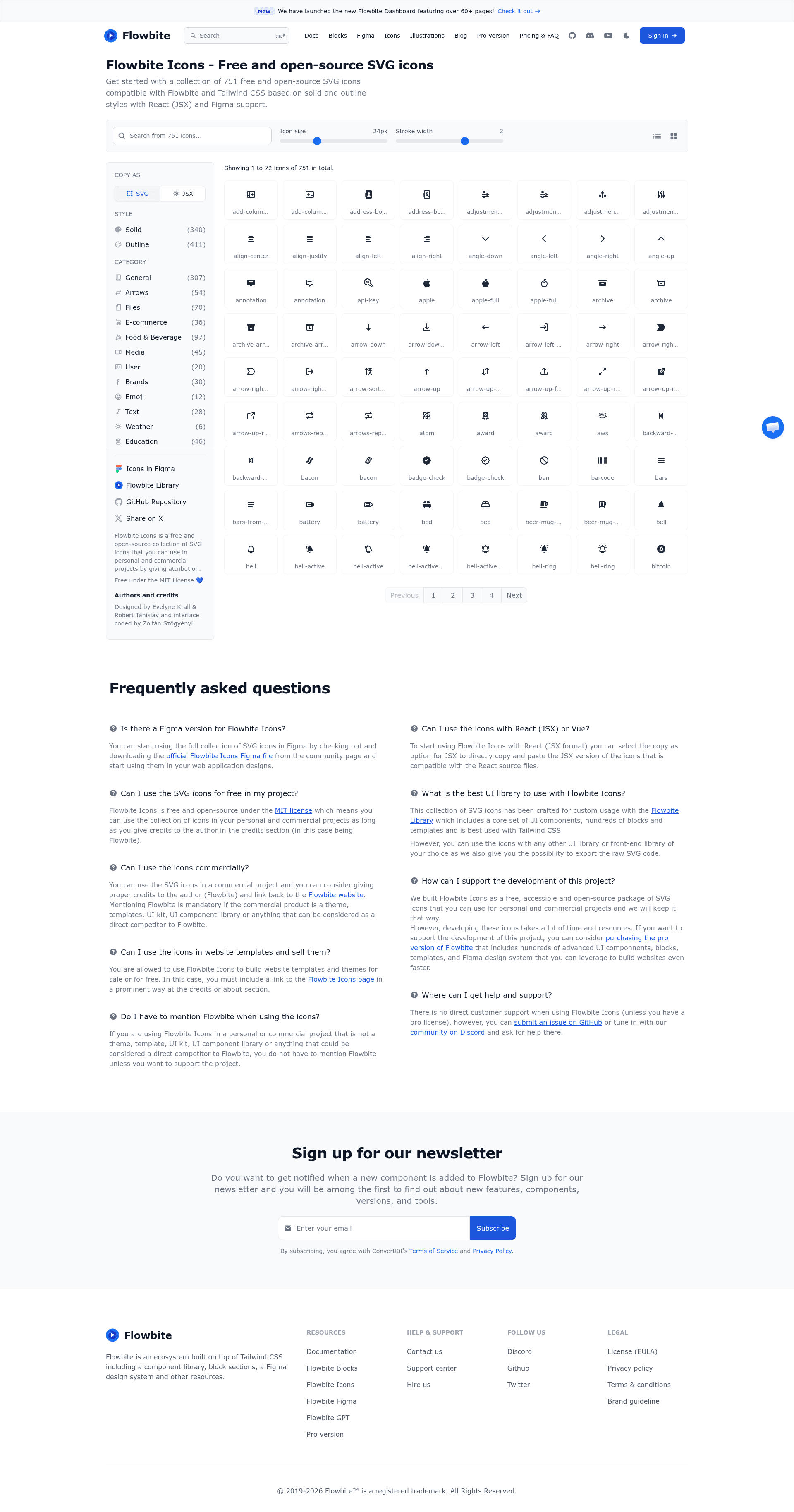
Flowbite Icons is a free and open-source collection of over 430 SVG icons built for Tailwind CSS, React, Svelte, Laravel, and Figma by the Flowbite team at Bergside Inc.
What is Flowbite Icons?
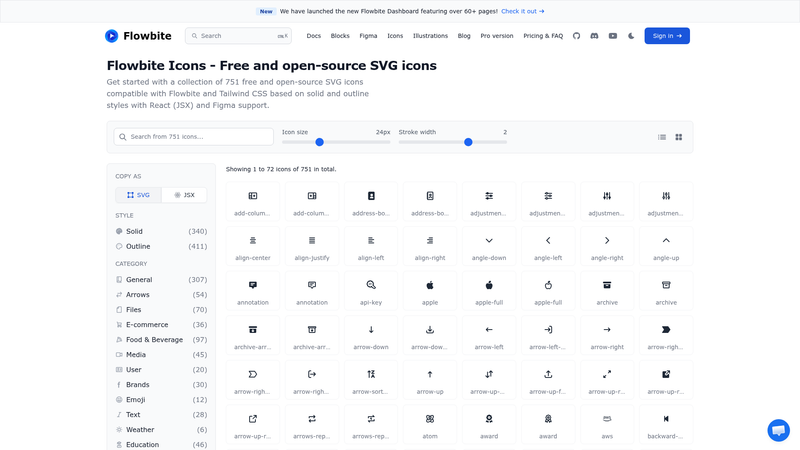
Flowbite Icons is an open-source icon set released under the MIT License, containing more than 430 vector icons in both solid and outline styles. You can copy icons as raw SVG or as JSX for React directly from the Flowbite Icons website, or install framework-specific packages for React, Svelte, and Laravel. The icons are designed to pair with Tailwind CSS utility classes, so color and size are controlled with classes like text-gray-500 and w-6 h-6.
Key Features
- Over 430 icons — Each icon is available in solid and outline variants, covering common interface symbols such as notification bells, adjustments, address cards, and angle arrows.
- Raw SVG output — Copy icons as inline SVG that works in any framework or plain HTML, with no build step required.
- React package — Install
flowbite-react-iconsfrom npm to import typed React components from separateoutlineandsolidmodules. - Svelte package — Install
flowbite-svelte-iconsto use icons as Svelte components, e.g.AddressCardSolid. - Laravel/Blade package — Install
themesberg/flowbite-blade-iconswith Composer and use Blade components prefixedx-fwb-o-for outline andx-fwb-s-for solid. - Figma community file — Duplicate the official Flowbite Icons Figma file to design with the same icon set.
- Configurable copy options — On the Flowbite Icons page you can adjust size and stroke width before copying the SVG.
- MIT license — Free for personal and commercial use without attribution; the Flowbite name and logos are trademarks of Bergside Inc.
Who should use Flowbite Icons?
- Tailwind CSS developers who want an icon set that reacts to existing utility classes instead of requiring custom icon fonts or separate styles.
- React developers who prefer importing icons as components from
flowbite-react-iconsrather than pasting SVG each time. - Svelte and Laravel developers who need framework-idiomatic packages (
flowbite-svelte-iconsandflowbite-blade-icons) to keep templates clean. - UI/UX designers who use Figma and want the same icon library for mockups as developers use in code.
What can you do with Flowbite Icons?
- Front-end developers: Add UI icons to any HTML page by copying SVG from the website, or install the React or Svelte packages for component-based use in modern apps.
- Designers: Reuse the official Figma community file to keep wireframes and prototypes consistent with the final implementation.
- Laravel developers: Drop Blade components like
x-fwb-o-adjustments-horizontalinto views to render SVG icons without mixing raw markup. - Open-source maintainers: Incorporate the icons into projects knowing the MIT license permits redistribution and commercial use.
How does Flowbite Icons work?
There are two ways to use the icons: copy from the website or install a package. On the Flowbite Icons page, select an icon, adjust its size and stroke width, then copy it as either raw SVG or JSX. Alternatively, install flowbite-react-icons, flowbite-svelte-icons, or themesberg/flowbite-blade-icons and import icons as components that render the same SVG assets.
Pricing
Flowbite Icons is free and open-source under the MIT License. The separate Flowbite Pro package, which adds advanced UI components, page sections, and a Figma design system, is a paid product; its price is not stated in this documentation.
Alternatives
- Heroicons — a free, MIT-licensed icon set created by the Tailwind CSS team.
- Tabler Icons — a library of more than 4,500 free icons with React and Vue packages.
- Phosphor Icons — a flexible icon family with multiple weights and React, Vue, and Svelte integrations.
FAQ
Is Flowbite Icons free?
Yes. Flowbite Icons is released under the MIT License, so you can use it in personal, commercial, and open-source projects without payment or attribution. The Flowbite name and logos are trademarks of Bergside Inc.
What formats can I copy from the website?
The Flowbite Icons website lets you copy each icon as raw SVG or as JSX for React. There is no PNG or font export; the icons are vector-only.
How do I change an icon's color and size?
When using raw SVG, apply Tailwind classes: color via text utilities like text-gray-500 dark:text-gray-400, size via w-6 h-6 or any width/height class. The website also lets you configure size and stroke width before copying.
Does Flowbite Icons work with React?
Yes. Install flowbite-react-icons from npm and import components from flowbite-react-icons/outline or flowbite-react-icons/solid. The package is maintained by Sutu Sebastian.
Does Flowbite Icons work with Laravel?
Yes. Install themesberg/flowbite-blade-icons via Composer and use Blade components such as x-fwb-o-adjustments-horizontal for outline icons and x-fwb-s-adjustments-horizontal for solid icons.