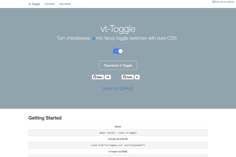
vt-toggle is a lightweight CSS/SCSS UI library that transforms standard HTML checkbox inputs into iOS-style toggle switches with a single class.
What is vt-toggle?
vt-toggle is a minimal UI component library that takes any standard <input type="checkbox"> element and renders it as an animated, visually styled toggle switch. It is written entirely in CSS and SCSS, requires no JavaScript, and is published on NPM and Bower. The project is maintained by GitHub user victornpb and includes a live demo at https://victornpb.github.io/vt-toggle/.
Key Features
- Pure CSS styling — The base switch is produced by a single CSS class (
vt-toggle) with no JavaScript or other dependencies; just load the stylesheet and add the class to a checkbox. - Four built-in sizes — The library includes
xs(18×22),sm(32×16),md(44×22, default), andlg(64×32) classes, each with its own on/off and disabled appearance. - SCSS mixin for custom designs — A
vt-togglemixin accepts parameters for width, height, handle margin, roundness, on-color, off-color, and a label option, letting you generate your own classes like.accentor.dangerwith custom colors. - Install flexibility — The stylesheet can be installed via NPM (
npm install vt-toggle), Bower (bower install vt-toggle), or loaded from the unpkg CDN athttps://unpkg.com/browse/[email protected]/css/vt-toggle.css. - Import options — The component ships as a CSS file and an SCSS file; use either a
<link>tag pointing tocss/vt-toggle.cssor an@importin your SCSS for thescss/vt-togglemodule. - State support — The component visibly distinguishes on, off, disabled-on, and disabled-off states, as shown in the project's documentation.
Who should use vt-toggle?
- Front-end developers — Add a modern toggle to forms, settings panels, or accounts pages without writing custom CSS or JavaScript.
- UI designers prototyping in code — Use the SCSS mixin to quickly generate toggles that match a design system's colors and dimensions.
- Maintainers of small static sites — The CSS-only approach means no build step; just drop in the stylesheet and add the class to upgrade any checkbox.
What can you do with vt-toggle?
- Customize toggle colors — Define your own on/off colors via the SCSS mixin, for instance a blue
.accenttoggle or a red.dangertoggle, then reuseinput.vt-toggle.accentanywhere. - Adjust dimensions and shape — The mixin's width, height, handle margin, and roundness parameters let you match toggles to any UI layout, from compact inline switches to large settings controls.
- Keep checkboxes accessible — Because the component remains a real checkbox underneath, it continues to work in forms and with keyboard interaction.
FAQ
Does vt-toggle require JavaScript?
No. vt-toggle is purely CSS/SCSS. The only action needed is to add the vt-toggle class to a normal checkbox; no JavaScript initialization or event wiring is required.
How do I use vt-toggle?
Load css/vt-toggle.css (or import the SCSS file) and add class="vt-toggle" to your <input type="checkbox">. You can also add a size class like lg for a larger switch.
How can I create a custom-colored toggle?
Use the SCSS mixin included in the package. Call vt-toggle with your preferred on-color, off-color, and dimensions inside a custom class rule, then apply that class to the checkbox.
What are the built-in sizes?
There are four: xs (18×22), sm (32×16), md (44×22), and lg (64×32). The default size is md; you can use size classes directly on the checkbox.