Newsletter
Join the Community
Subscribe to our newsletter for the latest news and updates

A lightweight JavaScript library that lazy-loads responsive images, background images, and HTML without breaking SEO.
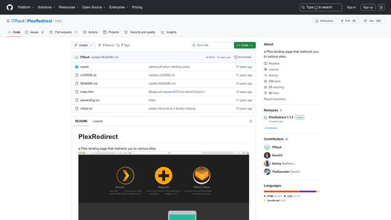
A Plex landing page that redirects to Plex.tv, PlexRequests, and PlexEmail, with live server status.

Bootstrap Igloo is a set of free cubes (bricks, blocks, modules) for Bootstrap 4.

Modern real-time design and 100% free resume builder.

Publish markdown files as websites, docs, wikis, and knowledge bases in seconds, with AI integration.
Responsively Lazy is a dependency-free JavaScript library for lazy-loading responsive images, background images, and HTML blocks using a valid-HTML approach that never removes the src attribute. It reads a data-responsively-lazy attribute listing image versions (with widths and optional WebP/AVIF formats) and requests only the version needed as the element approaches the viewport.
Responsively Lazy is a tiny (2.5kb gzipped and minified) JavaScript library that enhances <img> tags with responsive lazy loading while keeping the HTML valid for search engines, social networks, and older browsers. It takes an image with a normal src (the high-resolution fallback) plus a data-responsively-lazy attribute that lists alternative image versions, and it outputs the best-matching version when the image nears the viewport. The library works in browsers that support srcset (about 97.6% as of December 2023) and is created by Ivo Petkov.
src attribute, so search engines and social networks still see a complete image; it also works without <noscript>.data-responsively-lazy, each image version can declare a format (webp or avif) after its width, and the first format the browser supports is used.data-responsively-lazy-threshold attribute lets you control how close an image must be to the viewport before loading, in pixels or percentages.data-responsively-lazy-type="background" to lazy-load CSS background images with the same responsive version list.data-responsively-lazy-type="html" to lazy-load arbitrary HTML (including JavaScript) into a container.responsivelyLazy.run() method to trigger loading manually.npm install responsively-lazy) or include the minified file from a CDN.<img> markup and doesn't require changing the HTML structure.Include the JavaScript file (via CDN or a local script) and then add a data-responsively-lazy attribute to an <img> tag. The attribute contains comma-separated image versions like images/400.jpg 400w, images/600.jpg 600w. The library uses the srcset attribute as a baseline, calculates the current viewport width, and loads the smallest version that is large enough for the element's displayed size — only when the element gets close to the viewport. It also listens for DOM changes and lets you call responsivelyLazy.run() to re-scan the page.
src for crawlers.src for older browsers and social sharing bots.responsivelyLazy.run().No. The lazy loading itself requires JavaScript and browsers that support srcset (about 97.6% as of December 2023). If JavaScript is disabled or the browser doesn't support srcset, the image in the src attribute is displayed instead, which is why the page recommends keeping a high-resolution image there.
Yes. The library is released under the MIT license, so it is free to use in personal and commercial projects. No pricing tiers or paid features are mentioned on the page.
In the data-responsively-lazy attribute, append the format after each version's size: images/400.avif 400w avif, images/400.webp 400w webp, images/400.jpg 400w. The browser's first supported format for the chosen width is used, giving you automatic fallback behavior.
Yes. Set data-responsively-lazy-type="background" on an element and provide the same comma-separated list of versions with widths. The library will load the background image responsively when the element approaches the viewport.
Yes. Set data-responsively-lazy-type="html" and put the HTML (even with JavaScript) inside the data-responsively-lazy attribute. The library will inject it when the element is near the viewport.