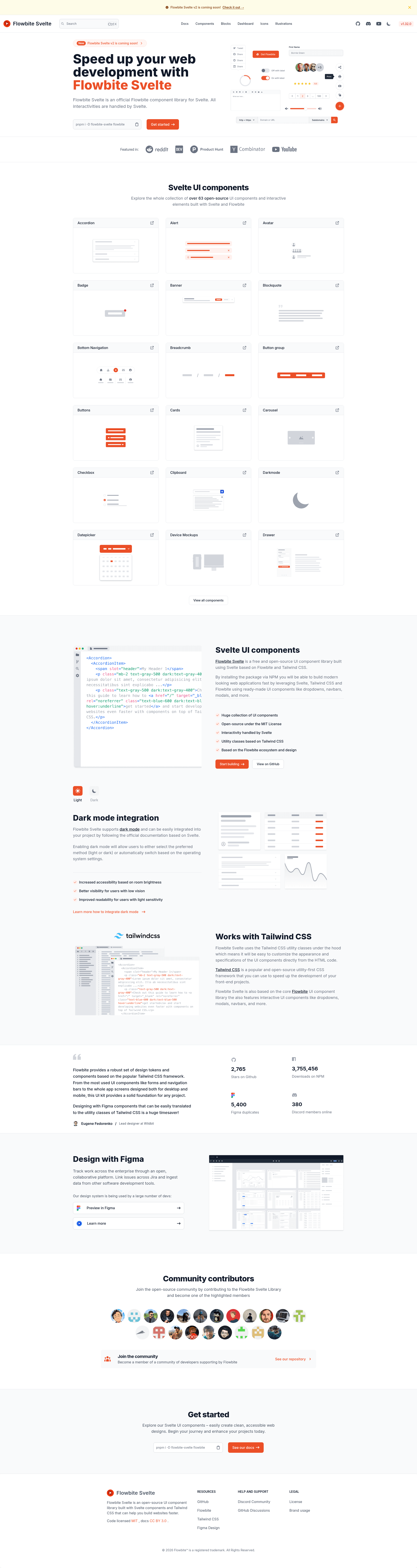
Flowbite Svelte is an open-source UI component library that gives Svelte and SvelteKit developers a set of Tailwind CSS-styled components built from scratch for Svelte 5's runes system. Maintained by the Flowbite team under the MIT License, it generates fully interactive UI components with all behavior handled by Svelte rather than vanilla JavaScript.
What is Flowbite Svelte?
Flowbite Svelte is the official Svelte implementation of the Flowbite UI library, published on npm as flowbite-svelte and documented at next.flowbite-svelte.com. It takes the Flowbite design language — alerts, buttons, cards, modals, navbars, tables, and dozens more — and packages them as reusable Svelte components that accept props and slots. The output is markup styled with Tailwind CSS utility classes plus Svelte-powered interactivity such as dropdown toggles, modal overlays, and tab switching. The project is in early development, and the README warns that APIs and packages are likely to change often.
Key Features
Flowbite Svelte stands out by combining the Flowbite design system with Svelte's runes, offering more than 60 prebuilt components that require no separate JavaScript runtime.
- Runes-based reactivity — Built from scratch for Svelte 5's runes system, making component state updates reactive without external libraries.
- Tailwind CSS styling — Every component uses Tailwind utility classes, so existing Tailwind projects can drop it in and customize via their Tailwind config.
- 60+ components — The README lists about 60 components, including Alert, Badge, Button, Card, Dropdown, Modal, Tabs, Navbar, Pagination, Timeline, Table, Toast, Datepicker, Carousel, Sidebar, Footer, and Accordion.
- Form controls — Includes Input Field, File Input, Search Input, Select, Textarea, Checkbox, Radio, Toggle, Range Slider, and Floating Label components for building forms.
- Typography set — Separate components for Heading, Paragraph, Blockquote, Image, List, Link, Text, and Horizontal Line (HR) to style prose content.
- Extra UI patterns — Adds Speed Dial, Drawer, Popover, Skeleton, KBD, Mega Menu, Bottom Navigation, Sticky Banner, and Masonry Gallery components.
- SvelteKit integration — Works with SvelteKit, as the library is oriented toward Svelte apps and the documentation includes quickstart and TypeScript pages.
- MIT licensed — Open-source under the MIT License, allowing free commercial and personal use.
Who is it for?
Flowbite Svelte suits developers who want Svelte components with the familiar Flowbite/Tailwind look, especially those building modern web apps with SvelteKit.
- Svelte developers — Build UI screens faster by importing prebuilt components instead of hand-coding Tailwind markup and JavaScript behavior.
- SvelteKit teams — Create marketing pages, dashboards, and admin panels using components that fit directly into SvelteKit routes and layouts.
- Flowbite users — Developers who already use Flowbite's Tailwind components but prefer Svelte-native interactivity over the vanilla JS versions.
What can you do with Flowbite Svelte?
Flowbite Svelte lets you assemble common interface patterns using prebuilt Svelte components, saving time on repetitive UI work.
- Landing page builders: Compose a navbar, hero card, feature grid, and footer using the Card, Button, and Typography components.
- Dashboard creators: Assemble a sidebar, table, pagination, progress bars, toasts, and modals for data-heavy admin interfaces.
- Form designers: Use the form components — inputs, select, checkbox, radio, toggle, and range slider — to build sign-up, login, and settings pages.
- Content publishers: Apply the typography components to format articles with headings, blockquotes, links, lists, and images in a consistent style.
Pricing
Flowbite Svelte is free and open source under the MIT License. There are no paid tiers or premium components described in the README.
FAQ
Is Flowbite Svelte free?
Yes, Flowbite Svelte is released under the MIT License, so you can use it in commercial and personal projects without paying a license fee.
Does Flowbite Svelte work with Tailwind CSS?
Yes, all components are styled with Tailwind CSS utility classes. You add the library to a Svelte project that already has Tailwind configured, and the components adopt your Tailwind theme.
What version of Svelte does it support?
Flowbite Svelte is built from scratch to leverage Svelte 5's runes system, so it targets Svelte 5 projects. As of this snapshot, the README marks it as early development, meaning APIs may change.
Are all listed components available?
Most components listed in the README are available, but the Stepper is marked "TBA" and the library as a whole is flagged as early development, so some APIs may still shift.