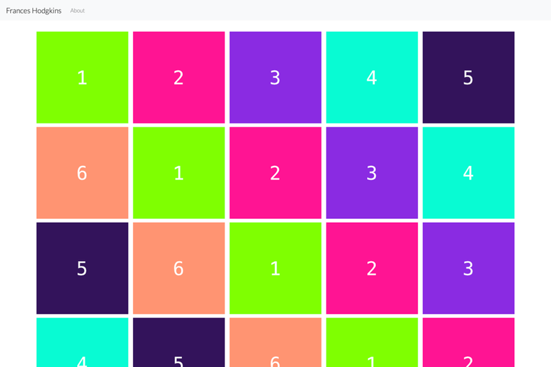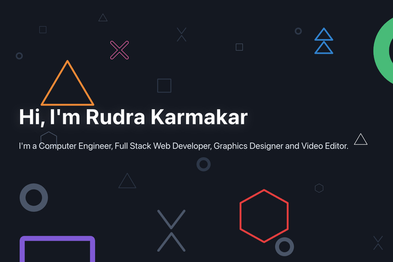
Gatsby Starter Portfolio: Cara is a free, open-source one-page portfolio starter built on the Gatsby static site generator, delivering a playful, colorful design with parallax scrolling and CSS shape animations. Created by LekoArts, it installs the @lekoarts/gatsby-theme-cara theme, so all content and styling live in MDX files and Theme UI configuration that you can override directly.
What is Gatsby Starter Portfolio: Cara?
This starter creates a new Gatsby site that installs and configures the @lekoarts/gatsby-theme-cara theme. The result is a one-page portfolio with four content sections — intro, projects, about, and contact — defined in MDX files. It outputs a static site built with React and GraphQL (core Gatsby tech), which is optimized for speed and security. The project is released under the 0BSD license.
Key Features
- Theme UI-based theming — Colors, typography, and layout are controlled through Theme UI, with configuration that you can shadow in
src/gatsby-plugin-theme-ui/. - react-spring parallax effect — The page includes a smooth parallax scrolling effect powered by react-spring.
- CSS animations on shapes — Decorative floating shapes animate with CSS to give the page a lively, playful feel.
- MDX content sections — Content is stored in four
.mdxfiles:intro.mdx,projects.mdx,about.mdx, andcontact.mdx. You can override them by placing files insrc/@lekoarts/gatsby-theme-cara/sections/. - ProjectCard component — Use the
ProjectCardcomponent insideprojects.mdxto display project cards, each with a title, link, and background gradient. - One-click deploy options — Deploy to Netlify with the provided button or open the starter in CodeSandbox for browser-based editing.
- Reusable static folder — The
staticfolder contains icons, social media images, androbots.txt; you should replace these for your own site.
Who is it for?
- Creative professionals and freelancers who want a distinctive one-page portfolio to present projects and contact details without spending time on layout and animation code.
- Gatsby developers who want a working example of a Gatsby theme starter, including how to install a theme, shadow its components, and override its MDX content.
- Learners exploring Gatsby themes — the starter's documentation links to official Gatsby guides on using and shadowing themes, making it a practical teaching tool.
What can you do with Gatsby Starter Portfolio: Cara?
- Designers: Build a portfolio site with parallax and animated shapes in about 10 minutes by running
gatsby new project-name https://github.com/LekoArts/gatsby-starter-portfolio-cara. - Developers: Customize the design system by shadowing Theme UI files, or drop custom React components into
src/@lekoarts/gatsby-theme-cara/. - Content creators: Edit the four MDX sections directly to update your bio, project list, about text, and contact info without touching React code.
How does the starter work?
You start by creating a new site with the Gatsby CLI, which pulls down the starter and installs the @lekoarts/gatsby-theme-cara theme. Then run gatsby develop to run a local dev server at http://localhost:8000. Content lives in MDX files inside the theme; to customize, you copy those files into your site's src/@lekoarts/gatsby-theme-cara/sections/ directory and edit them, using the ProjectCard component for project entries. Deployment can be done via the Netlify button or CodeSandbox.
FAQ
Is Gatsby Starter Portfolio: Cara free?
Yes. The starter is released under the 0BSD license, so it is free to use, modify, and redistribute without restrictions.
How do I customize the content?
Override the theme's MDX files by placing intro.mdx, projects.mdx, about.mdx, and contact.mdx in src/@lekoarts/gatsby-theme-cara/sections/. The starter already overrides intro.mdx as an example.
What is Gatsby theme shadowing?
Shadowing is the Gatsby mechanism that lets you replace files from an installed theme with your own versions. In this starter, you shadow the theme's components and MDX sections to change content and design.
Can I change the design?
Yes. The Theme UI configuration can be customized by shadowing files in src/gatsby-plugin-theme-ui/, allowing you to adjust colors, fonts, and spacing.