Gatsby Starter Specimens is a Gatsby starter that scaffolds a design-system documentation site with ready-made React components for displaying colors, typography, spacing, and other design tokens.
What is Gatsby Starter Specimens?
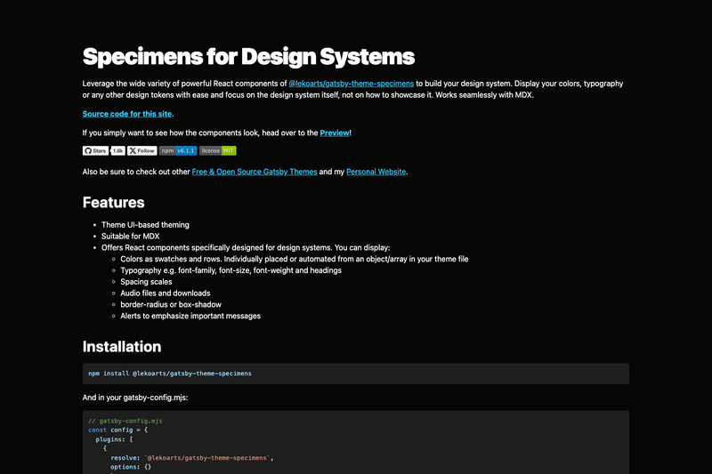
Gatsby Starter Specimens is a Gatsby starter created by LekoArts for building a design system showcase website. It installs and configures the Gatsby theme @lekoarts/gatsby-theme-specimens and provides MDX-compatible React components that render design tokens — colors, typography, spacing, shadows, and more — from your theme configuration. The starter outputs a static site with a demo at specimens.lekoarts.de, and is released under the 0BSD license.
Key Features
- Theme UI-based theming — The starter uses Theme UI for styling, and you can override the theme configuration by shadowing files in
src/gatsby-plugin-theme-ui/. - Color swatches and rows — Display colors as individual swatches or automated rows generated from an object or array in your theme file.
- Typography components — Showcase font-family, font-size, font-weight, and heading styles with dedicated React components.
- Spacing scales — Render your spacing scale values as a visual list or scale.
- Media components — Include audio files and download links directly in your design system documentation.
- Effect components — Display border-radius and box-shadow values as visual examples.
- Alert components — Emphasize important messages with styled alert boxes.
- MDX support — Works with MDX so you can mix JSX components and markdown in your documentation pages.
Who is it for?
- Design system maintainers — They can document design tokens like colors, type, and spacing without hand-coding every example.
- Gatsby developers — They can set up a themed site quickly via
npx gatsby newand customize it through Gatsby theme shadowing. - Frontend teams standardizing UI — They can publish an internal or public reference site that mirrors their theme tokens, keeping design and code in sync.
What can you do with it?
- Publish a style guide — Use the color, typography, and spacing components to create a living style guide from the same Theme UI config your app uses.
- Showcase media assets — Use the audio and download components to document brand assets, sound files, or resources in one place.
- Highlight UI effects — Use border-radius and box-shadow components to document elevation and rounding standards, plus alerts for usage notes.
How does it work?
You clone the starter with npx gatsby new gatsby-starter-specimens https://github.com/LekoArts/gatsby-starter-specimens, run npm run develop, and edit files in src/@lekoarts/gatsby-theme-specimens to shadow the theme's components. A one-click Netlify deploy button is available in the README for fast publishing.
FAQ
Is the template free?
Yes. Gatsby Starter Specimens is open-source under the 0BSD license, so you can use, modify, and distribute it without restrictions. The author, LekoArts, accepts GitHub Sponsors for support.
Does this theme support MDX?
Yes. The starter is built for MDX, so you can write Markdown with embedded React components for a design system documentation site.
How do I customize the theme?
You shadow files by placing them in src/@lekoarts/gatsby-theme-specimens/, and the Theme UI configuration lives in src/gatsby-plugin-theme-ui/. The README links to Gatsby's Shadowing guide for more detail.
What can I display?
The theme includes components for colors (swatches and rows), typography (families, sizes, weights, headings), spacing scales, audio files, downloads, border-radius, box-shadow, and alerts.