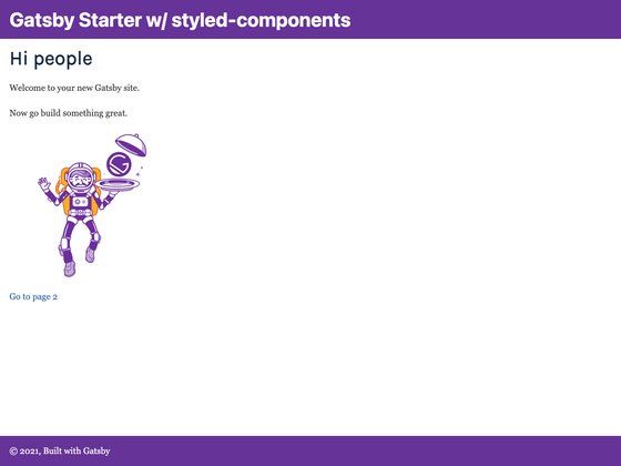
Gatsby Starter Styled Components is a boilerplate template that modifies the official Gatsby default starter to use styled-components for styling and adds a sticky footer. It provides a ready-to-run Gatsby site with React components, a standard project layout, and a one-click deploy option for Netlify.
What is Gatsby Starter Styled Components?
Gatsby Starter Styled Components is a starting point for building static websites with Gatsby, the React-based site generator. It takes the well-known Gatsby default starter and swaps its CSS modules for styled-components, giving you a CSS-in-JS solution out of the box. The starter also includes a sticky footer, which is not present in the default version. It was published on GitHub by user blakenoll and is available under the MIT license, matching Gatsby's own licensing.
Key Features
- Styled-components integration — The template uses
styled-componentsto style React components, allowing you to write scoped CSS directly in your JavaScript files without configuring additional tooling. - Sticky footer — A footer that remains at the bottom of the viewport is included, improving the layout for pages with small amounts of content.
- Standard Gatsby structure — You get the familiar file layout expected in a Gatsby project:
gatsby-config.js,gatsby-node.js,gatsby-browser.js,gatsby-ssr.js, and asrcdirectory for your source code. - GraphiQL interface — Running
gatsby developstarts a local development server athttp://localhost:8000and exposes GraphiQL athttp://localhost:8000/___graphqlfor experimenting with data queries. - Prettier formatting — A
.prettierrcfile is included to keep code formatting consistent across the project. - One-click Netlify deployment — A Deploy to Netlify button is provided in the repository, linking the repo to Netlify for instant static hosting.
- MIT license — The starter is open source, so you can reuse it for personal or commercial projects freely.
Who is it for?
- React developers who want a Gatsby site preconfigured with styled-components so they can avoid manual setup and start writing styled components immediately.
- Jamstack enthusiasts who prefer a minimal base and want to deploy quickly to Netlify using the built-in deploy button.
- Designers and developers building simple sites like a personal page or a company landing page, where the sticky footer helps maintain a polished layout.
What can you do with it?
- Create a personal blog — Begin with this starter and add markdown posts, using styled-components to design a unique theme.
- Build a landing page — The sticky footer and clean component structure make it easy to assemble a short marketing page with custom branding.
- Prototype a portfolio — Style your gallery with styled-components and have a working site in minutes, then deploy to Netlify with one click.
How does it work?
Clone the repository, run gatsby develop in the project directory, and the site becomes available at http://localhost:8000. Edit src/pages/index.js and save; the browser updates in real time. For data querying, use the GraphiQL tool at http://localhost:8000/___graphql.
Pricing
This starter is free and open source under the MIT license.
Alternatives
- gatsby-starter-default — The official Gatsby default starter before this modification, which does not include styled-components or the sticky footer.
FAQ
How do I install and run this starter?
Clone the GitHub repository with git clone https://github.com/blakenoll/gatsby-starter-styled-components.git, change into the new directory, and run gatsby develop. That command starts a local development server and you can view your site at http://localhost:8000.
Does this template support styled-components?
Yes. The starter installs and configures styled-components as the styling library. The default starter's CSS-based styling is replaced, so any component you create can use styled-components directly without extra setup.
What is a sticky footer?
A sticky footer is a footer that stays visible at the bottom of the browser window even when the page content is shorter than the viewport height. This starter includes that behavior, which is a common requirement for landing pages and dashboards.
Is this starter free to use?
Yes, the project is released under the MIT license. You can use, modify, and distribute it without paying fees, and you can include it in commercial projects.
How do I deploy this starter to Netlify?
The repository includes a "Deploy to Netlify" button. Clicking it takes you to Netlify, connects the repository, and builds a new site with the default configuration. No custom build commands are required.
![Image for Start UI [web] on template0.com](https://cdn.sanity.io/images/asuw607r/production/82416b588b6dbb99eaa1c693646962928c22b67e-1920x1080.png?w=800&auto=format "Image for Start UI [web] on template0.com")