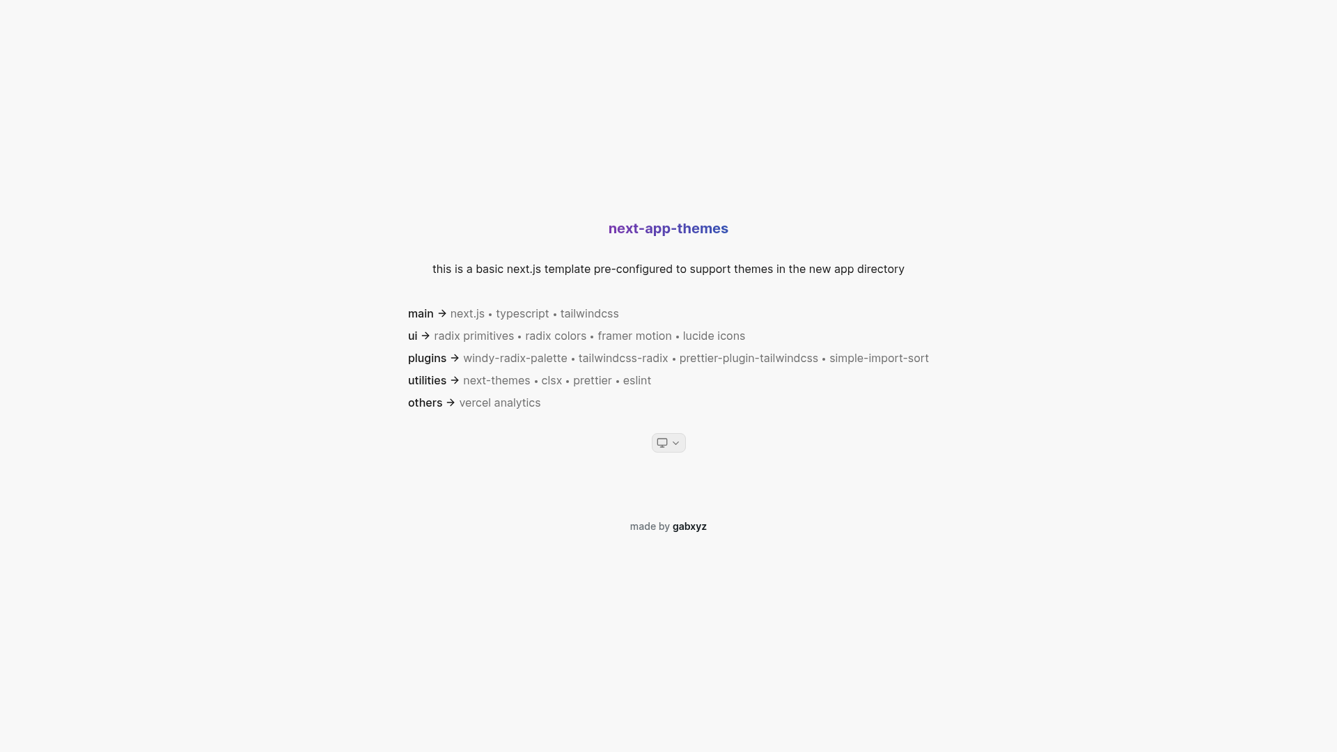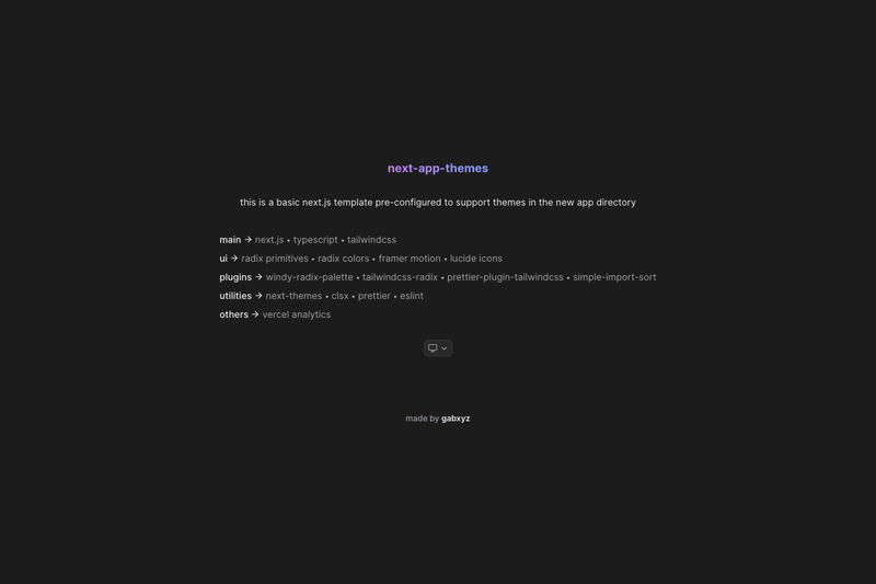
next-app-themes is a GitHub-hosted Next.js starter template for the App Router that ships with automatic light/dark theme support, built around next-themes, Tailwind CSS, Radix UI primitives, and Framer Motion.
What is next-app-themes?
next-app-themes is a boilerplate for Next.js projects using the new app directory, providing theme switching without requiring Tailwind dark: selectors. It runs on Next.js with TypeScript, uses Tailwind CSS for styling, and includes a providers.tsx component that wraps the application in next-themes' ThemeProvider using the use client directive. The template is maintained by developer gabxyz and includes a theme-select.tsx dropdown component built with Radix UI's dropdown-menu primitive and Framer Motion animations.
What makes next-app-themes stand out?
Automatic dark mode — next-themes is wired so themes are applied at the app level; you write color classes once and Radix Colors plus windy-radix-palette handle the dark palette.
No dark: selectors — because the palette is generated from Radix Colors, you don't need to duplicate styles with Tailwind's dark variant.
Styled Radix primitives — the tailwindcss-radix plugin lets you target Radix UI components with rdx-*: prefixes directly in Tailwind class lists.
Animated theme dropdown — theme-select.tsx combines Radix UI's dropdown-menu with Framer Motion for animated state changes, using useTheme and useState hooks.
Preinstalled linting and formatting — includes ESLint with the simple-import-sort plugin and Prettier with prettier-plugin-tailwindcss, plus clsx for conditional class names.
Vercel Analytics integrated — the template includes Vercel Analytics, so traffic data is available after deployment to Vercel.
Carbon-inspired motion — custom transitions from the Carbon Design System motion guidelines are included in the animation setup.
Who should use next-app-themes?
Next.js developers starting a new App Router project — clone this template to avoid manually configuring next-themes, Radix, and the Tailwind plugin chain.
Teams building component libraries or design systems — the combination of Radix primitives, Radix Colors, and Tailwind makes it straightforward to keep accessible components consistent across light and dark themes.
Developers learning App Router theming — the providers.tsx pattern demonstrates a working solution for using third-party context providers in server components via the use client directive.
What can you do with next-app-themes?
Scaffold a new app quickly — run pnpm dlx create-next-app my-app --example "https://github.com/gabxyz/next-app-themes" to create a local project with the template.
Style Radix components with utility classes — use the rdx-*: prefix to apply Tailwind styles to dropdowns, dialogs, and other Radix primitives.
Deploy to Vercel with analytics — the included Vercel Analytics script starts collecting page data as soon as the site is deployed.
How does next-app-themes work?
The template places providers.tsx inside the body tag in the root layout.tsx. That component uses the use client directive so next-themes' ThemeProvider can run in the App Router's client component boundary. The theme-select.tsx component uses the useTheme hook to read and update the active theme and uses local useState for display value and animation state.
FAQ
Do I need to use Tailwind dark: selectors with next-app-themes?
No. The template relies on Radix Colors and windy-radix-palette to generate the color palette, so dark mode styles come from the same classes you write for the light theme.
How do I clone this template?
Run pnpm dlx create-next-app my-app --example "https://github.com/gabxyz/next-app-themes" in your terminal. This uses pnpm as the package manager and creates a new Next.js app based on the template.
Does this work with the Next.js app directory?
Yes. The template is designed specifically for the app directory and demonstrates the use client workaround needed for next-themes to function with server components.
What UI components does the template include?
The base template includes a theme-select dropdown built with Radix UI's dropdown-menu primitive, but the Radix Primitives package is installed so you can add other accessible components.
What packages are preinstalled?
Next.js, TypeScript, Tailwind CSS, Radix Primitives, Radix Colors, Framer Motion, Lucide Icons, next-themes, clsx, Prettier, ESLint, and the plugins windy-radix-palette, tailwindcss-radix, prettier-plugin-tailwindcss, and simple-import-sort.