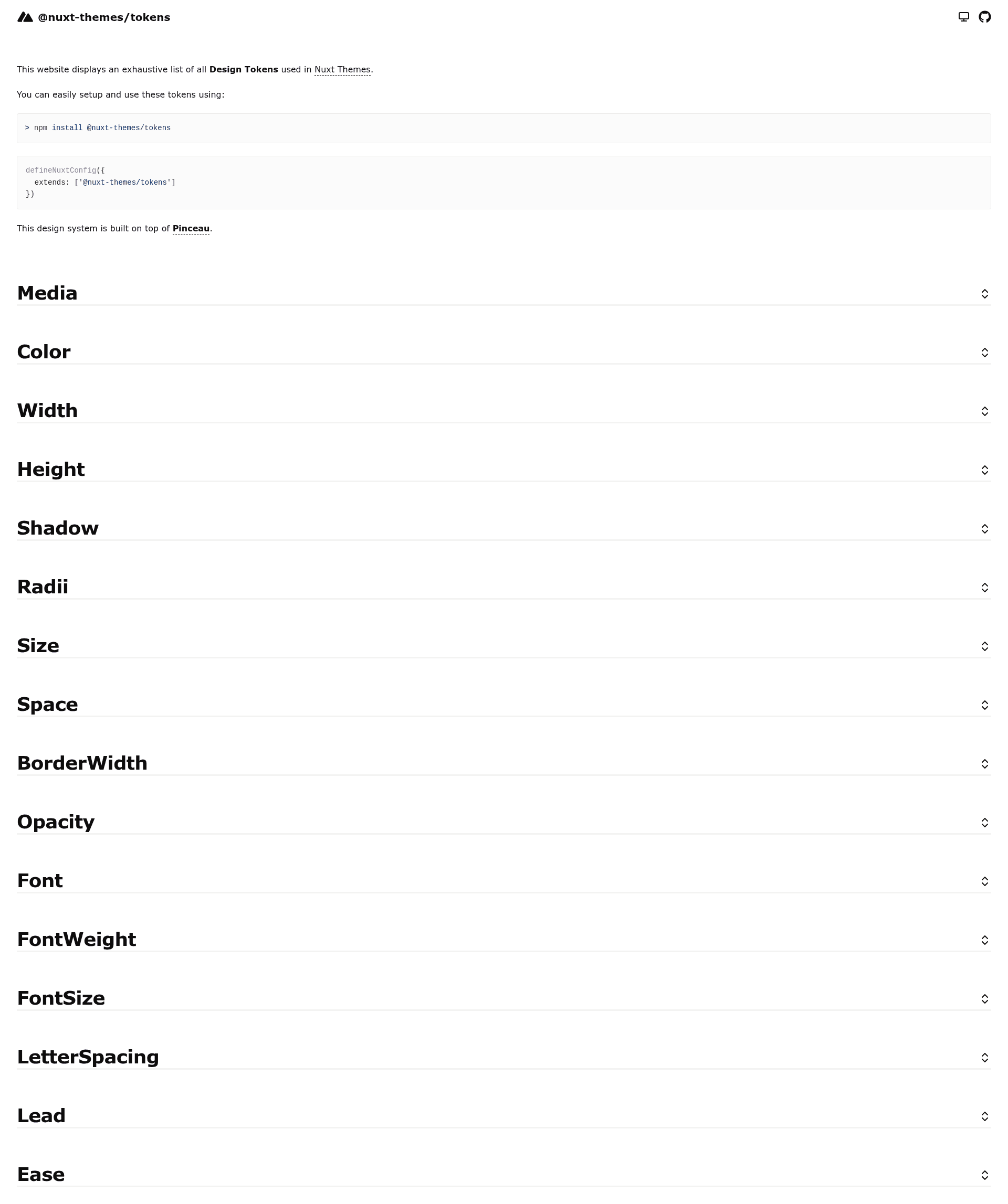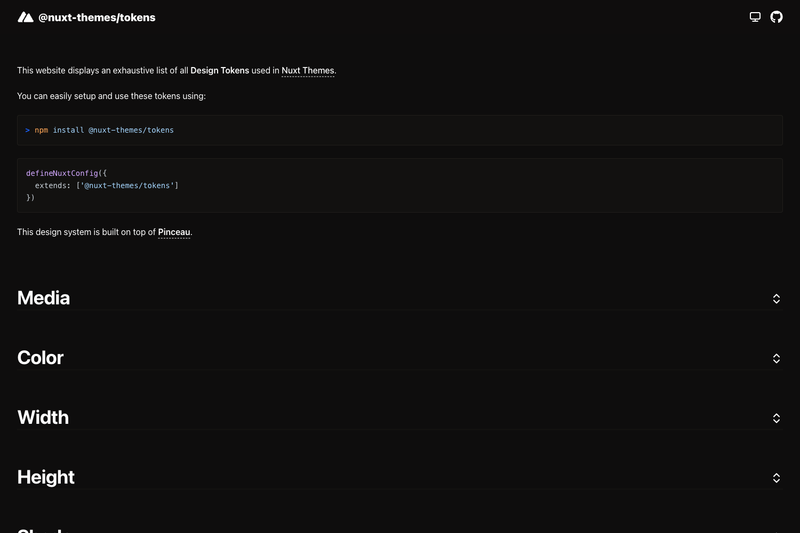
@nuxt-themes/tokens is a design-token system and Nuxt layer from NuxtLabs that ships only 6kb of CSS to the client and synchronizes design tokens with the Nuxt design team's Figma workspace.
What is @nuxt-themes/tokens?
@nuxt-themes/tokens is a design system built specifically for Nuxt, delivered as an npm package that you install as a Nuxt layer. It takes design tokens — colors, spacing, typography, and other visual primitives — that are synchronized with NuxtLabs' Figma design team, and makes them consumable inside any Nuxt application via CSS variables. The package is built on top of Pinceau, a styling and token system for Vue/Nuxt, and is maintained by NuxtLabs under an MIT license.
Key Features
- Low CSS footprint — A full install ships only 6kb of CSS to the client, making it lightweight for production Nuxt apps.
- Figma synchronization — Design tokens are synchronized with the NuxtLabs Figma design team, so development tokens stay aligned with the official Nuxt design language.
- Autocomplete on tokens — All token values are typed and offer autocomplete in editors, so you can reference design tokens without memorizing hex codes or raw values.
- Pinceau integration — Built on top of Pinceau, which handles token resolution and CSS generation within Vue/Nuxt projects.
- Simple layer install — Add
@nuxt-themes/tokensto theextendsarray innuxt.config.tsand the tokens are available throughout your Nuxt app without extra configuration. - Open source — MIT-licensed by NuxtLabs, so you can freely use it in personal, commercial, and open-source projects.
Who is it for?
- Nuxt theme developers — Use this token layer as the foundation for building new Nuxt themes, ensuring a consistent and maintainable design base.
- Design system maintainers — Keep code and Figma designs in sync by relying on tokens automatically synced with the Nuxt design team.
- Nuxt application developers — Quickly adopt a coherent set of design tokens in a new Nuxt project without creating tokens from scratch.
What can you do with @nuxt-themes/tokens?
- Build custom Nuxt themes — Extend the layer and override token values to create a custom theme that still shares Nuxt's design vocabulary.
- Maintain consistent styling — Use the same token values across design and code, reducing drift between mockups and implementation.
- Kickstart a Nuxt project — Install the package as the starting point for your app's visual foundation, then add only the components you need.
How does @nuxt-themes/tokens work?
Start by installing the package with npm install @nuxt-themes/tokens. Then add '@nuxt-themes/tokens' to the extends array in your nuxt.config.ts. The layer automatically wires the design tokens into your build via Pinceau, and they become available for use in your components and templates.
FAQ
Is @nuxt-themes/tokens free?
Yes. The package is released under the MIT License, so you can use it freely in personal and commercial projects, and even incorporate it into other open-source work.
What is a design token?
A design token is a named value that stores a design decision, such as a color hex code, spacing unit, or font size. @nuxt-themes/tokens provides these tokens as CSS variables so you reuse the same values across your whole Nuxt application.
How do I install @nuxt-themes/tokens?
Run npm install @nuxt-themes/tokens in your Nuxt project, then add the package name to the extends array in your nuxt.config.ts file. That's all the setup needed to start using the tokens.
Is Pinceau required separately?
No. Pinceau is a dependency of @nuxt-themes/tokens and is used under the hood. Installing the layer brings in the necessary Pinceau functionality, so you don't need to configure it manually.