Reducing bandwidth usage with next/image is a Vercel-published documentation example that shows Next.js developers how to serve optimally sized images from the next/image component by configuring the sizes prop and choosing the right layout mode.
What is Reducing bandwidth usage with next/image?
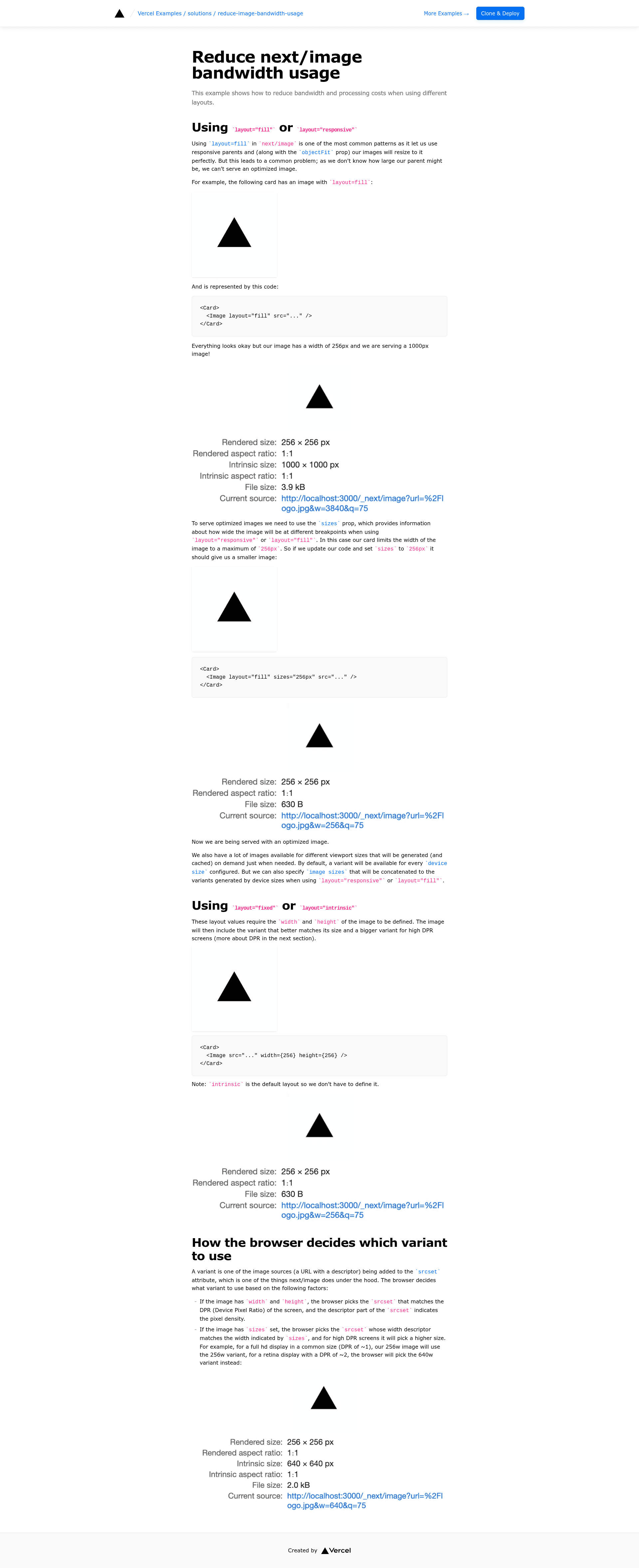
This example from the Vercel examples repository demonstrates how to reduce bandwidth and processing costs when serving images with Next.js's next/image component using different layout modes. It takes a Next.js app with next/image usage as input and produces a working example showing the sizes prop and layout configuration that generate and cache optimized image variants on demand. The example runs on Next.js (framework), uses Tailwind CSS for styling, and is published by Vercel as part of the vercel/examples collection.
Key Features
- Sizes prop optimization — Demonstrates how adding
sizes="256px"to alayout="fill"image reduces the served image from 1000px to an optimized variant matching a 256px card. - Layout mode coverage — Covers all four
next/imagelayouts:fill,responsive,fixed, andintrinsic, explaining when each needs thesizesprop. - On-demand variant generation — Image variants are generated and cached on demand for every configured device size, with custom
imageSizesappended for responsive/fill layouts. - Live demo — A public demo is available at https://solutions-reduce-image-bandwidth-usage.vercel.sh to inspect the optimized responses.
- One-click deployment — Includes a Deploy with Vercel button that clones the repository and deploys it without additional configuration.
- pnpm bootstrap — The example can be bootstrapped locally with
pnpm create next-app --example https://github.com/vercel/examples/tree/main/solutions/reduce-image-bandwidth-usage reduce-image-bandwidth-usage.
Who should use Reducing bandwidth with next/image?
- Next.js developers — Anyone using
next/imageresponsive/fill layouts who wants to eliminate oversized downloads by correctly applying thesizesprop. - Performance-focused teams — Frontend teams measuring Core Web Vitals who need a minimal, working pattern to verify image optimization behavior before adopting it in their own apps.
- Vercel deployers — Users who want a live environment to test image caching and variant generation without configuring their own server.
Use cases
- Build responsive image cards: Apply
layout="fill"withsizes="256px"andobjectFitso cards of any parent width receive correctly sized, cached images. - Fixed-intrinsic icons and avatars: Use
layout="fixed"or the defaultlayout="intrinsic"with explicit width/height to get optimized images without extra props. - Audit existing
next/imagecode: Compare screenshot-before and screenshot-after results in the example to identify where your own app is serving oversized images.
How does it work?
The example walks through two scenarios. For layout="fill", a card with a 256px width but a 1000px source image is shown; adding sizes="256px" tells Next.js to serve a matching variant. For layout="fixed" and layout="intrinsic", explicit width and height props define the variants automatically. All variants are generated and cached on demand, with device sizes configured in next.config.js and optional image sizes appended.
FAQ
Do I need the sizes prop for every layout?
No. Only layout="responsive" and layout="fill" benefit from the sizes prop for determining the width at different breakpoints. For layout="fixed" and layout="intrinsic", width and height are explicitly declared, so Next.js generates variants from those values without sizes.
How does layout="intrinsic" differ from layout="fixed"?
layout="intrinsic" is the default layout and preserves the image's natural dimensions unless width/height are changed, while also scaling down on smaller viewports; layout="fixed" pins the image to the exact width/height you specify. Both generate optimized variants based on the explicit dimensions.
Can I customize which image variants are generated?
Yes. In addition to the default device sizes configured in next.config.js, you can specify imageSizes that will be concatenated to the variants generated by device sizes when using layout="responsive" or layout="fill".
Where is the demo for this example?
The live demo is hosted at https://solutions-reduce-image-bandwidth-usage.vercel.sh, and the source is included in the vercel/examples repository under solutions/reduce-image-bandwidth-usage.
How do I deploy this example to Vercel?
Use the "Deploy with Vercel" button from the README, which creates a new project based on the GitHub repository URL, or clone and run pnpm create next-app --example locally before deploying via the Vercel CLI or Git integration.