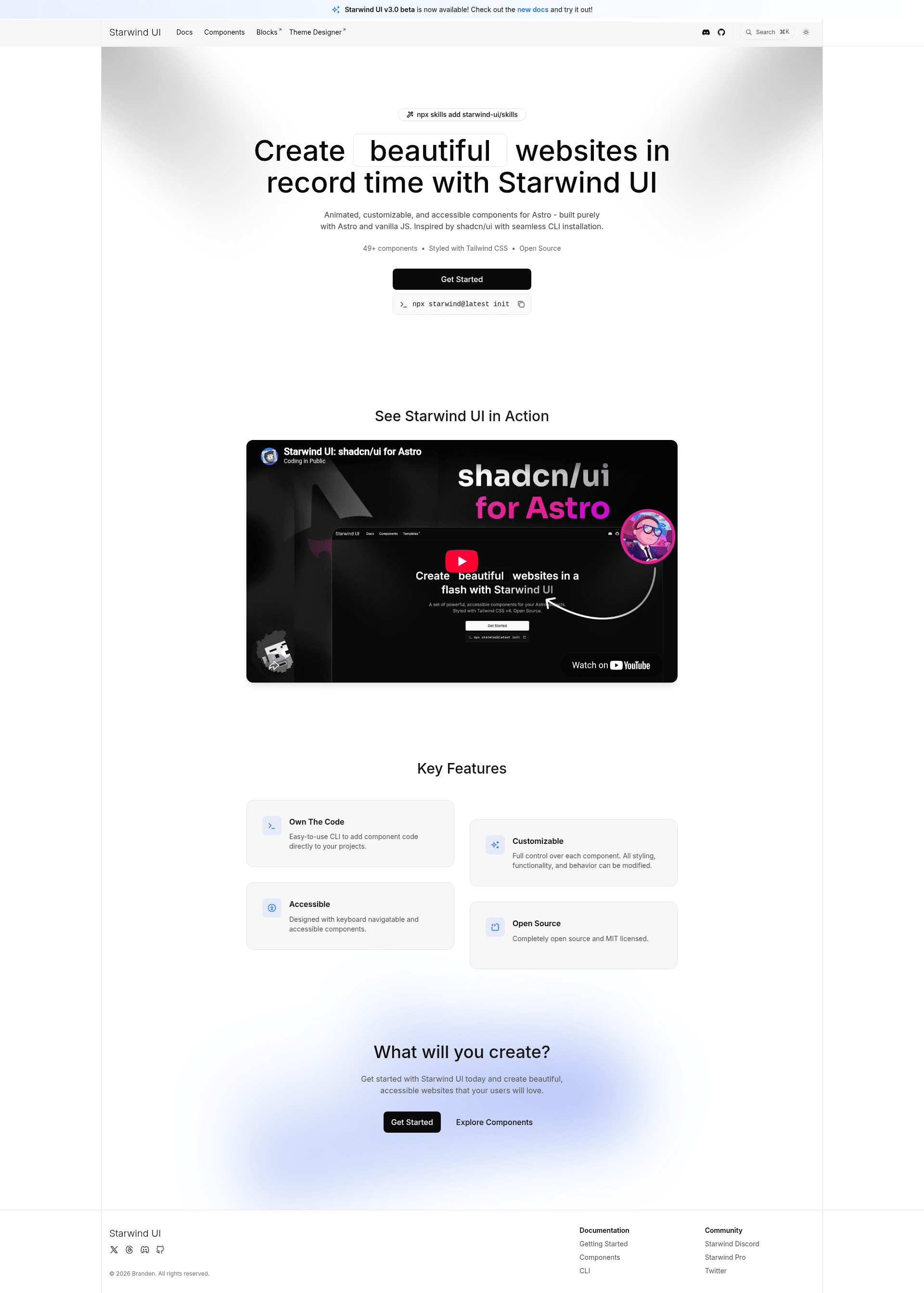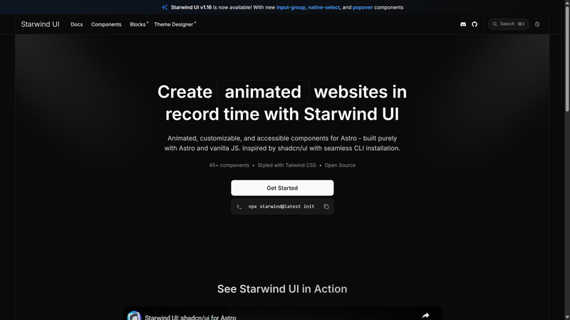
Starwind UI is an open-source, Astro-first component library that installs more than 49 animated and accessible Tailwind CSS components directly into your project via a CLI, backed by a portable runtime that powers Astro and React adapters.
What is Starwind UI?
Starwind UI is a component library inspired by shadcn/ui that copies code into your project instead of installing a package dependency. It runs on Astro, with React support available through a beta runtime channel, and styles components with Tailwind CSS v4. The project is MIT-licensed and is developed with AI assistance from Codex and GPT-5.6.
Key Features
- Own Your Code — styled components are written into your project source, so you can read, understand, and customize every class and attribute.
- Animated by Default — components ship with smooth, polished animations using Tailwind CSS v4, with no additional animation library required.
- Accessible — keyboard-navigable and screen-reader-friendly components built with a11y in mind from the start.
- Portable Runtime — a shared, framework-neutral runtime provides DOM behavior, with generated adapters for Astro and React.
- CLI-Powered — add only what you need by running
npx starwind add, and initialize withnpx starwind init. - AI Integration — official resources include Starwind Skills, an MCP server, and an
llms.txtfile for AI tools.
Who is it for?
- Astro developers who want shadcn-style components without leaving the Astro ecosystem can initialize and add components entirely through the CLI.
- React developers who need shared accessible behavior across frameworks can try the beta runtime channel with
npx starwind@beta init. - Teams that want to own their UI code can customize any copied component directly, since all source lives in their repository.
What can you do with Starwind UI?
- Build a new Astro site: run
npx starwind@latest init, thennpx starwind@latest addto pull in components like color pickers and form controls. - Prototype animated interfaces: get motion and polish included by default instead of wiring animations separately.
- Reuse behavior across frameworks: the DOM-first runtime design lets Astro and React adapters share the same accessibility and interaction logic.
How does Starwind UI work?
Starwind components are composed of Tailwind CSS plus framework markup that delegates behavior to the shared Starwind Runtime. That runtime talks to browser DOM APIs and is adapted for each framework. Developers select components through the CLI, and the code is generated into their project.
FAQ
Is Starwind UI free?
Yes. The project is open source under the MIT license, so you can use, modify, and distribute it freely.
Which frameworks are supported?
Astro is the stable target, while React is supported through the beta release of the portable Runtime. Use npx starwind@beta init to set up the beta channel.
How do I add components to my project?
Initialize an Astro project with npx starwind@latest init, then run npx starwind@latest add to choose components to copy into your source.
How many components does Starwind UI include?
The repository metadata states more than 49 animated and accessible components, all managed by the CLI.
Alternatives
- shadcn/ui — the React component collection that popularized the copy-in-your-code and CLI add workflow that Starwind UI adapts for Astro.