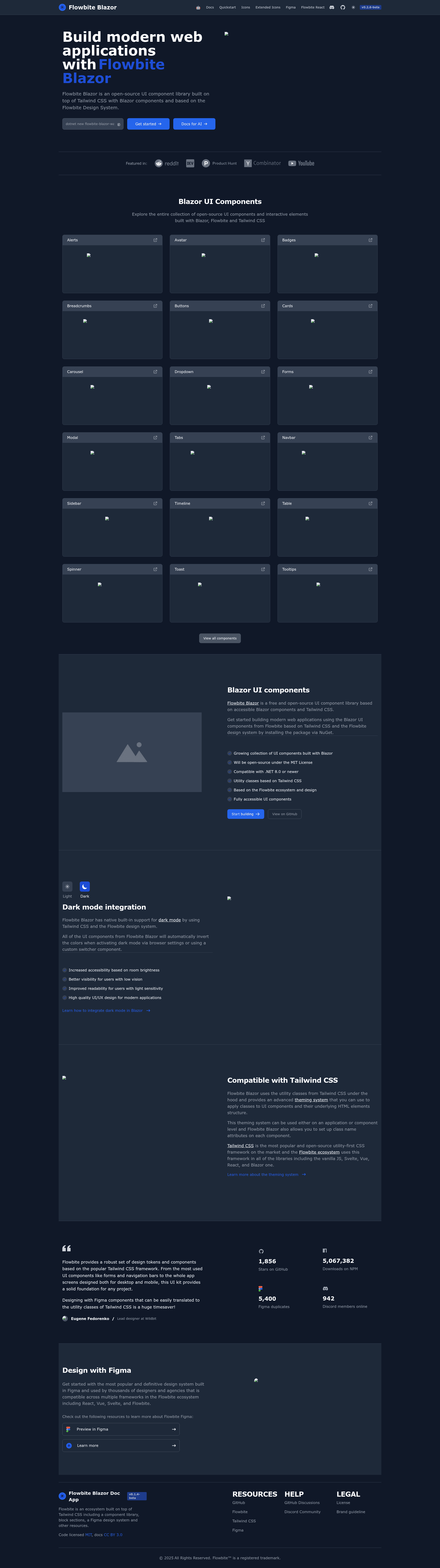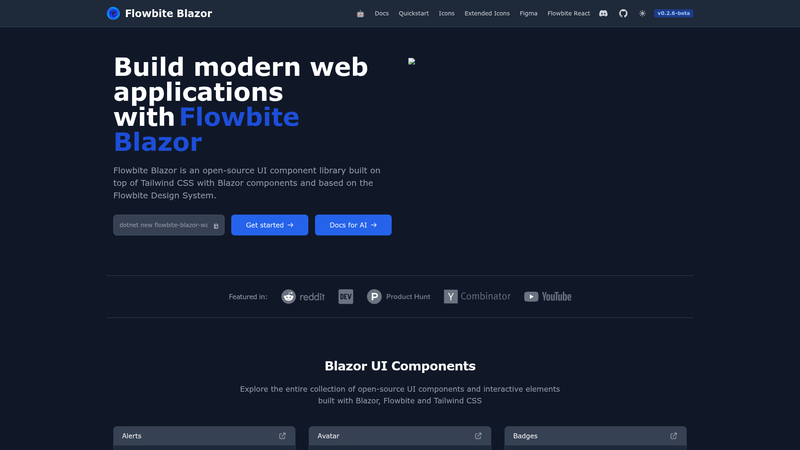
Flowbite Blazor is an open-source Blazor component library that ports the Flowbite design system to ASP.NET Blazor 8/9 on top of Tailwind CSS v4, providing 30+ reusable UI components for .NET developers. It is maintained by the Themesberg team behind Flowbite and is currently in beta (v0.2.x-beta).
What is Flowbite Blazor?
Flowbite Blazor takes Blazor component markup as input and produces accessible, keyboard-navigable UI styled with Flowbite's design tokens. It runs on .NET 8.0 or .NET 9.0 with Tailwind CSS v4 and Node.js 18+ as prerequisites. The library ships as the Flowbite NuGet package, with a companion Flowbite.ExtendedIcons package and a Flowbite.Templates.Wasm project template for Blazor WebAssembly.
Key Features
- 30+ components — Forms (TextInput, TextArea, Select, Checkbox, Radio, FileInput, ToggleSwitch, RangeSlider, Combobox), navigation (Navbar, Sidebar, Breadcrumb, Dropdown), feedback (Alert, Badge, Toast, Spinner, Modal, Drawer), data display (Card, Avatar, Table, Timeline, Carousel), layout (Button, ButtonGroup), and typography (Heading, Paragraph, Span).
- TailwindMerge integration — Conflicting CSS classes are resolved intelligently, so a custom Class parameter such as px-8 py-4 on a Button overrides defaults instead of stacking.
- Slot system — Each complex component exposes named slots (Card.Base, Dropdown.Menu, Modal.Header, AccordionItem.Content) for per-element CSS changes without replacing whole components.
- Floating UI — Dropdowns, Tooltips, and Combobox use @floating-ui/dom for auto-flip, shift, and an 8px offset so menus don't fall off screen.
- Debounced input — TextInput supports InputBehavior.OnInput with a configurable DebounceDelay (e.g., 300ms) for search-as-you-type experiences.
- Animation state machine — Sidebar and Accordion animate height smoothly; prefers-reduced-motion is respected for instant transitions.
- Lazy JS modules — IClipboardService, IElementService, and IFocusManagementService load their JavaScript only on first use, cutting initial bundle size.
- Icon libraries — Flowbite.Icons ships 90+ icons; Flowbite.ExtendedIcons adds 200+ more.
Who is it for?
Flowbite Blazor is for Blazor Server and Blazor WebAssembly developers who want production-style components without writing Tailwind utilities by hand. Teams that already use Flowbite for marketing sites can extend the same design language into .NET applications. Developers who need keyboard navigation, ARIA labels, and motion-reduce support for accessibility compliance will also find the built-in behavior useful.
What can you do with Flowbite Blazor?
- Blazor developers: Add the package, register AddFlowbite(), and drop components like Navbar, Modal, or Table into .razor files; the library injects the required CSS and JS.
- Dashboard builders: Assemble a Sidebar with collapsible nested groups, a DebouncedInput for live search, and a Table with QuickGrid integration for data-heavy admin panels.
- Brand customization: Override the CSS variables in the @theme block (e.g., set --color-primary-500 to a green hex) and every component adopts the new primary color instantly.
How does Flowbite Blazor work?
After installing the Flowbite NuGet package, you call builder.Services.AddFlowbite() in Program.cs, add the flowbite.min.css and flowbite.js references to your layout, and configure Tailwind CSS v4 with the flowbite plugin and @source paths for your .razor files. Then you can use any of the 30+ components directly in Razor markup.
FAQ
Is Flowbite Blazor free?
Yes, Flowbite Blazor is released under the MIT License, so it is free to use, modify, and include in commercial projects.
What .NET versions are supported?
The library targets .NET 8.0 and .NET 9.0 SDKs. You also need Node.js 18+ and Tailwind CSS v4.x to build the styles.
Is Flowbite Blazor production-ready?
The project is in beta (v0.2.x-beta). The v0.2.0 release renamed Button.Style to Button.Variant and Tooltip.Style to Tooltip.Theme, so breaking API changes may still occur before a stable 1.0.
Does it support dark mode?
Yes, dark mode is configured via a minimal tailwind.config.js that sets darkMode to class. The library ships with the Tailwind CSS class-based dark mode setup.
How do I customize component styles?
You can pass a Class parameter to any component and TailwindMerge resolves conflicts, or you can use the Slots parameter on complex components to style specific parts like the modal header or dropdown menu.