Newsletter
Join the Community
Subscribe to our newsletter for the latest news and updates

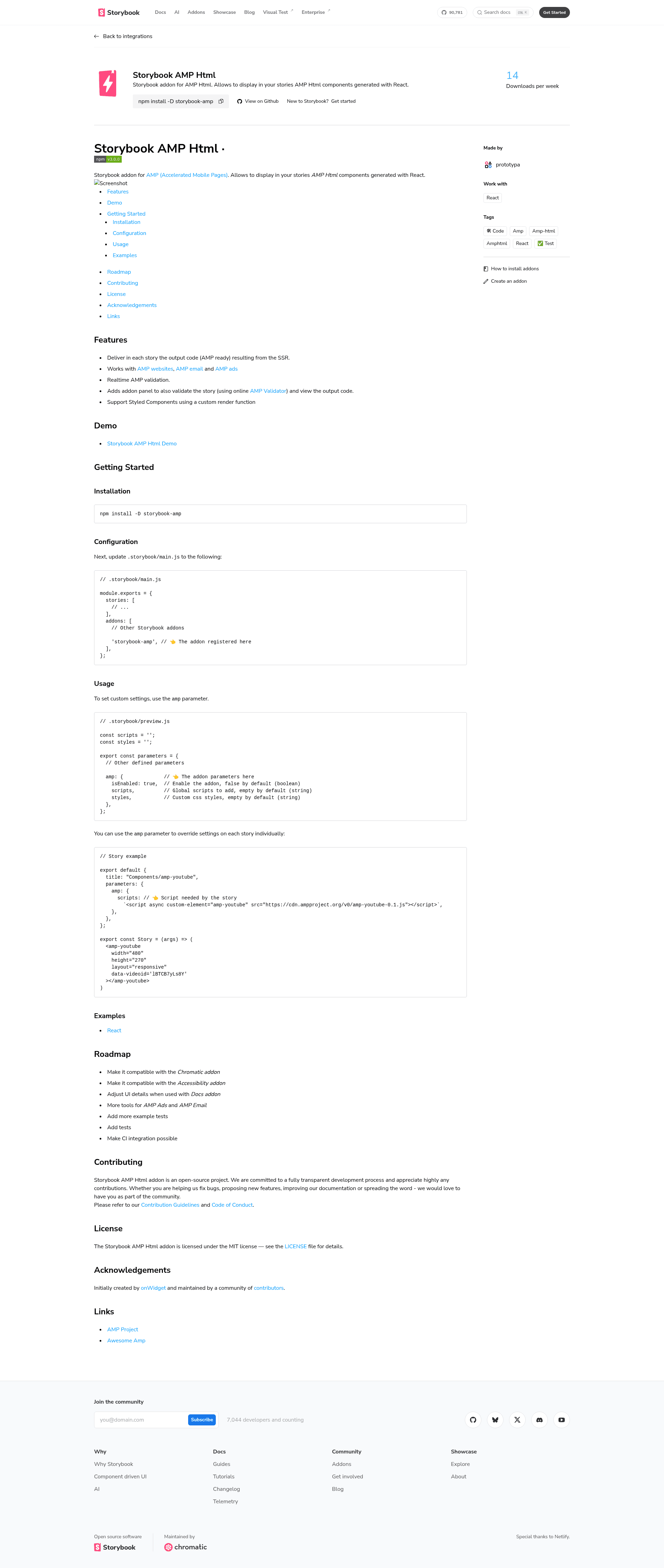
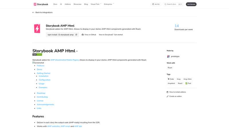
⚡ Addon to render and validate AMP html in Storybook
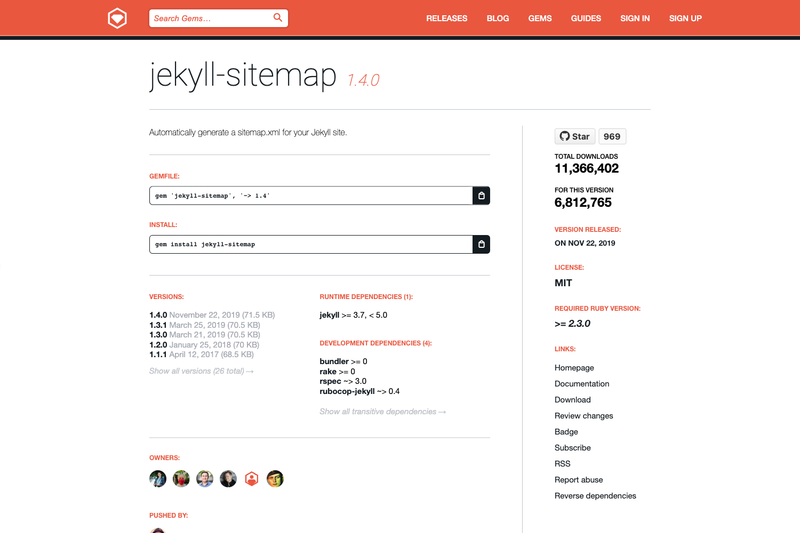
Jekyll plugin to silently generate a sitemaps.org compliant sitemap for your Jekyll site.
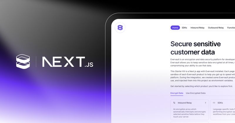
Share environment variables securely with AES-GCM encrypted, expiring links

Asset pipeline for Jekyll that collects, converts and compresses JavaScript and CSS assets.
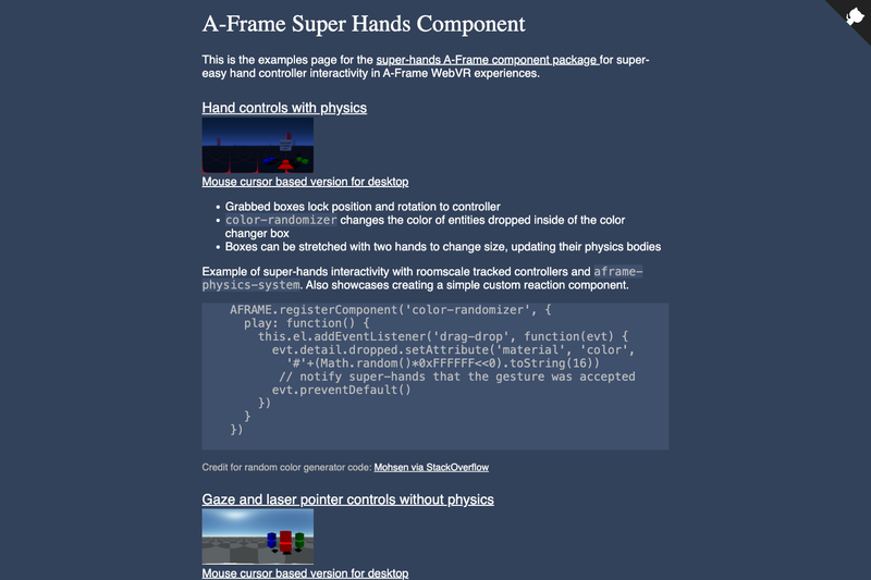
All-in-one natural hand controller, pointer, and gaze interaction library for A-Frame
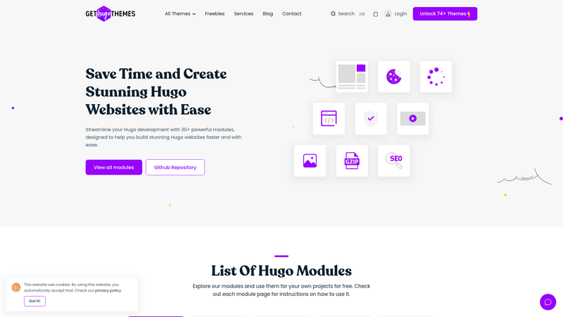
30+ Powerful Hugo Modules Created By Gethugothemes.
storybook-amp is a Storybook addon that renders React-based AMP HTML components inside stories and validates the resulting markup against the official AMP Validator. Built by onWidget and released under the MIT license, it targets developers who build Accelerated Mobile Pages components and want to see them work inside Storybook's component development environment.
storybook-amp is a Storybook addon that takes React components written with AMP custom elements, such as amp-youtube, server-side renders them into AMP-ready HTML, and displays that output in each story. The addon also validates the rendered code in realtime using the online AMP Validator, so a story passes only if the AMP markup is correct. It works for all three AMP formats: AMP websites, AMP email, and AMP ads. The project was initially created by onWidget and is maintained by an open-source community under the MIT license.
storybook-amp packs seven distinct capabilities directly into the Storybook UI, from code output to validation.
amp parameter can be overridden per story, letting you inject the AMP scripts and custom CSS a specific component needs, such as the script for amp-youtube..storybook/preview.js you can enable the addon globally and define shared scripts and styles.storybook-amp serves three main audiences, all of whom work in Storybook's React environment.
The addon's features translate into practical workflows for validating and sharing AMP markup.
amp-youtube story, and the addon reports whether the SSR markup passes the official validator.custom-element script your component needs in a story's parameters, and the addon includes it in the rendered output.Install the package with npm install -D storybook-amp, then register 'storybook-amp' in the addons array of .storybook/main.js. In .storybook/preview.js, set the amp parameter with isEnabled: true and optional global scripts and styles. For individual stories, override the same parameter with a script tag needed by that component. The addon then renders the story, server-side renders the React component to AMP HTML, and validates the result in the addon panel.
Yes, storybook-amp is open-source software released under the MIT license. You can install it from npm as a dev dependency and use it in commercial projects without a paid license.
After adding the addon to .storybook/main.js, set amp.isEnabled to true in the parameters exported from .storybook/preview.js. This globally activates the addon for all stories.
Yes. The addon explicitly supports AMP websites, AMP email, and AMP ads. Each format has different validation rules, and the validator integration can check all three.
The addon is designed for React components and includes a custom render function so styled-components work inside stories. There is no mention of support for Vue, Svelte, or other frameworks on the page.
The project's roadmap notes that it is not yet compatible with the Chromatic addon or the Accessibility addon, and that UI details still need adjusting for the Docs addon. These integrations are planned but not finished.