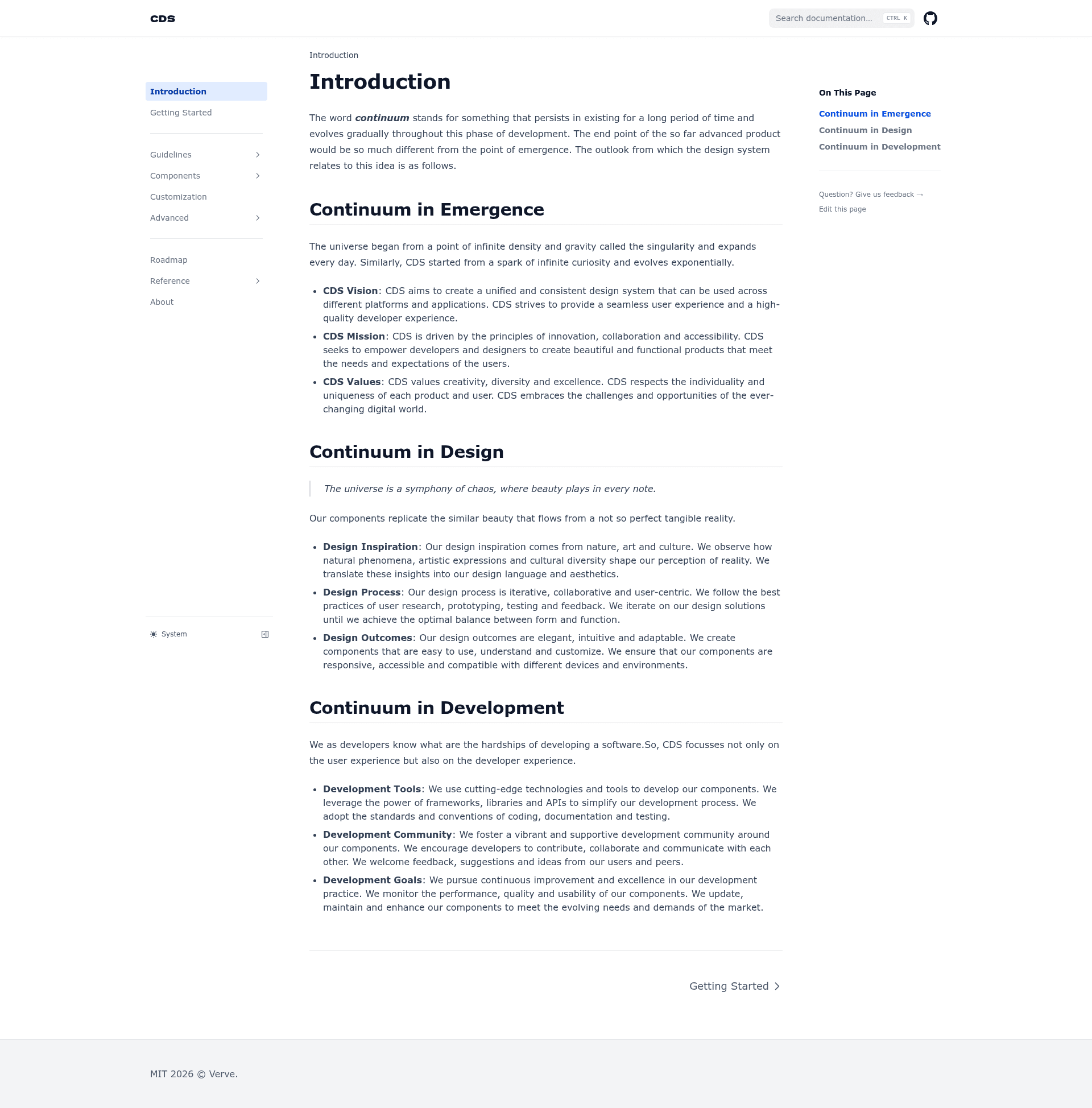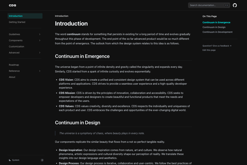
CDS Docs is a documentation site template for the Continuum Design System (CDS) by Verve, built to present a component library and design-system guidelines.
What is CDS Docs?
CDS Docs is the documentation template for Continuum Design System, a design system created by Verve. Its core function is to provide a structured website for publishing component documentation, design principles, and usage guidelines. The template takes design-system content and produces a navigable documentation site. The repository metadata describes it as 'Documentation for Continuum Design System' and lists topics such as component-library, design-system, ui-components, ui-design, and web-components, confirming its focus on web-component-based UI documentation. Source tags also list Nextjs, indicating the site is built on the Next.js framework. The GitHub repository currently has 4 stars.
Key Features
- Component library documentation — The template is organized to document a library of UI components, as indicated by the component-library and ui-components topics.
- Web components showcase — The web-components topic indicates the design system is built with web components, and the docs site is meant to display them with usage details.
- Design system guidelines — The design-system topic points to the inclusion of design principles, patterns, and best practices for CDS.
- UI design reference — With the ui-design topic, the site likely offers resources for designers to understand the visual language of the design system.
- Built on Next.js — The source metadata lists Nextjs as a tag, indicating the documentation site is developed with the Next.js React framework.
Who is it for?
- Design system maintainers — The team at Verve responsible for Continuum Design System can use this template to publish and update the official documentation.
- Frontend developers — Developers building applications with CDS web components will reference the site for component APIs, examples, and integration instructions.
- UI/UX designers — Designers can consult the documentation to understand design guidelines, component behavior, and design principles within the CDS ecosystem.
Use cases
- Centralized design-system docs — Use CDS Docs to create a single reference for all CDS components and guidelines.
- Component discovery — Developers and designers can browse the component library to see what web components exist and how they are meant to be used.
- Onboarding resource — New team members can rely on the documentation to quickly get up to speed with CDS conventions and available UI elements.