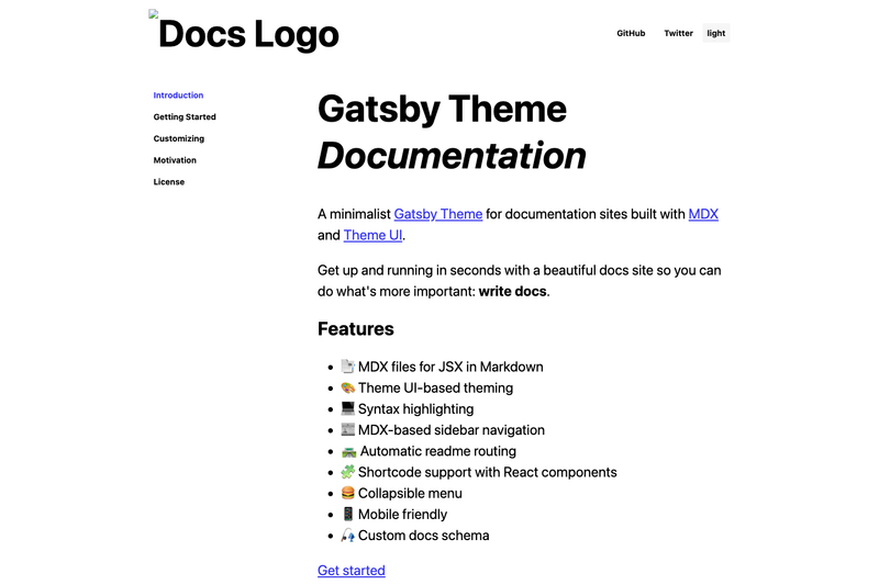
gatsby-theme-documentation is a minimalist Gatsby Theme that turns MDX files into a complete documentation website with Theme UI-based styling, sidebar navigation, and syntax highlighting.
What is gatsby-theme-documentation?
gatsby-theme-documentation is a Gatsby Theme — a prebuilt plugin that supplies the data layer, page templates, and styling for a docs site — so you can focus on writing Markdown/MDX content instead of configuring a site from scratch. It takes MDX files (Markdown with embedded JSX components) as its content source and outputs a static docs website with a collapsible sidebar, a custom header, and mobile-friendly layout. The theme runs on Gatsby, a React-based static site generator, and is distributed on npm and GitHub under the johno account.
What makes gatsby-theme-documentation stand out?
The theme's core differentiator is its minimal setup: one plugin entry in gatsby-config.js gets a working docs site, with all content authored as plain .mdx files on the filesystem. It also includes a Docs schema that exposes individual documents or collections via GraphQL, and it automatically routes every readme.md file to an index.html URL, matching how GitHub renders directories. The theme ships with MDX support, built-in syntax highlighting, a Theme UI design system for theming, and straightforward component shadowing for adding custom shortcodes, headers, and sidebars.
Who should use gatsby-theme-documentation?
Open-source maintainers who need a clean documentation site for their project's GitHub directory without building a custom site. Technical writers who want to author docs in MDX and take advantage of JSX components inside Markdown. Developers who want a Gatsby starter for a personal knowledge base or API documentation and prefer Theme UI for styling. Anyone already using Gatsby who wants to add a docs section to an existing site by installing the theme as a plugin.
What can you do with gatsby-theme-documentation?
- Open-source maintainers: Publish a docs site that mirrors a GitHub repo's
readme.mdfiles, with automatic routing from/readme.mdto/index.html. - Technical writers: Write pages in MDX, embedding React components as shortcodes (e.g., custom callouts, live demos) to enrich documentation beyond plain Markdown.
- Design-conscious developers: Reskin the entire site by shadowing
header.mdx,sidebar.mdx, andcomponents.jsthrough the Theme UI layer, letting you match the docs to your brand colors and typography. - GraphQL users: Query the generated
Docstype usingallDocsto build custom index pages, search functionality, or tables of contents.
How does gatsby-theme-documentation work?
Install the theme with yarn add gatsby-theme-documentation, then add gatsby-theme-documentation to the plugins array in your gatsby-config.js file. Author your documentation as MDX files in the project's content directory, and optionally customize the sidebar by shadowing src/gatsby-theme-documentation/sidebar.mdx, the header via header.mdx, or global components via components.js.
FAQ
How do I customize the sidebar?
Place a sidebar.mdx file at src/gatsby-theme-documentation/sidebar.mdx in your site. The theme will pick up this shadowed file and populate navigation with its list of links, which can point to internal pages or external URLs.
What is readme routing?
When you have readme.md files inside content directories, the theme converts each one to an index.html page in the built site, so /docs/readme.md becomes /docs/index.html. Links throughout the site are automatically rewritten to match the new URL scheme.
Does it support syntax highlighting?
Yes, the theme includes built-in syntax highlighting for code blocks out of the box, so code in your MDX files is rendered with language-aware highlighting without extra configuration.
Can I add my own React components to MDX?
Yes. Create src/gatsby-theme-documentation/components.js that imports and spreads the theme's base components, then add your custom components to the exported object. They become available as shortcode tags in any MDX doc.